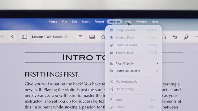
So many of the YouTuber reviews of iPadOS 26 are 'wow, I didn't know these iPad apps had all of these features' upon seeing the menu bar.

Just enforces the point: a menu bar is an educational tool with discoverability built in, just as much as anything else.

I have very strong feelings about this, and it's why I think the menu bar should always be visible in iPad windowing mode

Apple have made a point, too, about fitting the menu bar into the status bar area on the iPad, which is just empty space traditionally. There's no reason for it not to remain visible at all times, and hide in fullscreen mode (like on the Mac)
@stroughtonsmith Fully agree. It'd already be helpful to provide an option if they aren't going to do that by default.
@stroughtonsmith What’s your opinion on menu bar alignment on iPad? Center or left align?
@markv center is inferior to the left in pretty much every way, so I'd put it on the left
@stroughtonsmith The menubar should always be available in *every* mode, and every orientation. When I'm using a drawing app, holding my iPad portrait orientation in one arm, with a stylus in my free hand, I don't want to be trying to perform multi-touch gestures while not dropping the stylus, or pecking about looking for wherever / whatever this developer decided a menulet should be. Even if it's just a single word "Menu" top left of screen that gets me a top level from there.

@metaning @stroughtonsmith Funny, that’s exactly how this worked way back when the OS was still called NeXTSTEP.

(Starting at the active app level, not the “every app currently on the screen” level)

@darthnull @stroughtonsmith yup, that's a setting in Menuwhere - I just keep it on whole system mode, and use it mainly on my non-menubar displays to save coming back to the main one... bound to my scrollwheel button.

@metaning @stroughtonsmith Never heard of that! A nice feature on NeXT was you could keep the menu hidden and summon it anywhere with a right click (giving function to the second button Steve absolute hated having).

<finds app> Yup! Exactly like that. I may have to give that a whirl….

@darthnull @stroughtonsmith Many Tricks do good work, Moom is also a nice enhancement.
@stroughtonsmith Search in the Help menu is one of the greatest UX advantages of the Mac. Does the iPad also have it?
@mmackh it does, though it doesn't search the Help book (of which, no such thing exists on iOS)

@stroughtonsmith

It's also depressing because there are a lot of much better designs for menu bars on touchscreens. The thing that made WinCE so terrible was that they picked up desktop metaphores and ran them on screens where they don't make sense.

Most iPad uses have their hands at the bottom. Radial menus coming from the bottom two corners are great for this.

@stroughtonsmith things have come full circle and they're praising stuff that has been standard on desktop for 40 years?

@stroughtonsmith I love it most in the "purest" of forms in early classic MacOS apps. No toolbars, even no context menus - everything was in the menu bars.

You can discover entire app functionality this way.