Giving Tahoe titlebars a background really accentuates how chunky they are.
@johnwells Crazy how much usable space we’ve lost to window chrome with the Big Sur and Tahoe redesigns, for no apparent sensible reason at all.
@johnwells @tuomas_h I am not a fan of the Tahoe aesthetics, but you are comparing incomparable: the window in the background is a tool window with a smaller title bar, while the window in the foreground is a standard window. To compare these two UI epochs, compare windows of the same type.
@vancura @johnwells In that era of Mac OS X, that was always the size of the title bar, whether or not there was a toolbar below it.
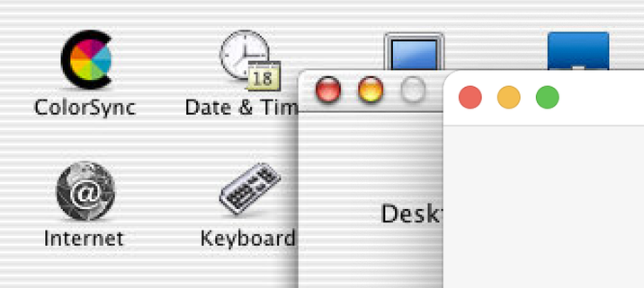
@tuomas_h @johnwells Actually, not all windows in the first version of Mac OS X (10.0 Cheetah) had the same title bar size. There was a clear distinction between standard document windows and utility/tool windows. Standard windows had a taller title bar (especially when the toolbar was enabled), while utility windows (like palettes or inspectors) had a much shorter title bar. This is visible in historical screenshots and documented in Apple’s UI guidelines from that era.

@vancura @tuomas_h Tuomas is correct. The background screenshot is of an OS X 10.0 Finder window using a standard titlebar.

Here's a side by side. The utility window screenshot is 10.4, but the height was unchanged from 10.0.

@johnwells @tuomas_h You're right, it was 7px smaller. Sorry!
@johnwells Make the stoplights glassy again, you cowards!
@johnwells #Apple is on a secret journey starting with Tahoe. Its a similar parallel to Catalina when they dropped support for 32 bit apps. They knew only 64 bit apps were gonna behave best on Apple Silicon. These large chunky parts of the Tahoe suggest either iPad Pro's will eventually run macOS or next years MacBooks will include Multitouch for the first time.
@johnwells i downloaded this old project from @_inside and it was so weird seeing a window with a titlebar this small (versus how it looks like inside IB)