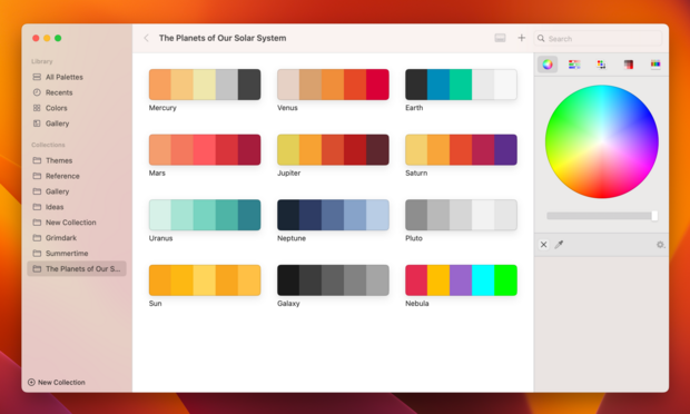
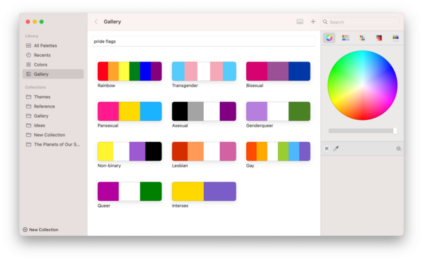
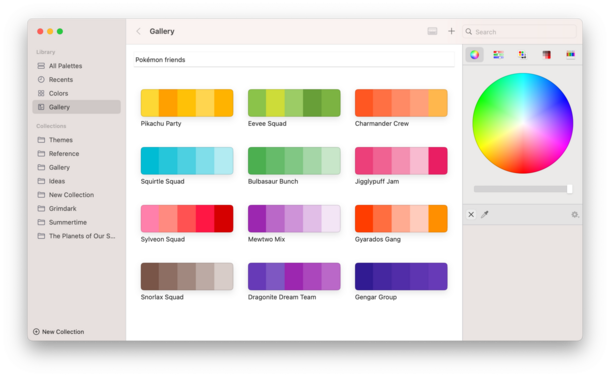
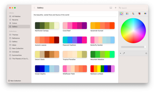
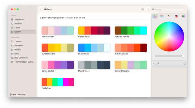
This is the time post-WWDC where I try to get all my projects building to a shippable state again with the new Xcode after working on experimental tangents and rabbit holes for months 😅 I think everything in my dev version of @pastelapp works again now, but I can't remember what I broke.
I'm doing a pass at a bunch of little things, shuffling some bits around, updating iconography etc
An awful lot of bringup for an existing iOS view controller on visionOS involves three things:
• Change your background color
• Round out your shapes/set your button configurations to the system rounded style
• Add roundrect hover styles
Here's a before/after on my wallpaper generator; just a handful of one-line changes
I built this palette-generation feature two years ago for @pastelapp, hoping that Apple would ship LLM APIs I could use instead of GPT-3. Womp womp.
Here's hoping tomorrow brings some change here…
Finally trying Apple's Foundation Models for palette generation, side by side with what I generated with ChatGPT.
The first image is the prompt "Planets of the Solar System" with Apple's on-device LLM, the second image is the same prompt using GPT-3.5 as of 2 years ago.
It can certainly do what I need it to do; whether the results are any good is an open question. I think it's inoffensive, and harmless, at the very least, so maybe I can move forward with it
Enabling streaming, you can see that the Foundation Models API is slow — I would say alarmingly slow — on M1 hardware. I'm not even sure what kind of optimization I might be able to do to speed this up, as it's seemingly purely on the token generation side 🤔
It's going to take more than a little care and attention before you start sprinkling this all over your apps, that's for sure. Good to know
Still a long way to go, but here's a before/after on Pastel on macOS 26 as of the current build.
During development, you spend so much time looking at the new design that you kinda forget how it used to look
With today's work out of the way, I think Pastel's iOS 26 update is done for Mac and for iPhone. The iPad build is blocked by my earlier radar, and I haven't figured out a mitigation strategy yet, but we're nearly there
I've started the TestFlight process for Pastel for iOS and macOS 26. There are some known issues on iOS, including a severe hang, but most things are in place now, and there are still slots available 😄
This *is* a nice API!
@jncn the bar under the color wheel is shared across all the tabs, so isn't intended to align with the wheel directly. I do agree about the tabs at the top, though, but ran into complications due to how it's structured so shelved it for now.
The color wheel itself can't expand to the same spacing as the bar underneath because it has to share the space with the brightness slider, and having the slider match the wheel looks best with that in mind
@jpsachse @stroughtonsmith Never having used the app (it is quite obvious, what it does):
The search bar overlapping the sidebar makes no sense to me.
The commands that affect only the content should be above (in) the content area.
Without a toolbar (background), it looks like the search bar is part of the sidebar (just a bit too wide to fit inside).
(I know that is as Apple designed it to be but as I said: *To me*, this makes no sense.)
@stroughtonsmith @jpsachse Sorry if I didn’t make it more clear: I do not blame you. Not at all.
IMO the idea of removing the toolbar background, and therefor the toolbar, is not working. Unless you also move the controls that were in the toolbar. But that is (often) not possible due to space constraints. All of this is 100% Apple’s fault.
@teilweise @stroughtonsmith 💯 this
I think you executed well on what Apple has been doing, but to me it also looks like a rendering error with the search bar overlapping the side bar border.
I also don’t understand why the left side bar is a floating container and the right one is not.
Liquid glass seems like „designed to be beautiful in one specific case and didn’t think about any edge cases at all“ to the extreme. Pretty in the optimal case, a failure as design system. 🥲
@jpsachse @teilweise @stroughtonsmith The set of horizontal controls, with marked shadows in light mode, implicitly indicate a toolbar for the whole window. I guess it’s something we’ll get used to.
It might look better with a slightly wider Search box, since there’s enough space to the left, unlike in Finder
@stroughtonsmith That really does give the illusion that there is some kind of physical glass object there, but it's super hard to infer what shape it is. Some kind of rectangle with rounded edges, I guess
It's neat! It's kind of weird! I wonder what it'll be like in practice.
@Joekw try:
titleVisibility = .init(rawValue: 10) ?? .hidden // UITitlebarTitleVisibilityTransparent