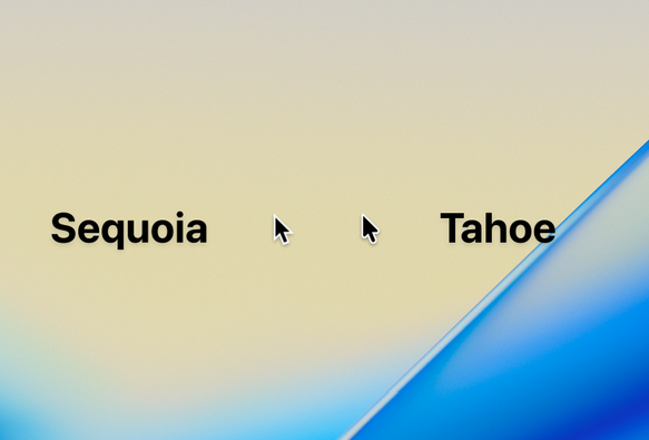
Wait, they've updated the mouse cursor! In macOS!

This is the first time they've changed it since the Retina transition in 2018, or arguably since the first Mac OS X itself, 24 years ago. Dang!

Personally I really like it, it feels right!

Plus, when they did transition to Retina, the cursor was redrawn sharper, pointier than it felt on @1x screens; so now they’re reverting to that OG look, to some degree.

@Cykelero I kind of wish they had only rounded the stem (that’s how I always read the 1x pointer), but I’m sure I’ll get used to this.
@Cykelero Toyota Sequoia versus Chevrolet Tahoe? :3c
@Cykelero they're giving our Macs safety scissors
@Cykelero And its worse 😭 the finger tap mouse cursor looks straight out of WIndows 98
@Cykelero ohh. I don’t hate it but, uh, that doesn't seem like it's gonna look good on non-Retina displays like many desktop Mac users still have to put up with. my Sequoia cursor looks great on 1080p 24”, two of which about filled up my monitor budget at work.
@Cykelero it's just a fucking arrow ffs
No wonder #apple are sodding coining it, look how easily impressed people are
@djstreethawk so you’ve never in your life been impressed or excited by a minor detail that meant a lot to you?

@cris I've had a think about it, and can't say that I have in this way, no.

That said, I can obsess about a particular sound or note in a piece of music so maybe I need to consider the differences and similarities

@cris so I've thought about it and, no
If a certain song had a slightly louder note in a particular place it wouldn't be worthy of note

Just like a slightly bigger arrow isn't

@Cykelero I would love to see a cursor evolution analysis from System 1 to macOS 26.
Ooh, fewer sharp points that could puncture your fingertips.
@Cykelero @siracusa And is this a good change or a bad one?
@Cykelero That's definitely a mistake. two cursors, you won't know which one is the real one and keep clicking with the wrong one. or if they both work, you'll click in two places at once and who knows what that will break
@Cykelero Yes, that’s crazy and really weird when first using it—I noticed it in the first seconds, cause the old one was so familiar.
@Cykelero Arguably closer in feel to the 72dpi original — I always thought the retina version looked too sharp.

@Cykelero they are enamored by rounded corners, it seems. The mouse is a precision device, the arrow should end in a single pixel. Otherwise, what’s the point?

(happy accidental pun)

@Cykelero Awesome! now get rid of the tail and it's perfect! I love the pointer on iPadOS!
@Cykelero I haven’t used it but I like the looks of it
@Cykelero should’ve made it transparent with waterdrop effects to match the aesthetics.