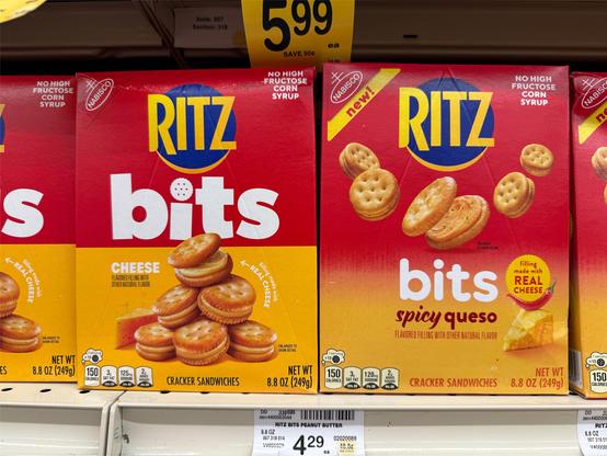
a ritz bits logo redesign incoming! (new on the left). looks more fun to me, i like it. what do you think? #WildRedesign
@cabel Bigger “bits“ along with the stacked crackers feels nice. Curious if they ditched the spicy cheese flavor?
@cabel Ooooh and the cracker in the i-dot is a fun addition too!
@cabel I don’t care either way but now I want to try the spicy queso variety
@cabel Design looks fine, but spicy queso sure is new.
@cabel I like that "bits" is promoted to the top-half, and can't be mistaken for a flavor or other variation. I bet it works even better in conjunction with other varieties, esp. if they do a bold color change for what is now the yellow background.
@cabel Definitely like the "i" dotted with the cracker. Like the half and half box background colors. And the wobbly stack feels like they're smaller than the smaller amount of crackers separated. Good call, Ritz.
@cabel it’s kind of funny looking at the old one. Like how are you in the snack business making snacks look serious instead of fun?
@cabel the new one is better, IMHO but I need to try those spicy queso ones ASAP

@cabel

I’d ignore the old and buy the new. I barely noticed the older design was pushing an interesting variant on the core Ritz cracker. I don’t mind classic Ritz crackers at all, but almost never seek them out, even if there is an entire bay of value added variants, because they don’t seem different enough.

@cabel Oh! I'm so used to bad logo redesigns I assumed the little one on the right was the new one. Nice to see a logo get more personality
@cabel Looks good. Galad theh lost the big gradient.
@cabel Ritz crackers were such a staple in our family that I have multiple photos of me eating them as a small child.
@harrymccracken @cabel Everything tastes better sittin' on a Ritz.
@flargh @harrymccracken @[email protected] Thank you, Andy Griffith.

@harrymccracken @flargh

I find it mildly disturbing that I can’t think of them without the Andy Griffith ad coming to mind now.

I ate them much more often before that campaign.

@harrymccracken @cabel

Ritz product diversification seems to be taking the same route as Triscuits and Cheez-its. With either ‘flavor added l’ on one hand, or crispy chip form on another

By the way, the crispy chip form of Cheez-its is very good imo.

@cabel Adding the "cracker dots" to the "i" in the edgier bits font is objectively more fun. Pyramids of food are also more fun. The word "queso" is not fun. So, you're right. The new one is more fun.
@cabel Approved! Ship it!

@cabel

I often prefer the original but in this case the new one is way better.

The position of the crackers in space made no sense on the old one, especially since the cheese was still forced to adhere to the laws of gravity. Now the crackers have to sit on the ground too, which works better.

But the tiny cheese on the old one made more sense because the crackers were closer to the viewer and larger.

Now the cheese looks comically small and I’m left wondering how big the crackers are.