
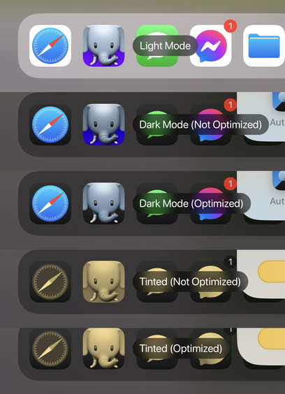
Here's how our app icon looks when optimized* vs not for the new dark and tinted icons.
*there's still a lot of work I can do to improve the actual contrast/brightness of the icon. This is just a quick sample to see how it all works.
Here's how our app icon looks when optimized* vs not for the new dark and tinted icons.
*there's still a lot of work I can do to improve the actual contrast/brightness of the icon. This is just a quick sample to see how it all works.
@mark Dark mode optimized looks great!
Tinted…not so much (but that's not your fault). Not sure why Apple thought that was a good idea.
@mark Did I just miss it, or is there not a way to detect the current icon mode?
(I get why they might not provide it, but it’d be nice to adjust the alternate icon selector presentation appropriately)
@mark Can an app tell which mode (dark/light/tinted) the user has selected on the home screen?
That way in an alt icon selector, you could have it show both the light/dark versions, with the dark (or light) one highlighted.
@mark I hope so! It would be a nice touch to be able to do that in the picker.
I haven't seen it mentioned, but it's not like *any* of this has been documented particularly well (or at all) so far.