
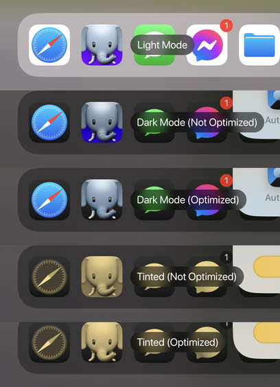
Here's how our app icon looks when optimized* vs not for the new dark and tinted icons.
*there's still a lot of work I can do to improve the actual contrast/brightness of the icon. This is just a quick sample to see how it all works.
Here's how our app icon looks when optimized* vs not for the new dark and tinted icons.
*there's still a lot of work I can do to improve the actual contrast/brightness of the icon. This is just a quick sample to see how it all works.