extremely #cursed numeric keypad layout
@th literally upper letters
 🏳️🌈
🏳️🌈@FlorianTischner
Upper case letters for printing presses were literally kept in an upper case, so why not on a typewriter? 😂
@th Wow, I’ve never seen a typewriter like that! I wonder how old it is?
@th aaaahhhh!!! at first I was expecting Linotype keyboard layout when I saw this and my brain threw a wooden shoe into itself when I didn't see the expected etaoin shrdlu pattern
@th yes! I find it interesting the letter frequencies aren't that far different. (At least, I'm guessing that's what the layout is based on.)
@th @vxo
Actually it's "ETOAIN SHURDLU" for English machines. There's also a small documentary titled "Farewell Etaoin Shrdlu" which follows the last Linotype set print of The New York Times.

Farewell Etaoin Shrdlu : David Loeb Weiss. : Free Download, Borrow, and Streaming : Internet Archive
(1978) 30m, dir. David Loeb Weiss. On July 2, 1978, the last hot lead edition of the New York Times rolled off the presses. Weiss, a proofreader for the Times,...
@bayindirh @th yea that's the one I'm used to. I had never seen the French layout before
@th I SAID I USED QWERTY. not qwerty.
@th a fun aside: apparently back in the day, keyboards typically didn't have zero or one keys, with the reason being you could just use the I and O keys which looked similar enough (ex. I92O), here's an early QWERTY layout from 1878, also check out the wikipedia article about QWERTY, the history section is really interesting https://en.m.wikipedia.org/wiki/QWERTY

@th ngl wouldnt mind this last one
@th still the most upsetting thing about it is that it doesn't have 0 and 1 keys.
@th Smarter. Unbelievably thin. Magical. ™️
@th Imagine turning up to your coworking space and unboxing this absolute unit.
@th don’t threaten me with a good time
@th
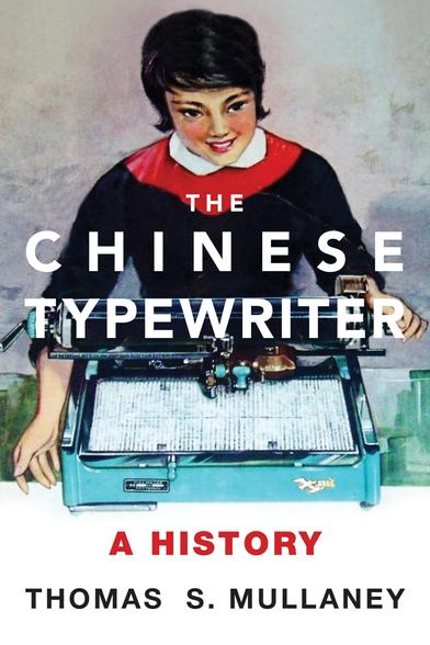
The Chinese Typewriter, A History (2016) by Thomas S. Mullaney’s
Includes the story of the “Siamese” typewriter that repurposed a version of this extended keyboard because it had ~almost~ enough letters for the Siamese/Thai alphabet
They were about two characters short, so the guy who brought this typewriter to market jettisoned two letters from their alphabet — which to this day nobody uses anymore 😱
https://en.m.wikipedia.org/wiki/Thai_typewriter
Great book:
https://mitpress.mit.edu/9780262536103/the-chinese-typewriter/
#NonAccordionContent

@th
Is that an encrypting telegraph?!
Is that an encrypting telegraph?!
@dymaxion @th A bit of googling tells me it's a very early typewriter, from the experimental days. Going by this video (turn the sound down and just read the subtitles) it looks like a distant ancestor of the golfball typewriter. https://www.youtube.com/watch?v=ozFLYTrU8_w

Old typewriter Mignon Model 4 - AEG (1925)
@Daveosaurus @dymaxion @th oh that's cool! I was kind of expecting it to have a golfball honestly, not a faceted cylinder, but the faceted cylinder makes sense too.
@Daveosaurus @dymaxion @th oh that looks so cool
love the simplicity of the mechanism
the handedness seems odd (assuming everything back then was right-hand only) but maybe it feels different to use than it looks
@th i saw a video of this working recently, it was so cool. like, i love it.
@th i saw a video of this working recently, it was so cool. like, i love it.
Went on to design ClearCase.
@th ooooh these pointing typewriters are so cool :O
@th why cursed? The letters are arranged by usage statistics from the middle out. It looks very quick once you’ve trained for it.
Funny that the character palette looks kind of like a curved Apple Newton screen.
@th This is a tabulator right?

@th I am apparently the kind of person that immediately noticed there has to be a letter missing in a 5x5 grid, so I wondered which one it was. Saw Q, X, and Z pretty quickly, and that made me morbidly wonder what they got rid of instead.
It was J.
Was this not meant for English, then? I don’t know what it would be used for otherwise.
@th on a second look, I found J on the outer rim, so it’s not actually as bad as I thought. But, yes, “cursed” is right.
@IslandUsurper in addition to 'j', there is also the lowercase 'ij' character (for uppercase you would type both I and J)
@th What the what?!
@mwichary in case you haven't seen this one yet
@th thanks i hate it
@th There must be a reason for this layout. The arrows are logical, so must be the rest?
@th I guess because you type 0 most often?

@Life_is @wmd @th If you are typing random numbers, which is not a given. These days if you're typing prices you're going to type a lot of .99s; before the invention of that antipattern, a lot of .00s. But from http://www.johnwolff.id.au/calculators/Tech/FacitC1-13/C113.htm I think the internal construction made it convenient to put 0 in the middle.
@th This keypad still feels like a lot of progress from this input https://upload.wikimedia.org/wikipedia/commons/3/3d/Original_Ohdner_1.jpg
@th has @NanoRaptor gone too far?

@th
There's probably some mechanical reason for it to be like that because there's no way a sane person could ever come up with something this wonky 
There's probably some mechanical reason for it to be like that because there's no way a sane person could ever come up with something this wonky
@th @NanoRaptor Is that a partially Dvorak-ed numpad? 0 in the centre as it’s the most commonly used?
@th why?
…no, seriously; surely there's some non-obvious reason for this?
…no, seriously; surely there's some non-obvious reason for this?
@th imagine the design discussions
"you see, 0 is the most frequent number, so it's best to put it in the middle so you can reach it with both hands"
@th i assume this is where labelp rinter manufacturers get their ideas for keyboard layouts. yes, i mean you Dymo and Brother!
@th "We needed to slow down the touch typists so that the machine didn't jam."
@th I wonder what the most frequently used digits are...
@th it's an adding machine none of them are uncursed