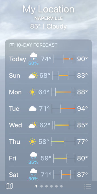
The unbearable sorrow of Apple Weather

I’m being told the alignment is good when you’re using the default text size. I bumped mine up so long ago, I’d forgotten about it. Thanks for the heads-up; I’ll update the post shortly.

But I still don’t understand how alignment works. Don’t you need to account for text size when you position other items?

@drdrang yes but what you’re seeing is essentially a bunch of springs get compressed so the width of the weather icon/precipitation percentage affects the amount of horizontal space available for the chart. I’m not saying it’s a good design!
@nriley @drdrang One advantage of Apple's leadership being mostly in their 50s and 60s is that you'd think these layout problems with larger text sizes ought not to pass without notice.
@gruber @nriley Is the problem is that app developers *can’t* make adjustments for larger text sizes because things are set up for the system to do that automatically?
@drdrang @gruber @nriley there’s lots of tooling for adjusting layout based on font size up to and including switching interface orientation

@drdrang @gruber @nriley We developers can do what we want, and SwiftUI in particular makes this much easier than it used to be. All Dynamic Type settings can be detected and interface layout overridden as desired.

It’s just a matter of prioritization and/or sufficient Q/A testing.

@gruber @nriley @drdrang helping my mom use iOS and my apps with her large dynamic type on is how I got started getting serious about accessibility support. I have found some interesting issues with iOS and large text in the past.

Links to two examples:

https://mastodon.social/@MuseumShuffle/111091995179538182

https://mastodon.social/@MuseumShuffle/112133690126918599

@MuseumShuffle Yikes! That’s an especially bad one.
@drdrang yeah and the one about the contact poster was so confusing. If I wasn’t on top of all the changes as a developer I wouldn’t know what that ui was indicating either.
@drdrang Do you have your text size increased? Not excusing it, but at the default text size it appears to be aligned better.
@globex @drdrang Agreed. The zoomed version should still be better-aligned, but at 100% text size on my 15 Pro Max, it seems to be correctly spaced.
@mattparcher @globex @drdrang Seems like the width of the conditions icon has a lot of influence on the starting point of the slot
@globex @drdrang mine appears to be aligned better too:

@drdrang for the color range, my personal guess is that it is meant to reflect the overall temperature of the day, as experienced by a person mostly up during daylight.

You can ignore temperatures during the night because you won’t leave the house before 7-8am.
In your example, the day ranging from 71-87 will probably be experienced as 80-87. While the day ranging 59-80 will probably be experienced as 70-80. So little to no overlap. This way the overall color of the color gradient reflects at a glance how the day will feal.

With an accurate gradient, a chill night and a huge temp span, most of the gradient would be blue, even if the day could feel hot.

@drdrang After years of Dark Sky's brilliant design, I absolutely could not go to this hot garbage. So I bit the bullet and subscribed to CARROT which has a layout that mimics Dark Sky's.
@aako I had Carrot for a year and didn’t see the value in it. Despite the many raves.

@drdrang I’ve been wondering if the color gradient perhaps reflects the feels-like temps? But I can’t get that theory to line up (no pun) either.

Also, a tad difficult to compare days here (Frisco, TX) when the 10 day is too consistent. 😂

@drdrang I had the same question/issue when DarkSkys was doing it. I never understood the alignment and sausage size
@drdrang I also tried to understand how they calculate the rain %, but I can’t! 75% in the ten days view for today, but then in the detail page… it is so inconsisten! The % and the icons doesn’t make any sense for me: for example it stay at 30% for a long period of time, but the cloud+rain icons are displayed only for the last 3 hours of the day.
@drdrang Ah, I see you’ve wandered into the world of low-vision accessibility! Welcome! Apps that use dynamic type are the best case scenario, but many others present the issue you describe in Weather. It’s worse there, because of the tabular data, but it’s all over for us big print users. Color contrast, for which there are standards in web accessibility, has always been a Weather thing, too. Now let us speak of apps that don’t even offer dynamic type support a passing wave!