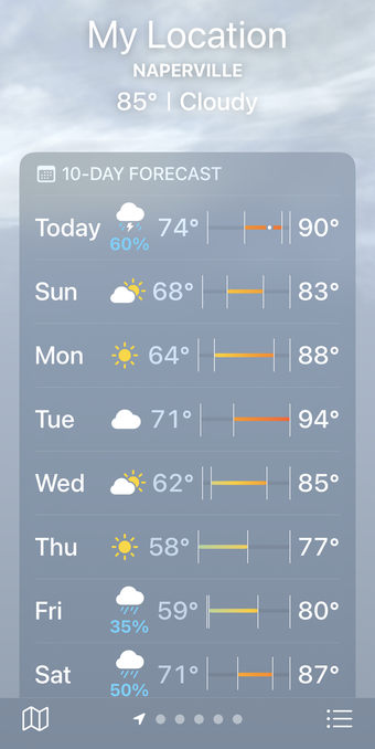
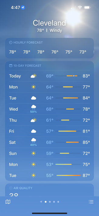
☃️ The app’s charting has broken me.
https://leancrew.com/all-this/2024/06/the-unbearable-sorrow-of-apple-weather/
https://leancrew.com/all-this/2024/06/the-unbearable-sorrow-of-apple-weather/
I’m being told the alignment is good when you’re using the default text size. I bumped mine up so long ago, I’d forgotten about it. Thanks for the heads-up; I’ll update the post shortly.
But I still don’t understand how alignment works. Don’t you need to account for text size when you position other items?
@gruber @nriley @drdrang helping my mom use iOS and my apps with her large dynamic type on is how I got started getting serious about accessibility support. I have found some interesting issues with iOS and large text in the past.
Links to two examples: