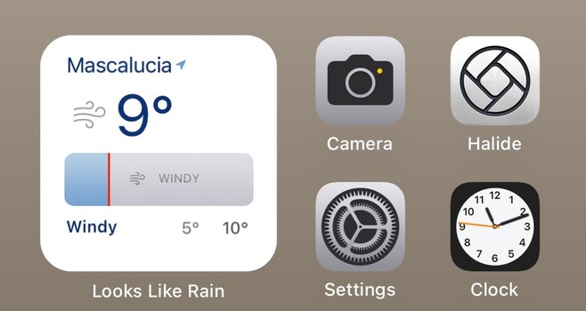
(Re-)introducing Looks Like Rain, a weather app I wrote because I couldn't find one that was quite what I wanted.

I launched a first beta a few months ago. The app's made a lot of progress since then, so I could really use some more people to kick the tires since I think it's ready to go.

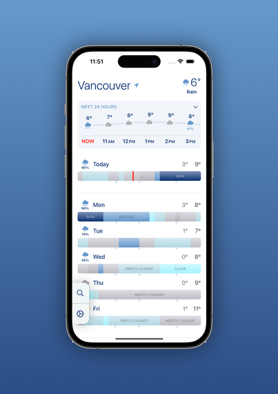
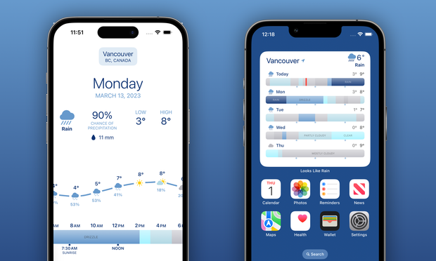
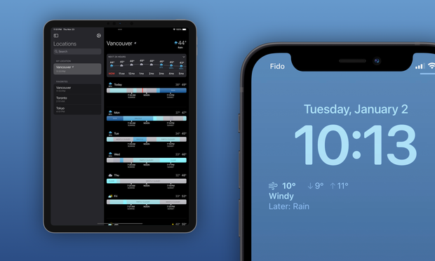
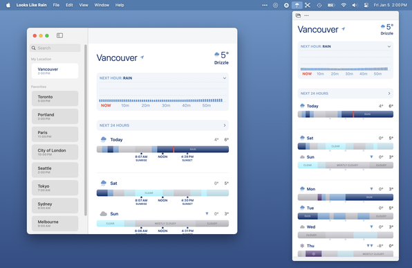
It's available for iOS and Mac, it's got home and lock screen widgets, and a handy menu bar popup on Mac.

Please give it a try!
https://testflight.apple.com/join/wAkO0ddI

#indiedev #iosdev #showcase #testflight #swiftui

Join the Looks Like Rain beta

Available on iOS

@colink building a weather app in Vancouver in the winter must be fun, oh look it’s all rain for the next…6 months! 🥲

@sideshow_boz Hence the name, I guess. ;)

But one of the reasons I wrote it is because most weather forecasts don't give a good feel if it's going to be really rainy, just kinda rainy, sunny bits in the afternoon, etc.

@dhrystone @Tinrocket Unfortunately this uses Apple's WeatherKit, which is only available on iOS 16+. Supporting older OS's would be a pretty significant chunk of additional effort. Sorry about that!
‎Hello Weather: Forecast & Maps

‎Hi, we're Jonas and Trevor, the crew behind Hello Weather. There are a million weather apps out there, and they're all overloaded with ugly ads, confusing interfaces, and stupid gimmicks. We think that stinks, so we made the antidote—a straightforward, no-nonsense app that’s a joy to use. Five reas…

App Store
@colink truncated text when it gets too cold in Vancouver 🥶

@sideshow_boz Doh! That was fixed in yesterday's build, but TIL TestFlight doesn't let people download it until you click "notify testers". Should display ok with build 19 which it should be distributing now, although I think I still might need some more optimizations for smaller displays.

Of course if you don't want to know how cold it's going to get (which is a perfectly reasonable reaction) you can stay on the old version. ;)

@colink I really like how your app visualizes weather data!

One thought: left-right swipes to change between favourite locations would be nice?

@rgordon Thank you!

That's definitely something I'm considering putting back for a future release. I had it very early in development but ended up removing it for various reasons.

@colink The left-right swipe isn't what I'm wedded to personally, just some way to switch between favourites that doesn't involve clicking into the search interface.

Instead, maybe change cities via a menu-style picker accessed by tapping the city name at the top? Just another spitball idea. I am the furthest thing from knowledgeable about UI design.

@colink Got this when pressing the info above the 24h forecast. V1.0 (19).
@Marknl Thanks for the report. Looks like it's an Apple bug, the Apple Weather app is doing that too for Utrecht when I click on the weather alert. I'll keep an eye on it, hopefully they'll clear that up.

@colink @gedeonm

Hey Colin. Great app!

A few thoughts…

- There is a lot of space on each timeline dedicated to the ‘nighttime hours’. I get that this is proportional, but the daytime hours (7am-11pm ish) are more important to my typical experience?

- the temperature feels like it could be integrated as an embedded sparkline or something inside / on top of / integrated with the rain band?

- the colors for *not raining* could be more obvious? Easier to register quickly visually…

@kraigschmidt @gedeonm Thanks for the feedback! Those are all issues I've wrestled with.

I looked into a couple of approaches for removing the nighttime hours but they all felt unbalanced. I might just make it an option to set viewable hours in a future version.

@kraigschmidt @gedeonm

I looked into adding more data into the day band or otherwise graphically showing temperature but it always just felt cluttered. I ended up with the "significant temperature change" arrows (which might not currently be visible in your region depending on temps) as my favorite solution.

@kraigschmidt @gedeonm

Adding a variety of color options was something I was hoping to get into version 1 but I ended up having to push it. People definitely see colors differently and the app needs options. Hopefully I'll be able to get to that in a future release.

@colink @gedeonm

I can’t quite put my finger on it, but (at least on iPad) it feels pretty low info-density?

That’s not exactly what I mean, because there *is* a lot of info visible (the rain bands are a neat idea!)

— the repeated labels (sunrise, noon, sunset) are too much; there must be a more elegant solution?
— the day label sitting above, plus a lot of dead space between bands
— one single condition glyph is not that useful / indicative of an entire day?

@kraigschmidt @gedeonm The iPad version definitely has a bit of "stretched iPhone version" feel about it. And showing the sunrise and sunset times was an experiment in using a bit more of the space, which kinda works in portrait but really doesn't work well in landscape. And... it's probably not needed at all, as people probably just want to see as much forecast as possible.

Now that I have a few more iPad testers, I'll probably put out a couple of variations and see what people think.

@colink @gedeonm

I like what youve got going a lot. 👍

But I think you could perhaps consider; the top 24-hour has about the same spatial weight as each rain band. That seems off to me. Or at least, lacking definitive hierarchy.

If you find a way to include temp with the bands, maybe you don’t need the top 24 hr thing at all.

Or, maybe you superimpose a band on the 24hr thing for each day?

I don’t know. Hard to describe in words… but I get that expressing complex info with clarity is… hard.

@kraigschmidt @gedeonm Heh no worries, thanks for the all the feedback!

The top 24-hour thing doesn't quite fit with the rest; it's something that was added because sometimes people just want a quick "what are the next few hours like", and it was a "don't re-invent the wheel" sort of situation. So conceptually it's a bit messy but practically I think it works... but not as well on the iPad.

@colink I like the idea!! Thanks for letting me try it. I’ll let it run for a couple days and see how it works out!
@RichelleTrickel Awesome! Let me know what you think.

@colink @gedeonm Very nice!

When I tap on a day and then move through days using the arrow buttons, I see the text and icons above the weather graph move vertically (and some icons also horizontally). Rather annoying… Can you please put them at a fixed location?

@rob @gedeonm Good catch! I'll take another look at that. Thanks!
GitHub - breezy-weather/breezy-weather: A feature-rich weather app with good visualizations and more than 50 sources.

A feature-rich weather app with good visualizations and more than 50 sources. - breezy-weather/breezy-weather

GitHub
@colink it reminds me of https://merrysky.net/. Is that an inspiration for your design?
Merry Sky Weather Forecast

Merry Sky: weather, uncluttered. With hourly forecast timelines, plan ahead activities with great precision. Don't get caught off guard by mother nature!

@alpennec Yup, in a sense... Both Merry Sky and my app were inspired by the web interface of the Dark Sky app, which was bought by Apple and shut down a few years ago
@colink thanks. I knew Dark Sky app, I loved the design.
@colink Whats data sources are you using? American weather models usually fail miserably at predicting weather in Switzerland because of the complex local weather patterns we have. The RainToday app sometimes tells me it’s dry while I’m standing in pouring rain. Because it’s dry 10km south of me.
@dgavin I'm using Apple Weather, so I'm not sure what data sources they use for your region; my results will be similar to the iOS Weather app. I might add more data sources in a later version. What apps give you good results?
@colink Local weather apps like Pflotsh or MeteoSwiss. They use local data but are by far not as user friendly or nice to use as other alternatives.
@colink @gedeonm Impressive, I’ve just join3d the beta and loaded up on my iPhone / Mac. The only lack so far I’m thinking is not having the daily temperature / forecast portion (top) of the app screen brought to the widget?
@t3kk @gedeonm Thanks! I personally prefer the 5-day view, so I wasn't sure if people would like to sacrifice some days to have the hourly temperature. If there's demand, I can definitely bring it over.
@colink I immediately love it! Would be nice to have some color sets—the blue for clear reminds me of rain. 🤷‍♂️
@Tinrocket Thanks! Having more color options is definitely moving up on my list.
@colink Really nice work. It’s clear you’ve put a lot of time and thought into the design. Thank you for sharing!
@terp Thanks for trying it out!

@colink @gedeonm How much will the “Looks Like Rain” Premium subscription cost?

This might be my new favourite weather App…

(if Apple Weather turns out to be accurate for my locations)

@rob @gedeonm Thanks!

I'm currently thinking around US$10/year for the Premium version. That would initially include widgets, more saved locations, and the macOS menubar popup. I think I'm also going to include more color options either in the initial release or soon after.

Now that I've got a lot more testers, I'll take another look at the weather API usage (which has a cost) and see what people think after using it.

@colink I’m excited to give this a try! I was a Dark Sky devotee and haven’t found a replacement that I like.

@colink Does the App support multiple languages?

Weather conditions are shown in my local language in the widget, but in English in the App itself…

(Dates are in English everywhere)

@rob Right now it's English-only (in theory, not sure what's happening with that widget), but there's not much text so I'm hoping to get more languages in there quickly.
@colink May I suggest one addition? I really like squared (small) widgets for the home. Something, like that.
@valv0 I like that! The trick for the small widget is figuring the right time period for the timeline, since 24hrs can look really cramped. Probably not for release version, but it's definitely on my list to revisit.
@colink The App currently shows a warning for “moderate flooding”. When I tap on that a pop up with the title weatherkit.apple.com and the text “403 Forbidden” appears…