Mercator size vs. true country size
by Neil Kaye
@conradhackett which is which?
@u0421793 @conradhackett Mercator = light blue
True size = turquoise
@u0421793 @conradhackett Dark green is actual size.
@GerEllen @conradhackett actual size on my iPad mini, or on my iPhone mini?
@conradhackett goodness. I was not prepared for Asia. And break it gently to Greenland

@conradhackett

oh this is better than the gif-motion one. All synoptic. <boost>

@conradhackett My primary school teacher already demonstrated this to us 40 years ago, with the roughly equal size of New Guinea and Greenland on a globe.
@conradhackett @stickfog I find the Google Earth is very handy for that perspective too:
@conradhackett Thank you!!! FYI, growing up I always wondered how Sweden looked almost the same size as India when I looked at maps!
@conradhackett if he’s seen this, it might help explain the expansionist policies of someone rumored to feel inadequate about his own size
@conradhackett Oh! Canada 🇨🇦 is really tiny. And still huge to cross in any direction.
@conradhackett Great post! Lead us to have a really interesting conversation around the dinner table tonight. Thanks for keeping the brain food coming.
@conradhackett Why do we still use the Mercator projection it's useless.
@gregsbrain @conradhackett that’s the old question of whether we want the shape to be correct or the area…

@gregsbrain @conradhackett It's incredibly useful for navigation. Any compass direction shown anywhere on a Mercator projection is accurate. It's no use for illustrating the relative size of countries - because that's not its purpose.

A screwdriver isn't useless, despite being of little or no use for hammering in a nail.

@Daveosaurus @gregsbrain @conradhackett Thing is, we don't navigate on a global scale. Sure, the lines are useful, but if you're a boat you navigate on much smaller pieces of the projection where the distortions of size are basically irrelevant. Blowing up to the planet is only convenient for books and... there they are deeply misleading.

Also, can I just say that this stupid projection is the reason we almost always end up with a #mapswithoutNZ ?

@gregsbrain @conradhackett

As a Canadian, I'm quite happy with Mr Mercator. It's like we're standing on top of the map in big heels and our hands over our head going, "don't mess with us."

@conradhackett ok, so I stand corrected that the Mercator projection is sometimes useful for compass based navigation.
@gregsbrain @conradhackett Mercator is pretty useful to navigate by unless you are at the poles because lat and long lines are straight. I don’t think the intention was ever to accurately compare landmasses. Unfortunately it’s overuse has caused people to trust it too much
@gregsbrain @conradhackett
Because it came very handy for Google Maps and all that followed. And frankly, there are no issues with it unless you get to a global scale.
@conradhackett I don’t get it why not just have a map projection where every region is the exact right size and shape? 🧐
(I’m joking)
@conradhackett Can you tell how this occurred?

@conradhackett
This map by Neil Kaye, true size vs #Mercator projection, was a disorienting revelation in my quest to figure out how #EarthSystem|s work and how they evolved in the past 6Ma or so, since the #Pliocene . Staying aware of how small the land mass in the Northern Hemisphere really is is nigh impossible and contrarian to its importance to weather and climate. Just look at tiny Greenland...!

I wonder how a true-size 2D-version for oceans and landmass would look and feel?

@conradhackett please stop with this nonsense. You can't take the surface of a sphere and present it in a plane with distorting it. This map is also incorrect
@BigFudge It's correct for the information it wishes to convey. All projections are a compromise on some criteria. @conradhackett
@conradhackett we should write an article for Russia Today. 😬
@randahl @conradhackett Yes, Russia was definitely the biggest eye opener on this map.
@conradhackett Russia and Antarctica are real shockers

@conradhackett the-maps-are-wrong.mpg

m.youtube.com/watch?v=vVX-PrBRtTY

@conradhackett it’s incredible how they got away with this for so long. HOW did Mercator ever get accepted as a useful representation, and why do we keep on using it? No doubt due to US/eurocentrism and geopolitics etc. but would love to know more about actual history
@pvonhellermannn @conradhackett Actually central Europe and the US are not TOO enlarged. I would say it is an evil plan of the Greenlanders and the penguins to show they dominate the planet.

@pvonhellermannn @conradhackett It was created in the 16th century for the purpose of navigating oceans on a ship, for which purpose it works better than any other. Had nothing to do with US/eurocentrism or geopolitics. (E.g. at that time obviously North America and Russia were not considered to be "white", etc.)

The best representation of our globular world is a globe which is what I grew up with. Trying to project a globe's surface onto flat paper will always have one distortion or another.

@conradhackett @PaulTheFossil thank you and yes, sorry, I realise what I said was pretty stupid. I did mean more how it just lived on as our main map for so long, it as you say even that probably more has more to do with projecting onto a flat surface rather than politics
@conradhackett excellent visualisation. I knew Russia/Asia was inflated but that's remarkable.
@conradhackett @jotbe I have an map of the old ussr on the wall in the room I have my treadmill (one of the kids was into it at one time and it hasn’t come down, for no reason) and I regularly go “it CAN’T be that big!,” but have forgotten by the time I get off - so, thank you… it isn’t ;)
@conradhackett it is really amazing that we still use a projection that so grossly inflates the northern half of the planet
@conradhackett
🇺🇸 : I thought we were bigger 😭
🇳🇱 : What? Where are we?
🇬🇱 : We still got the most land ice.. still..
🇨🇳 : We're shrinking! We need to invade!
🇷🇺 : You see, it's like Putin's ego not very realistic..
🇺🇦 : I wish there was so much distance between us
@conradhackett i wonder why is that huge difference in size... 🤔 because we do not live in a spinning ball.
@conradhackett @nabeards Canada and Russia are overrated.

@conradhackett
My favorite episode of The West Wing addresses map fidelity.

https://youtu.be/QMlp8BeBJgg

CJ, Josh & Peters Projection Map

YouTube

@conradhackett I love this, while we use Mercator less these days there's still so much distortion

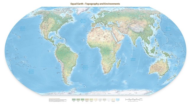
I keep meaning to get a print done of the equal earth map but it remains a plan for now

@matgb @conradhackett
This is the type of maps I use to use in school as a child.
@conradhackett I need to pay more attention to a globe - I knew that there was some distortion but didn't know the scale of it, wow!
@conradhackett done with pen and paper.. this guy didn’t had anykind of computer.. so he has my respect
@conradhackett so a Kind of Donald Trump in relation to facts?
@conradhackett isn't the actual size itself inaccurate? Especially for larger countries that require the projection of the curvature of the earth onto a flat paper?
Map projections can be deceptive! [OC]

Posted in r/dataisbeautiful by u/neilrkaye • 1,230 points and 78 comments

reddit
@conradhackett Me (to Canada and Russia): You're not so big!

@conradhackett

This explains why Russia's "3 day war" is a smidge off the plan.