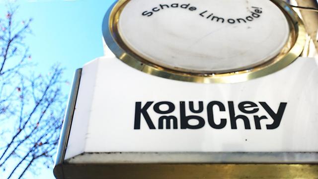
Soms kom ik speelse en wanordelijke #typografie op straat in #berlijn tegen die mij blij maakt | Sometimes I come across playful and disorderly #typography on the streets of #berlin that makes me happy.
#signing ‪#typographic‬ #typematters ‪#fontlove‬ ‪#Typographymatters‬ #typographyinspired ‪#typographydesign‬ ‪#typographyart‬ ‪#typedesign‬ ‪#goodtype #WorldofType

Design isn’t neutral — it’s decisive.

On Brave UX, we talked about something subtle but critical: how poor typography in election ballots can lead to real-world confusion.

This clip from the episode has been quietly resonating — thanks to Brendan Jarvis for surfacing this moment.

🎧 Full episode here → https://youtu.be/1WcXHhvMhls?si=v6mzbU2sdzZ3_JoX

#ElectionDesign #TypographyMatters #UXNow #DesignEducation #BraveUX #DesignJustice #Sorbonne

Brendan Jarvis just dropped a new short from our Brave UX episode — this one touches on the “life or death” nature of typography.

I meant it literally. Typography can soothe or inflame. It can give someone dignity — or take it away.

When we treat type as neutral, we ignore its power.

🎧 Watch the clip → https://www.linkedin.com/posts/brendanjarvis_typography-can-be-life-or-death-thomas-ugcPost-7337735293942251524-UbKX?utm_source=share&utm_medium=member_ios&rcm=ACoAAABgMBIBnE8p_SqXnbbwqoBBAgD9jMH1e6o

#TypographyMatters #BraveUX #DesignWithCare #UXNow #TactileUX

Typography can be life or death. | Brendan Jarvis 🇺🇦

Typography can be life or death. Thomas K GIRARD, MA, CDP shares a powerful example — poor type on a ballot once changed an election outcome. Design details matter — sometimes more than we realise. 👉 Full episode link in comments!

Good typography = invisible helper. If your reader doesn’t notice it, but understands everything? You nailed it. 👌📚
#TypographyMatters #FontDesign #DesignTips #TypeLove #MinimalDesign #ReadableDesign #GraphicDesigners #CreativeWisdom #InvisibleDesign
Your font choice says more than your headline. Comic Sans? 😬
Pick fonts like you pick outfits—based on the vibe, not just what's trendy. #TypographyMatters #DesignWisdom
Overleden Paus verdient betere spatiëring van zijn uitgehouwen naam op zijn steen. Hemeltergend | Deceased Pope deserves better spacing of his carved name on his stone. Heaven forbid.
#handlettering #handtype #signing #typografie #typography #typographic #typematters #Typographymatters #typographydesign #font #typeface #letterspacing
@Renatomancer As someone who learned typesetting back in the 1970s, I can totally appreciate your post! I still love fonts! (And used to do calligraphy.) #TypographyMatters!
"THE .LOUD ONE, HOTEL" That smudge is supposed to be a cutesy tiny C? O...kay. #typographyMatters
Bluesky

Bluesky Social
The interrobang (‽) is a gem of punctuation! Curious about its origin and modern uses‽ Let’s celebrate creativity and language innovation together. #InterrobangLove #TypographyMatters
https://medium.com/@sanjay.mohindroo66/the-interrobang-a-symbol-that-shouted-why-not-b26b5bd8d434
The Interrobang: A Symbol That Shouted “Why Not!?” - Sanjay K Mohindroo - Medium

Discover the fascinating story of the interrobang (‽) — its origins, rise to fame, decline, and enduring charm as a symbol of enthusiasm and inquiry. Symbols are powerful. They transcend language…

Medium

קו-לו-לו-לו! פונט חדש לאתר ynet מאת סטודיו RAG 🎉

https://www.ynet.co.il/article/sy79ux00oa
https://ragdesign.co/
#Hebrew #font #TypographyMatters

קריאה מהנה: הכירו את הגופן החדש של ynet

קריא יותר, חסכוני יותר: החל מהיום, ynet עובר לגופן חדש שעוצב במיוחד עבורו על ידי סטודיו RAG. המטרה: טקסטים נוחים יותר לקריאה, עם תצוגה אופטימלית של כל סוגי הטקסט, בכל המכשירים

ynet