 Grumpy Website
Although action vs state is a controversy in _buttons_, it’s not in toggles. Toggle icon should show current state! That’s the way it always worked in physical toggles
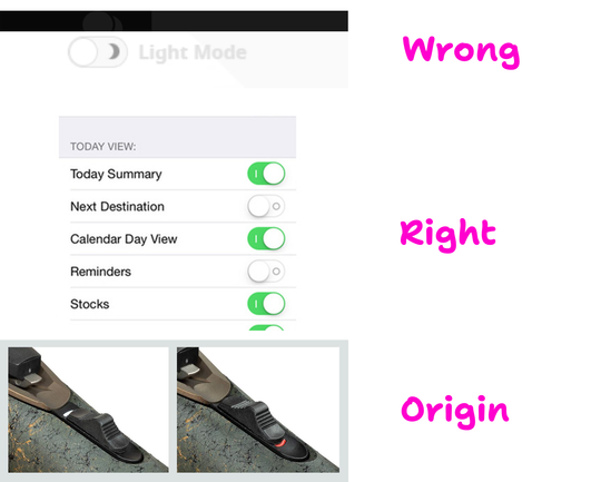
Although action vs state is a controversy in _buttons_, it’s not in toggles. Toggle icon should show current state! That’s the way it always worked in physical toggles
🎲 RANDOM MOD FOR GAME Medal Of Honor, Toggle HUD for MoH Warfighter https://www.nexusmods.com/medalofhonor/mods/3970
🎮 In MoH Warfighter you can toggle the HUD on/off in-game: press Caps Lock, or on an Xbox controller hit D-pad Right. PROTIP, one tap hides the UI.
Great for clean screenshots, streams, or just playing without the clutter.

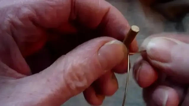
Winding a thicker brass wire harp string onto a wooden toggle
Replicating a Switch Input (and Polyfill)
https://fed.brid.gy/r/https://frontendmasters.com/blog/replicating-a-switch-input-and-polyfill/

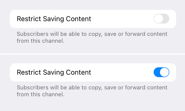
My first thought was: gray text is explaining what the toggle does. But then I read the text and it made no sense: if I _restrict_ sharing, it will allow people to save and forward?
Okay. Second idea. It might be explaining current state of the toggle. That would be wrong (don’t to this! always explain what toggle does when enabled), but at least I can understand the thinking.
So I enabled it and the grey text didn’t change. So I’m out of ideas now.
Another single-element toggle switch without using JS or images, just HTML and CSS.
Demo on @codepen.io: https://codepen.io/alvaromontoro/pen/XJXPddw
This one is "directional aware" and has micro-interactions, but it's using a trick so not all the toggle area is clickable... which is not ideal 😳
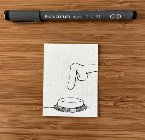
Inktober 2025 Day 22: Button
#art #artist #illustration #illustrator #drawing #sketch #sketchbook #creative #inktober #penandink #linework #artchallenge #ink #inktober2025 #prompts #traditionalart #pen #dailydrawing #button #switch #push #toggle #press #control
@ArneBab I’m away from my computer right now, but won’t defining custom properties for ::root be cleaner and more reusable? Something like:
::root:has(#toggle:checked) {
—bg-color: black;
}
::root:has(#toggle:not(:checked)) {
—bg-color: white;
}
And then just use var(—bg-color) everywhere, without a need for duplication. Am I missing something?
 Steam & Epic Games | Daily
 Simon Chadwick
 Learn JavaScript, React, and TypeScript to Node.js, Fullstack, and Backend [Unofficial]
 Sam Young
 Alvaro Montoro
 thesketchbookchronicles
 Lou
Lou Artyom Bologov