Breakout #2—100 Posters by Cihan Tamti Proves That Daily Practice Builds a Design Language
Some design books document a finished career. This one documents a transformation in progress. Breakout #2—100 Posters by Cihan Tamti, published by Slanted Publishers in May 2026, collects 100 selected works spanning 2022 to 2025—a period when Tamti’s personal daily poster experiments evolved into commissioned client work, community-driven initiatives, and collaborative design projects. The result is a book that reads less like a portfolio and more like a philosophy made visible.
What makes this volume particularly compelling is its context. Tamti’s first Breakout—100 Posters book documented the raw, unfiltered energy of treating Instagram like a graphic design gym—no briefs, no clients, just pure typographic and visual exploration. Now, Breakout #2 answers a harder question: what happens when that personal creative energy meets real-world constraints? Does it survive? Does it evolve? The evidence here is clear—it does both.
Breakout #2—100 Posters by Cihan TamtiWhat Exactly Is the Breakout Series, and Why Does It Matter Right Now?
Cihan Tamti launched the original Breakout project as a self-imposed daily design challenge. He used Instagram as a living sketchbook, posting one poster per day with no client brief and no approval process. The practice was deliberate and disciplined—an approach that design educators often talk about but rarely document this rigorously.
That first series gained significant traction. Some posters won awards. Others attracted clients. Tamti’s personal work became professional work, which is a creative arc many designers aspire to but few execute this visibly. The Breakout book followed, compiling 100 of those formative pieces into a tangible artifact. Then came Homebound and New Wave—two additional volumes that extended and deepened the conversation.
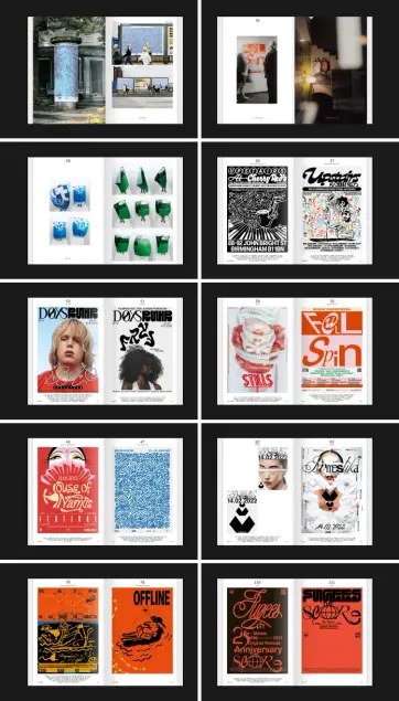
Breakout #2 is different in a crucial way. Rather than returning to the unconstrained personal work, it examines what grew from it. The 100 posters in this volume include commissioned projects, community work launched during the COVID pandemic under the “Local Support Posters” initiative, and collaborative pieces made with other designers. Tamti presents all 100 works equally—no hierarchy between personal and commissioned, no separation between self-initiated and client-driven.
That editorial decision is itself a statement about creative identity. It suggests that a mature design language doesn’t fracture under commercial pressure—it expands.
The “Constraint-to-Language Pipeline”: A Framework for Understanding Tamti’s Process
To understand what Breakout #2 achieves, it helps to introduce a concept: the Constraint-to-Language Pipeline. This describes the process by which a designer moves from self-imposed limitations (daily practice, no brief, immediate publication) through increasing complexity (real clients, community needs, collaboration) and arrives at a coherent, recognizable visual language that operates across all contexts.
Most designers experience this pipeline in reverse. They start with client work, develop technical competence, and then—if they’re lucky and disciplined—carve out time for personal practice. Tamti inverted the sequence. He built the language first, then applied it outward. Breakout #2 is the documentation of that outward application.
Furthermore, this pipeline has three identifiable stages that this book makes visible. First, there is the generative phase—daily practice without external input. Second, there is the translational phase—where the designer discovers which personal instincts survive contact with real-world requirements. Third, there is the synthetic phase—where personal and professional become indistinguishable in the finished work. Breakout #2 lives firmly in that third phase.
How Cihan Tamti’s Poster Design Approach Redefines Visual Communication in Print
Tamti’s posters are dense with intent. Typography, lettering, illustration, and layout function not as separate disciplines but as a single integrated visual argument. Each poster makes a specific communicative claim, and the visual language exists to amplify that claim rather than decorate it.
This is notably different from poster design that prioritizes aesthetic novelty. Tamti’s work is aesthetically distinctive, certainly—but the style is in service of the message. That alignment between form and content is what makes his work useful as a reference for designers studying how visual systems communicate across cultural contexts.
The “Local Support Posters” as a Case Study in Community-Driven Graphic Design
The “Local Support Posters” initiative, launched during the COVID pandemic, deserves specific attention. Tamti created these posters to support local businesses and community resilience at a moment when visual communication was being weaponized by anxiety and misinformation. His work went in a different direction—toward clarity, warmth, and local specificity.
This initiative represents what might be called Civic Typography: the deliberate use of graphic design tools and visual language to reinforce community bonds rather than individual brand identities. It’s a practice with deep historical roots in wartime poster design and public health communication, but Tamti deployed it with a contemporary sensitivity that felt neither nostalgic nor clinical.
Including these posters alongside commercial work in Breakout #2 makes a quiet but important argument. It says that design at its most useful operates without a clear distinction between civic and commercial intent. The designer’s language is the through-line, not the brief.
Collaborative Design in the Breakout #2 Framework
Collaborative projects appear throughout Breakout #2, and their inclusion reflects something significant about how Tamti thinks about creative authorship. Collaboration in design can dilute a personal voice or sharpen it, depending on the working relationship. The collaborative pieces in this book feel continuous with the solo work—which suggests that Tamti’s visual language is robust enough to survive and incorporate outside input without losing coherence.
This robustness is a marker of design maturity. It’s easy to produce consistent work when you control every variable. It’s considerably harder when you’re responding to a client’s brand, a collaborator’s instincts, or a community’s needs. That Breakout #2 holds together as a unified body of work despite those variables is itself an editorial and creative achievement.
Breakout #2—100 Posters Book Design: Craft, Production, and Physical Language
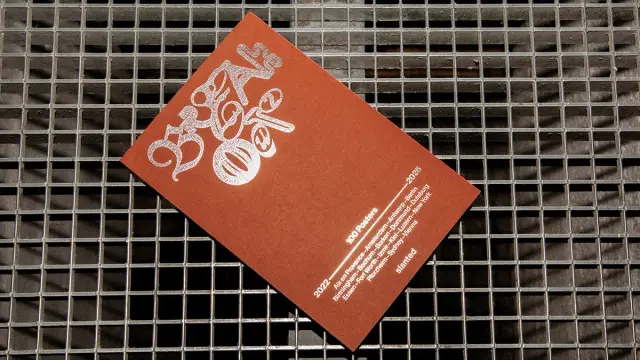
The physical object matters in design publishing, and Breakout #2 delivers on every production detail. Published at 16 × 24 cm across 128 pages, the book uses full-color offset printing throughout. The cover stock is ICON Glam sand copper 350 g/sm by IGEPA—a paper choice that communicates warmth and tactility before a single page is turned. Interior pages use ICON Classic extrasmooth white 150 g/sm, providing the clean, high-contrast surface that poster reproductions demand.
The binding is a softcover with flaps, thread stitching, and hot-foil embossing—a combination that positions this firmly as a collectible object rather than a disposable catalog. Thread stitching in particular signals longevity; it’s a bookbinding choice that acknowledges the work deserves to be revisited repeatedly rather than consumed once and shelved.
The foreword is written by Götz Gramlich, one of the most respected voices in contemporary German graphic design. His presence in the book adds critical authority and frames Tamti’s work within a broader design conversation beyond Instagram and social media visibility.
The Limited Bundle: Extended Objects and the Yolcu Typeface
Alongside the standard edition, a limited bundle extends the project beyond the book itself. The bundle pairs the book with a screen-printed tote bag and the custom Yolcu typeface—a combination that transforms the Breakout #2 project from a printed archive into a design system with deployable components.
The Yolcu typeface is a particularly interesting inclusion. Custom typefaces developed alongside or from poster practice often carry the rhythmic and structural fingerprints of their design context. Yolcu likely encodes the same tensions between legibility and expression, tradition and invention, that animate Tamti’s poster work. Including it in the bundle invites the reader to participate in the design language, not just observe it.
Screen-printing the tote bag extends the tactile vocabulary of the project. It’s a deliberate choice—screen printing is labor-intensive and produces imperfect, human results that offset printing cannot replicate. Together, these bundle elements make a sophisticated argument about the relationship between mass-produced design and handmade craft.
Why Poster Design Books Like Breakout #2 Are Essential References for Graphic Designers
Poster design books occupy a specific and valuable niche in design publishing. Unlike monographs that survey a career retrospectively, or technique books that teach step-by-step processes, the best poster collections do something more immediate—they show a designer thinking in real time across a range of problems and constraints.
Breakout #2 belongs to this tradition while extending it. The book demonstrates what a designer’s visual language looks like when it’s stressed across different contexts—personal, civic, commercial, collaborative. For design students, that stress-testing is more instructive than perfection. For working designers, it’s a reminder that a strong personal language doesn’t disappear under client pressure; it finds new expressions.
Consider also the timing. Design education and professional practice are both wrestling with questions about AI-generated imagery, algorithmic aesthetics, and the future of human creative authorship. Into that context, Breakout #2 arrives with a clear position: daily practice, human judgment, and the iterative development of a personal visual language are not obsolete. They are, in fact, more valuable precisely because they cannot be automated.
What the Breakout Series Predicts About the Future of Design Practice
Here is a forward-looking claim worth considering seriously: the Breakout series represents a model of design practice that will become increasingly prevalent over the next decade. As AI tools commoditize certain categories of visual production, the designers who thrive will be those who have invested in developing a distinctive, legible personal language—one that clients, collaborators, and audiences can recognize and value specifically because it is irreducibly human.
Tamti built that language through daily practice, public accountability, and iterative refinement across contexts. The Breakout books document that process in real time. They will likely become historical records of a particular moment in design practice—the period just before and during the AI transition—when designers were consciously articulating what makes human graphic design irreplaceable.
This prediction is grounded in the evidence of the books themselves. The visual intelligence on display in Breakout #2 isn’t just skilled—it’s specific. It reflects particular cultural references, particular aesthetic commitments, particular ways of seeing typography and image in relation to each other. That specificity is exactly what makes it citable, teachable, and worth studying.
Slanted Publishers and the Role of Design Publishing in Amplifying Creative Voices
Slanted Publishers has built a reputation for producing design books that treat their subject with intellectual seriousness and production quality that matches the work inside. Their partnership with Tamti on the Breakout series reflects a shared commitment to documenting design practice rather than simply showcasing finished results.
This is worth noting because not all design publishers operate this way. Many prioritize visual spectacle over critical depth, producing beautiful books that illuminate little about how or why a designer works. The Breakout series, under Slanted’s editorial stewardship, has consistently done the harder thing—contextualizing the work within a broader narrative of creative development.
Additionally, Slanted’s distribution and visibility in European and international design communities ensures that Breakout #2 reaches the audiences—students, educators, practitioners, collectors—for whom it will be most productive. That reach matters. Design books that don’t circulate widely don’t influence practice. These do.
Personal Thoughts: What Breakout #2 Gets Right That Most Design Books Miss
Most design books are retrospective. They arrive when a designer’s reputation is already established, selecting and sequencing work to support a predetermined narrative of success. Breakout #2 is something rarer—a book made while the story is still developing, from a designer who is clearly still in the middle of becoming.
That’s a vulnerable position to publish from. And it’s also exactly why the book is worth your time. The best design books don’t give you polished answers—they give you honest questions. What does practice actually look like? How does personal work survive commercial contexts? What does a designer’s voice sound like when it’s stressed across different kinds of problems?
Breakout #2 answers all of these without pretending the answers are simple. The 100 posters in this book are not equally successful—some are bolder than others, some more resolved, some more experimental. That unevenness is honest. It reflects what practice actually produces. And it makes the strongest pieces stand out with more force precisely because they’ve earned their place in the sequence.
Götz Gramlich’s foreword adds a critical dimension that prevents the book from becoming self-congratulatory. Having a serious outside voice frame the work signals that Tamti is interested in conversation, not just documentation. That’s the right instinct.
At €26, the standard edition is priced accessibly for a book of this production quality. The limited bundle—with the Yolcu typeface and screen-printed tote—is the option for those who want to engage with Tamti’s visual language as active participants rather than passive observers. If you work in graphic design, typography, or visual communication, either version belongs on your shelf.
Frequently Asked Questions About Breakout #2—100 Posters by Cihan Tamti
What is Breakout #2—100 Posters?
Breakout #2—100 Posters is a graphic design book by Cihan Tamti, published by Slanted Publishers in May 2026. It collects 100 selected poster works created between 2022 and 2025, spanning commissioned client projects, community initiatives like the “Local Support Posters,” and collaborative works with other designers. The book is a follow-up to Tamti’s original Breakout—100 Posters and the volumes Homebound and New Wave.
Who is Cihan Tamti?
Cihan Tamti is a graphic designer who gained recognition through a daily poster practice shared on Instagram, using the platform as a self-directed design exercise without client briefs or constraints. His personal work attracted awards and clients, leading to the publication of multiple books documenting his practice and development. He designed Breakout #2 himself and authored its content.
What is the Yolcu typeface included in the limited bundle?
Yolcu is a custom typeface designed by Cihan Tamti that is included in the limited edition bundle of Breakout #2—100 Posters, alongside a screen-printed tote bag. The bundle extends the project beyond the printed book, giving collectors and designers access to a deployable component of Tamti’s visual language.
Who wrote the foreword for Breakout #2—100 Posters?
The foreword was written by Götz Gramlich, a highly respected figure in contemporary graphic design, particularly within the German design community. His contribution adds critical context and frames Tamti’s work within a broader professional and cultural conversation.
What are the production specifications of Breakout #2?
The book measures 16 × 24 cm and runs 128 pages, printed in full color offset on ICON Classic extrasmooth white 150 g/sm interior paper. The cover uses ICON Glam sand copper 350 g/sm. Binding is softcover with flaps, thread stitching, and hot-foil embossing. Both paper stocks are produced by IGEPA. The ISBN is 978-3-69202-000-6 and the retail price is €26 in Germany.
What were the “Local Support Posters” initiative?
The “Local Support Posters” were a community design initiative Cihan Tamti launched during the COVID pandemic to support local businesses and strengthen community resilience through graphic design. These posters are included in Breakout #2 alongside commercial and collaborative works, presented with equal weight to both commissioned and personal projects.
How does Breakout #2 differ from the original Breakout—100 Posters book?
The original Breakout—100 Posters documented 100 personal, self-initiated posters created through Tamti’s daily practice on Instagram—work made without clients or external briefs. Breakout #2 documents what grew from that practice: commissioned client work, community-driven projects, and collaborative designs. Where the first book captures a personal experiment, the second captures how that experiment evolved into a professional and civic design practice.
Is Breakout #2—100 Posters suitable for design students?
Yes—particularly for students interested in typography, poster design, visual communication, and the relationship between personal practice and professional work. The book demonstrates how a sustained daily practice can develop into a coherent design language applicable across very different contexts. It is a practical and conceptual reference for anyone studying how designers build their visual voice over time.
Where can I buy Breakout #2—100 Posters?
The book is available through Slanted Publishers and design bookshops that stock Slanted’s titles internationally. The limited bundle—including the Yolcu typeface and screen-printed tote bag—is available in small quantities directly through Slanted Publishers.
All images © Slanted Publishers. Check out WE AND THE COLOR’s Graphic Design and Books category for more.
#2 #book #CihanTamti #design #graphicDesign #graphics #posters #slanted #SlantedPublishers