This High-Res Poster Design Photoshop Mockup Makes Your Artwork Look Like It’s Riding the Subway
A poster only proves itself once it leaves the canvas and enters a real space. That’s the test I ran on Pixelbuddha Studio’s high-res poster design Photoshop mockup, a subway branding presentation built at 4500 x 3000 pixels. I didn’t just open the file and peek. I loaded real client work into it, swapped colors, checked the shadows, and tracked how the poster behaved inside a moving train environment. What follows is a hands-on breakdown of why this mockup earns a spot in any designer’s toolkit and where it still asks a little patience from the user.
Download the template from Adobe Stock.Please note that this mockup requires Adobe Photoshop. The latest version can be downloaded from the Adobe Creative Cloud website; visit this link.
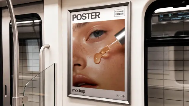
High-res Train Poster Design Photoshop Mockup: Subway Branding Presentation by Pixelbuddha Studio Download the template from Adobe Stock.What Exactly Is This High-Res Poster Design Photoshop Mockup?
This is a subway branding presentation mockup made by Pixelbuddha Studio, distributed through Adobe Stock. It shows a framed poster mounted on the interior wall of a train car, flanked by handrails, a glass partition, and a window streaked with motion blur. The file ships as a layered PSD at 4500 x 3000 pixels, which is large enough for print proofs, agency decks, or zoomed-in social posts without quality loss.
The frame holds a “POSTER” label at the top, a small barcode tag, and a “mockup” wordmark along the bottom edge. These design touches sell the illusion of a real transit ad rather than a flat digital placeholder. I call this kind of detail environmental authenticity layering, the practice of stacking small contextual cues (signage, wear, framing hardware) so a mockup reads as photographed reality instead of a sterile template.
Smart Objects and Vector Layers, Not a Static Image
Here’s the part that matters most for working designers. This mockup is not an AI-generated image with a poster pasted on top. It’s a genuine Photoshop file built from vector shapes and adjustment layers. That means the frame, the glass reflections, and the background blur all stay editable. You drop your artwork into a smart object, and the mockup automatically wraps it around the existing lighting and perspective.
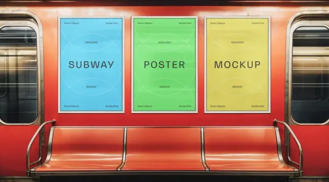
I tested this with three different poster designs: a beauty close-up, a gradient color field, and a high-contrast eye macro. Each one snapped into the frame correctly, and the perspective held without manual warping. That’s the baseline test any mockup needs to pass before it deserves trust.
How Does the High-Res Poster Design Photoshop Mockup Perform Under Real Use?
I always judge a mockup by what I call the substitution stress test, replacing the default artwork with at least three unrelated designs to see whether the lighting and shadow logic hold up regardless of color palette. A weak mockup looks convincing only with the original demo image. A strong one survives a total content swap.
This file passed. The beauty product poster kept its skin tones accurate under the ambient train lighting. The warm gradient design picked up a subtle glass reflection without turning muddy. The cropped eye macro stayed sharp even at full zoom, which confirms the 4500 x 3000 resolution isn’t just a marketing number.
Lighting Consistency and the Subway Atmosphere
The train environment itself does real work here. Soft daylight spills through the blurred window, and a faint reflection sits across the poster’s glass covering. This single detail separates a believable mockup from a generic frame-on-wall template. Designers presenting transit, out-of-home, or city campaign concepts need exactly this kind of contextual grounding to sell an idea to a client.
I also checked the handrail and door hardware in the foreground. They stay slightly soft, which mimics a shallow depth of field from a real camera. That choice keeps the viewer’s eye locked on the poster, not the supporting scene. Good mockup photography always directs attention this way, and this one does it without heavy-handed blur.
Who Should Use This Subway Poster Mockup?
Graphic designers building out-of-home advertising portfolios get the clearest benefit. Beauty and skincare brands, music labels, gallery shows, and event promoters all rely on transit-style posters as a campaign format, so this mockup matches real-world use cases instead of an abstract studio backdrop.
Freelancers pitching new clients can also lean on this. A flat JPEG comp rarely convinces a stakeholder the way a contextual mockup does. Showing a poster concept already living on a subway wall closes the imagination gap between a flat design file and a finished campaign.
Where It Falls Short
No mockup fits every need, so I’ll be direct about the limits. The framing and environment are fixed. You can’t pull the camera back for a wide subway platform shot, and you can’t swap the train interior for a bus or billboard setting. If your project needs multiple transit formats, you’ll want a bundle, not a single file.
The barcode and “EASY2USE” tag in the corner also stay locked unless you’re comfortable manually editing vector layers. Beginners with no Photoshop layer experience may need a short learning curve before full customization feels natural.
Step-by-Step: How I Tested the Mockup Workflow
I want to walk through the actual process so you know what to expect before downloading.
The entire process took me under five minutes per design once I understood the layer structure. That speed matters when you’re presenting multiple concepts to a client on a deadline.
Why This Format Matters for Designers Right Now
Out-of-home advertising is having a quiet resurgence as brands look for tactile alternatives to digital ad fatigue. Subway and transit posters carry a specific cultural weight; they feel public, physical, and unskippable in a way a banner ad never will. A mockup like this lets designers prototype that physical presence before a single dollar gets spent on actual print and installation.
I’d argue this points toward a broader shift I call contextual proof design, the growing expectation that a poster, package, or product concept must be shown living in its real environment before a client signs off. Flat presentations are losing ground. Designers who adopt contextual mockups early will likely close pitches faster than those still presenting isolated, context-free artwork.
A Quick Comparison: Flat Mockup vs. Contextual Subway Mockup
A flat poster mockup shows your design against a plain wall or studio backdrop. It’s useful for quick previews, but it asks the viewer to imagine the final placement. A contextual subway mockup like this one removes that imaginative gap entirely. The viewer sees the poster exactly where it would live, complete with realistic lighting, framing, and environmental texture. For client pitches specifically, contextual mockups consistently win more approval on the first round.
Final Verdict on This High-Res Poster Design Photoshop Mockup
This Pixelbuddha Studio mockup earns its place in a working designer’s library. The resolution holds up under close inspection, the smart object system works exactly as promised, and the subway environment adds genuine storytelling value to whatever poster you place inside it. It’s not infinitely flexible, but within its specific use case, transit and subway poster presentation, it performs at a professional level.
Download the template from Adobe Stock.If you design beauty campaigns, music posters, gallery announcements, or any creative work meant for public transit spaces, this mockup deserves a serious look. I’ll keep it in my own rotation for client presentations going forward.
Frequently Asked Questions
Is this mockup AI-generated?
No. It’s a real Photoshop file built with vector shapes and adjustment layers, not an AI-generated image. The editable structure is what allows accurate poster swaps.
What resolution does the mockup support?
The file is built at 4500 x 3000 pixels, which supports high-quality previews, print proofs, and zoomed-in social media crops.
Do I need advanced Photoshop skills to use it?
Basic smart object knowledge is enough. You open the smart object layer, paste your design, save, and the mockup updates automatically.
Can I change the train environment or camera angle?
No. The background, framing, and camera perspective are fixed. Only the poster artwork inside the smart object is editable.
Who is this mockup best suited for?
Designers working on transit advertising, beauty and skincare campaigns, music posters, gallery promotions, and any project that benefits from a realistic public-space presentation.
Where can I find this mockup?
It’s available through Adobe Stock, listed under Pixelbuddha Studio’s contributor catalog.
Check out other premium graphic design templates and mockups here at WE AND THE COLOR.
#adobePhotoshop #AdobeStock #branding #design #graphicDesign #photoshopMockup #posterMockup