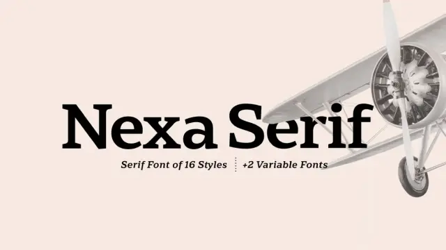
Nexa Serif Font Family by Fontfabric
Nexa Serif: Could This Be Your New Favorite Typeface for Elegance and Impact?
Finding that perfect font can sometimes feel like searching for a hidden gem, right? You know the feeling – scrolling endlessly, looking for something that clicks, something that balances personality with professionalism. Well, allow us to introduce Nexa Serif from the talented folks at Fontfabric. This isn’t just another serif font; it’s a thoughtfully crafted typeface designed to be both beautiful and incredibly functional. If you appreciate clean lines combined with sophisticated details, the Nexa Serif font family might just be the answer you’ve been looking for. It aims to bring a unique blend of geometric simplicity and refined character to your design projects. Ready to see what makes it special?
Download from MyFonts The Story Behind Nexa Serif: A Tale of Two Fonts
So, where did the Nexa Serif font family come from? Its roots lie in a Fontfabric bestseller: the sans-serif font, Nexa. For years, the designers envisioned a serif counterpart. They wanted something that could stand alongside Nexa, complementing its clean, geometric structure. Yet, it also needed to hold its own, offering a distinct personality. The challenge was clear: maintain the core simplicity of Nexa while infusing it with the elegance and intricate details associated with serif typefaces.
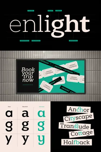
How did they achieve this? They started by preserving key letter proportions and contrast levels from the original Nexa. This creates a sense of familiarity and harmony. However, they didn’t just slap serifs onto the existing letters. Instead, they introduced unique character shapes. Take a look at the lowercase ‘a’, ‘g’, and ‘y’ in Nexa Serif, for example. You’ll notice special versions directly inspired by Nexa’s sans-serif foundation. This clever approach blends the heritage of Nexa with fresh, serif-specific elements. The outcome? A truly versatile serif font family. It’s enriched with functional ligatures (those little connections between letters that improve flow) and stylistic ones (adding extra flair). This makes this serif font family equally comfortable in long blocks of text and commanding attention in headlines. It’s a testament to considered design – creating something new while honoring its inspiration.
Nexa Serif Font Family by Fontfabric
Download from MyFonts What Makes Nexa Serif Stand Out? Key Characteristics
You might be wondering, “Okay, it has a nice backstory, but what really makes Nexa Serif tick?” Let’s break down its defining qualities.
First off, balance. The serif typeface strikes a beautiful equilibrium between modern geometric forms and classic serif traditions. It doesn’t feel stuffy or old-fashioned, nor does it feel cold or overly technical. It finds that sweet spot, resulting in a typeface that feels both contemporary and timeless. Think clean construction meets refined detail.
Next, elegance. There’s an undeniable sophistication to this typeface. The serifs themselves are crafted with care, not too chunky, not too delicate. They add a touch of grace without overwhelming the letterforms. This inherent elegance makes it a fantastic choice for projects aiming for a premium or distinguished feel. Have you ever needed a font that just looks smart? This typeface delivers that.
Readability is another crucial aspect. A font can be beautiful, but if it’s hard to read, its usefulness plummets. Fontfabric clearly prioritized legibility with Nexa Serif. The clear letter shapes, generous spacing (though adjustable, of course), and well-defined forms ensure text set in this font is comfortable to read, even at smaller sizes or in longer passages. This makes it a reliable workhorse for body copy.
Finally, versatility. Thanks to its range of weights (more on that soon!) and the inclusion of useful ligatures, the typeface adapts beautifully. It can be strong and impactful in a headline, yet subtle and easy-flowing in paragraph text. This adaptability is a huge asset for designers working across different media and requirements. It’s a true multitasker in the world of typography.
Exploring the Nexa Serif Font Family: Weights and Styles
A single font is good, but a font family offers so much more flexibility. The serif font family comes equipped with a range of weights, typically including styles like:
- Light
- Regular
- Bold
- Black (or similar heavy weights)
Each weight often comes with a corresponding Italic version, adding another layer of expressive potential. What does this mean for you?
Think about how you can use these variations. The Light weight might be perfect for delicate subheadings or airy body text. Regular is often the go-to for main content, offering excellent readability. Bold steps up for emphasis, section titles, or stronger call-to-actions. And the Black weight? That’s your powerhouse for impactful headlines, logos, or anywhere you need a serious visual presence. Having this range within the Nexa Serif family ensures consistency across your design while allowing for necessary hierarchy and emphasis. It’s like having a full toolkit instead of just one screwdriver.
Who Should Use Nexa Serif? Applications and Ideas
Is this typeface the right choice for your next project? Its blend of qualities makes it suitable for a wide array of applications. Consider these possibilities:
- Branding and Identity: Its elegant yet modern feel is perfect for logos, wordmarks, and establishing a sophisticated brand voice. Could Nexa Serif define the look of a new company or product line?
- Editorial Design: Magazines, newspapers, and book layouts benefit immensely from its high readability. It works beautifully for both headlines and long-form articles, providing a cohesive typographic experience. Imagine a feature spread set entirely in different weights of Nexa Serif.
- Web Design: Don’t relegate serifs just to print! Nexa Serif renders crisply on screens, making it a great choice for website headings, subheadings, and even body text where a touch of class is desired. It pairs wonderfully with clean sans-serifs too.
- Packaging Design: Want a product to look premium on the shelf? This typeface can lend that air of quality and refinement to packaging labels and descriptions.
- Marketing Materials: Brochures, flyers, posters – anywhere you need to convey information clearly and stylishly, Nexa Serif is a strong contender.
Essentially, if you’re a designer, marketer, publisher, or anyone creating visual communications that need to feel balanced, elegant, readable, and professional, Nexa Serif deserves your attention. Ask yourself: where could this font elevate my work?
Nexa Serif and Nexa Sans: A Perfect Typographic Pairing?
Remember how Nexa Serif was inspired by Nexa Sans? This shared DNA makes them natural partners. Using Nexa Serif for headlines and Nexa Sans for body text (or vice versa, depending on the desired effect) can create a harmonious yet dynamic typographic system.
Why does this pairing work so well?
Shared Proportions: Because Nexa Serif retains key proportions from Nexa Sans, they sit comfortably together on the page or screen. There’s no jarring mismatch in scale or basic structure.Complementary Contrast: The clean, geometric nature of Nexa Sans provides a beautiful counterpoint to the detailed elegance of Nexa Serif. This contrast creates visual interest without clashing.Unified Feel: Using fonts from the same extended family (designed by the same foundry with intentional compatibility) lends an overall sense of cohesion and professionalism to your design that’s harder to achieve when mixing fonts from disparate sources.Think about combining Nexa Serif Bold for a main heading, Nexa Regular for the body text, and perhaps Nexa Serif Italic for pull quotes. This creates a rich, layered typographic texture built on a solid, related foundation. It’s a powerful combination offered by Fontfabric.
Technical Details and Getting Nexa Serif
Beyond its aesthetic appeal, the font family likely comes packed with practical features typical of professional fonts from Fontfabric:
- OpenType Features: Expect things like standard and discretionary ligatures, possibly alternative characters, fractions, and figure styles (like lining and oldstyle figures). These features allow for finer typographic control.
- Language Support: Fontfabric fonts usually boast extensive multilingual support, covering Latin-based languages and often Cyrillic or Greek alphabets as well. Always check the specific character set, but Nexa Serif is likely built for global use.
- File Formats: You’ll typically find it available in standard formats like OTF (OpenType Font) for desktop use and WOFF/WOFF2 for web embedding.
- Licensing: Like all professional fonts, Nexa Serif requires appropriate licensing for its intended use (Desktop, Web, App, etc.). You can usually find and purchase these licenses directly from the Fontfabric website or authorized resellers. Investing in proper font licenses is crucial for professional work.
To explore Nexa Serif further, try it out, or acquire a license, the best place to start is the Fontfabric website. They provide detailed information, previews, and purchasing options.
Why Choose Nexa Serif Font Family? The Final Word
So, what’s the takeaway? Nexa Serif represents a successful evolution, born from a popular sans-serif but establishing its own distinct, elegant identity. It masterfully blends geometric foundations with refined serif details, achieving a result that is both highly readable and visually appealing.
Its versatility across weights and applications makes it a powerful asset for designers. Whether you’re crafting a brand identity, laying out a magazine, designing a website, or creating sophisticated packaging, the font family offers a compelling blend of clarity, elegance, and modern sensibility. It avoids feeling trendy or fleeting, aiming instead for lasting appeal.
If you appreciate typefaces that are meticulously designed, offer flexibility, and bring a touch of quiet confidence to your projects, Nexa Serif is absolutely worth considering. It’s more than just letters on a page; it’s a tool for clearer communication and more beautiful design.
Could this typeface be the font that elevates your next project? Why not take a closer look and see for yourself?
Download from MyFonts Feel free to find other trending typefaces on WE AND THE COLOR.
Subscribe to our newsletter!
By continuing, you accept the privacy policy