Retro Logo Illustrations That Give Every Brand a Story Worth Telling
Honestly, nostalgia is not just a trend. It is a design language — one that communicates trust, craft, and character faster than any modern typeface ever could. Retro logo illustrations have dominated branding conversations for years now, and yet the demand keeps growing. Why? Because consumers are exhausted by the sterile, the interchangeable, and the forgettable. They want brands that feel like they come from somewhere. Badges with history. Marks with texture. Identity systems that look like they were earned, not generated.
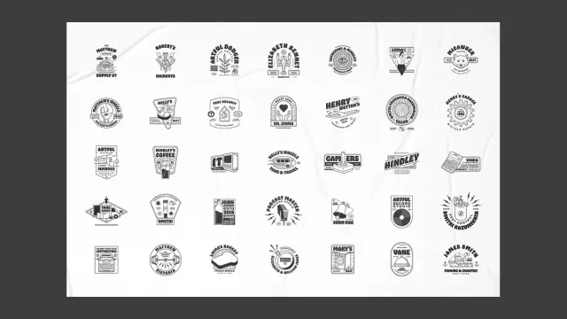
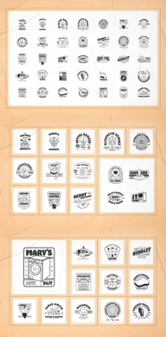
This set of 35 fully editable retro logo illustrations by graphic designer and Adobe Stock contributor Danny Aldana delivers exactly that energy. It is a single, cohesive vector graphics collection that spans industries, aesthetics, and eras — all rendered in a confident black-and-white line style that is both immediately recognizable and endlessly adaptable. If you are a designer working across brand identity, packaging, merchandise, or editorial, this pack is worth your time.
So let’s talk about what makes vintage badge design so commercially durable, what this specific set brings to the table, and why it belongs in your design toolkit.
You can download the set from Adobe StockPlease note that to edit these templates, you need professional graphic design software like Adobe Illustrator installed on your computer. You can get the latest version from the Adobe Creative Cloud website. Just have a look here.
Download 35 retro logo illustrations by Danny Aldana as fully editable vector graphics in the style of cool vintage badges. You can download the set from Adobe StockWhy Are Retro Logo Illustrations Still the Gold Standard for Brand Identity?
The honest answer is that retro logo design never actually went out of fashion. It simply evolved. What started as a nod to mid-century Americana — think barbershop poles, gas station signage, diner menus — has become a full visual vocabulary that designers across every vertical now reach for. Coffee shops, craft beer labels, barbershops, fitness studios, podcast brands, bakeries — they all converge on the same aesthetic. And it works every single time.
There is a psychological mechanism at play here. Researchers in visual perception have consistently found that humans assign higher perceived quality to marks that appear established. A logo with structural weight, serif letterforms, radial symmetry, and illustrative detail communicates expertise before a single word is read. Call this the Heritage Heuristic — a coined framework describing the cognitive shortcut by which visual complexity and age-suggestive aesthetics trigger trust responses in brand audiences.
Modern brands exploit this heuristic deliberately. A coffee roaster founded in 2019 can look like it has been perfecting its craft since 1952. That is not dishonesty. That is branding. And retro logo illustrations make it possible without requiring a six-figure identity studio.
Furthermore, vector-based vintage badge templates offer something that custom logo work rarely does at scale: speed without sacrifice. Designers can deliver polished, contextually appropriate brand marks for clients who need quality fast. That commercial reality is exactly what makes sets like Danny Aldana’s collection so relevant.
Inside the Set: What 35 Retro Logo Illustrations Actually Look Like
The visual language across this collection is remarkably consistent. Every illustration uses clean, confident line work — thick outlines, minimal fill, and zero gradients. The black-and-white treatment is not a limitation. It is a design decision that makes every badge instantly scalable, screen-printable, embossable, and embroiderable. You could transfer any of these to a t-shirt, a wax stamp, a coffee cup, or a sign without losing a single detail.
Each badge is built around a central icon paired with typographic elements — business names like “Robert’s Haircuts,” “Hindley’s Coffee,” “Emma’s Bakery,” “James Smith Fishing & Charter,” and “Podcast Master Record Studio.” These names are placeholder text, of course, but they function brilliantly as naming system prototypes. They suggest complete brand worlds with just a few words and an illustration.
The Iconographic Range Across the Collection
The subject matter spans a wide range of industries and visual themes. You will find a motorcycle engine illustration for an auto supply brand, a lobster for a seafood or coastal charter business, a vintage computer for an IT company, a dumbbell for a fitness studio, a washing machine for a laundry service, a typewriter for a copywriting agency, a pet grooming badge featuring a cat, a bread loaf for a bakery, a travel bus for a tour company, and a vinyl record for a recording studio.
There are also eye motifs, plant-based organic illustrations, barber-style marks, coffee cup graphics, and geometric diamond forms. The range is genuinely broad. More importantly, the visual execution is consistent across all 35. Each illustration shares the same tonal weight, the same linework discipline, and the same structural logic — which means mixing and matching elements from multiple badges into new compositions is entirely viable.
Badge Structures and Layout Typology
Within the set, several structural archetypes repeat. There are circular radial badges, horizontal banner formats, diamond-shaped marks, stacked rectangular frames, and shield-style compositions. This variety means you are not locked into a single layout convention. A client needing a wide horizontal lockup for a website header gets a different starting point than one needing a circular mark for an embroidered cap.
These are not arbitrary choices. The Badge Architecture Spectrum — a framework for categorizing logo structural types — runs from centripetal designs (where all visual energy points inward toward the center icon) to expansive designs (where typographic arms and decorative borders push outward). Aldana’s set includes both ends of this spectrum, giving designers structural flexibility within a unified aesthetic.
The Commercial Logic of Vintage Badge Templates for Designers
Let’s be direct about the professional use case here. As a working graphic designer, you are often asked to deliver brand identity work on timelines that make fully custom logo design impossible. A client wants a polished, versatile, print-ready logo in 48 hours. You either have a reliable toolkit or you scramble.
Sets like this one are not a compromise. They are leveraging. Using a well-crafted retro logo template as a structural starting point — then customizing the typography, icons, and layout — is a completely legitimate professional practice. The result, when executed thoughtfully, is indistinguishable from a ground-up custom mark.
Adobe Illustrator is the recommended editing environment here, which makes sense given that the files were designed natively in Illustrator. Every path, anchor point, and text element is fully accessible. You can expand character, adjust stroke weights, swap typefaces, reposition icon elements, or strip everything back to bare structural geometry and rebuild from there.
Why Adobe Illustrator Is the Right Tool for Editing These Retro Logo Templates
Illustrator’s vector editing environment gives you complete fidelity. The retro logo illustrations in this set use layered path structures — meaning the icon, the badge frame, the text rings, and the decorative elements are all separate, independently editable components. Unlike raster editing, where every modification degrades quality, vector work scales infinitely without data loss.
Additionally, Illustrator’s appearance panel and graphic styles make it straightforward to apply color themes globally. Want to convert a black-and-white vintage badge into a two-tone amber-and-cream version for a coffee brand? Four clicks. Want to apply a worn, textured effect that simulates letterpress printing? Add a roughen distortion filter or overlay a custom texture brush. The starting asset handles the hard structural work. You bring the brand specificity.
Retro Logo Design Principles You Can Extract From This Collection
Beyond the immediate commercial utility, this set is a study in effective vintage badge design. Spend time with these illustrations and you will notice recurring structural decisions that explain why they work so well. Understanding those decisions makes you a better logo designer, not just a faster one.
The Rule of Iconographic Specificity
Every badge in this collection uses a hyper-specific icon rather than a generic symbol. The fishing and charter badge does not use a fish silhouette — it uses a full boat illustration with an anchor motif. The IT badge does not use a circuit board — it uses a vintage desktop computer. This specificity is intentional. Generic icons produce forgettable logos. Specific, contextually precise icons produce logos that communicate expertise and niche authority.
Think about what this means for your own design practice. When a client asks for a logo, your first instinct might be to reach for the most recognizable symbol in their category. Resist that. Go one level deeper. The most memorable vintage badge designs are the ones where the icon choice surprises you slightly — and then immediately makes complete sense.
Typographic Hierarchy as a Trust Signal
Notice how each badge handles typography across multiple levels. There is typically a primary display name in a bold, condensed, or serif typeface. Below that, a secondary line in a lighter weight establishes the category or tagline. Then, around the perimeter of circular badges or stacked beneath rectangular ones, micro-text carries details like “ESTD,” founding year, location, or specialty.
This three-tier typographic architecture — primary identity, secondary descriptor, supporting detail — creates layered reading experiences. A viewer absorbs the brand name first, understands the category second, and discovers the supporting credibility detail third. This is the Typographic Trust Ladder, and it is one of the most reliable structural frameworks in vintage badge design.
Line Weight Consistency as Visual Cohesion
One of the clearest markers of amateur logo work is inconsistent stroke weights. When the icon outline is thicker than the text outline, or when decorative elements are hairline-thin while structural frames are heavy, the eye registers instability. Aldana’s collection maintains strict linework discipline throughout. The icon strokes, the frame outlines, and the typographic elements all share a common weight family. That consistency is what makes these feel like finished, professional marks rather than design exercises.
Who Benefits Most From This Collection of Retro Logo Illustrations?
The primary audience is working graphic designers who need to move fast without compromising on quality. Freelancers, in particular, will find immediate ROI. A single set like this can serve clients across a dozen different niches — which means one purchase, multiple deployable assets.
But the use cases extend further than you might expect. Brand strategists building visual identity mood boards can use these as structural reference points to communicate retro brand positioning to clients before any custom work begins. Print-on-demand entrepreneurs building Etsy stores around custom merch can use these as the starting point for t-shirt designs, tote bag graphics, and sticker packs. Social media content creators building a personal brand with a vintage aesthetic will find ready-made marks that communicate their positioning without requiring design expertise.
Podcast producers are another underserved audience here. The “Podcast Master Record Studio” badge in this set is exactly the kind of mark that differentiates a serious audio brand from a hobbyist feed. Add custom typography and a specific color palette, and you have a logo system that works across iTunes artwork, YouTube thumbnails, merchandise, and press kits.
Small Business Branding on a Realistic Budget
Not every brand identity project has a five-figure budget. For the vast majority of small businesses — the local barbershop, the independent bakery, the personal trainer, the charter fishing company — a professionally designed template adapted to their specific identity is the most pragmatic path to a polished brand mark. This set covers all of those niches explicitly.
The question is not whether to use templates. The question is which templates are worth using. A well-designed retro logo illustration set from a skilled designer like Danny Aldana is fundamentally different from the generic badge clip art available through lesser platforms. The difference lies in the illustration quality, the typographic intelligence, the structural variety, and the editorial consistency across the full set.
The Aesthetic Theory Behind Monochromatic Vintage Badge Design
Color is often treated as the primary carrier of brand emotion. But this collection proves a different thesis: structure and line work carry more emotional weight than color when executed at a high level. Every badge here works in pure black and white. They communicate personality, industry, authority, and era without a single hue.
This is what I call the Chromatic Independence Principle — the idea that a logo design should possess complete expressive and communicative power before any color is introduced. Color becomes enhancement, not foundation. If a logo only works because of its color, the structural design has failed.
Aldana’s collection passes this test with ease. You know exactly what each brand does, feels, and values from the illustration alone. Apply a warm amber for a coffee brand, a deep navy for a fishing charter, a dusty sage for an organic wellness company, and the badges transform — but they do not depend on that transformation to communicate.
This also makes the collection exceptionally versatile for production contexts. Embroidery, letterpress, screen printing, and laser engraving all require single-color or two-color originals. A monochromatic vector illustration is the perfect starting asset for every one of those processes.
How Retro Logo Illustrations Perform Across Digital and Print Contexts
One legitimate concern designers raise about vintage badge aesthetics is complexity. Do detailed, illustrative logos hold up at small sizes? At favicon scale? On mobile screens? These are valid questions. The answer depends entirely on the execution quality of the original files.
Aldana’s set handles this well because the line weights are calibrated for reproduction. At small sizes, the primary icon and the core brand name remain legible. The supporting micro-text, which appears in the third tier of the typographic hierarchy, is intended for large-format reproduction — but any experienced designer working with these assets would create simplified lockup variants for small-format use. The full detail version for merchandise and print. A stripped-back version for digital icons and profile images. That is standard logo system practice.
For Adobe Stock licensing, these files come with the flexibility to be adapted across commercial contexts — packaging, merchandise, social media, print advertising, and brand identity systems. That licensing breadth is a major practical advantage over templates sourced from less commercially structured platforms.
Predictions: Where Retro Logo Design Is Heading
The vintage badge aesthetic has proven durable because it is not actually about nostalgia. It is about craft signals. In an era of algorithmic content and AI-generated visuals, handcrafted illustration and deliberate typographic choices communicate something that generative tools cannot yet replicate convincingly: intentionality.
Here is a specific prediction. Over the next three years, the most sought-after retro logo illustrations will not be those mimicking 1950s Americana exclusively. They will be hybrid temporal designs — marks that blend structural elements from multiple eras. A 1970s badge frame with 1940s serif typography and 2020s negative space composition. Call this the Temporal Layering Trend, and watch for it to become the dominant mode of premium vintage badge design within the broader graphic design market.
Designers who build fluency in these hybrid aesthetics now — and who develop a toolkit of high-quality vector starting assets — will be better positioned than those who treat retro logo design as a single, static aesthetic category.
Danny Aldana’s collection, with its range of structural types and its rigorous linework consistency, is exactly the kind of foundational asset that supports that kind of evolved practice.
Practical Tips for Customizing These Retro Logo Templates in Adobe Illustrator
If you have just downloaded the set and are opening it in Illustrator for the first time, here is a practical workflow that maximizes the collection’s utility.
Start by auditing the layer structure. Understanding how each badge is assembled — which elements are grouped, which paths are compound, which text is live versus outlined — gives you a map of what can be changed easily and what requires more surgical editing.
Next, identify the badge structure that best matches your target layout format. Circular for merchandise. Horizontal for website headers. Diamond for packaging labels. Start there rather than forcing a structural transformation that fights the original geometry.
Then address typography before iconography. Replace the placeholder name text with your client’s brand name first. This single change immediately personalizes the badge and helps you evaluate how much additional customization is actually necessary. Often, a name change plus a color adjustment is sufficient to produce a client-ready mark.
Finally, if you are adapting the icon illustration, work with the existing path structure rather than against it. Modify, simplify, or replace elements while maintaining the original stroke weight and line style. Consistency between modified and original elements is what keeps the final mark looking coherent rather than patched together.
Why Danny Aldana’s Design Approach Sets This Set Apart
Not all Adobe Stock contributors bring the same level of illustrative discipline to badge template design. What distinguishes this particular set is the iconographic ambition. Most retro logo template sets rely on simple geometric icons — a star, a coffee cup, a lightning bolt. Aldana’s collection features fully realized illustrations: a detailed motorcycle, a lobster with articulated claws, a vintage washing machine with visible controls, and a boat with rigging.
These are not clipart-level graphics. They are editorial-quality illustrations adapted for logo use. That distinction matters enormously when you are trying to produce brand marks that hold up against fully custom work. The illustrative quality is the differentiator.
Additionally, the naming system Aldana uses across the placeholder text — real-sounding personal and business names like “Henry Wotton’s Transport and Travel,” “Catherine & Hindley Photography Studio,” and “Micawber Pet Grooming” — creates complete brand world prototypes. These feel like actual businesses, which makes them far more useful as client presentation materials than generic “Lorem Ipsum Brand” placeholders.
You can download the set from Adobe StockFrequently Asked Questions About Retro Logo Illustrations
What are retro logo illustrations used for?
Retro logo illustrations are used for brand identity design, merchandise graphics, packaging labels, social media branding, print advertising, podcast artwork, and product labeling. Their vintage badge aesthetic communicates heritage, craft, and authority across virtually every industry category.
Can I use these retro logo illustrations for commercial projects?
Yes. Downloaded through Adobe Stock, these vector graphics come with a commercial license that covers a wide range of commercial applications, including merchandise, packaging, advertising, and brand identity systems. Always verify the specific license terms at the point of purchase for your intended use case.
Do I need Adobe Illustrator to edit these retro logo templates?
Adobe Illustrator is the strongly recommended editing application because the files were designed natively in Illustrator. Other vector editing applications like Affinity Designer can open and edit vector files, but full compatibility and ease of editing are best guaranteed in Illustrator.
Are these retro logo illustrations suitable for screen printing and embroidery?
Yes. The monochromatic, single-color line art style and clean vector paths make these badges highly suitable for screen printing, embroidery, letterpress, laser engraving, and other production processes that require clean, high-contrast artwork.
How many logos are included in this set?
This set includes 35 fully editable retro logo illustrations covering a wide range of industries and brand contexts, from coffee shops and bakeries to fishing charters, auto supply, pet grooming, podcasting, and more.
What file formats are included in the download?
The set is available as vector graphics through Adobe Stock. Editable vector format files are standard for this type of template collection. Check the specific product listing on Adobe Stock for the exact file formats included with the download.
Can beginners customize these retro logo templates?
Designers with a working knowledge of Adobe Illustrator can customize these templates with relative ease. Basic tasks like replacing text, changing colors, and repositioning elements require only foundational Illustrator skills. More advanced customization — modifying illustration paths or restructuring badge geometry — benefits from intermediate-level experience.
What industries are best served by vintage badge logo design?
Vintage badges and retro logo designs perform exceptionally well for food and beverage brands, personal care services, fitness and wellness studios, artisanal and craft businesses, outdoor and adventure brands, media and entertainment companies, and any business positioning itself around heritage, quality, or craft expertise.
What makes a retro logo illustration different from a modern logo?
Retro logo illustrations typically feature detailed illustrative icons, serif or slab-serif typography, badge or shield structural formats, decorative border elements, and a visual aesthetic referencing design conventions from the early to mid twentieth century. Modern logos tend toward flat geometry, sans-serif type, and minimal detail. The retro approach communicates tradition and craft, while the modern approach communicates simplicity and accessibility.
Where can I download Danny Aldana’s retro logo illustrations?
This set of 35 retro logo illustrations is available through Adobe Stock. Search for the collection by Danny Aldana on Adobe Stock to find the full download and licensing options.
Browse WE AND THE COLOR’s Graphic Design and Templates categories for more.
#adobeIllustrator #AdobeStock #badges #logo #logoIllustrations #logos #retroLogos #vintageLogos