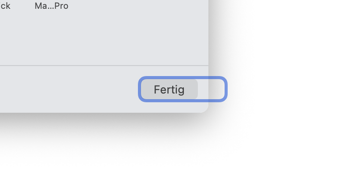
"Apples design is so clean and organized"
Meanwhile Apple: "Lets put the user completely unaligned to the rest of the items" 
"Apples design is so clean and organized"
Meanwhile Apple: "Lets put the user completely unaligned to the rest of the items"
A tiny, tiny difference in font size bothers me to no end many times a day: «Verbinden …» is smaller than «Gerade aktualisiert» in iOS Mail. Feels like a fly buzzing around my head that I cannot catch.


lmfao
they backported it because no-one was updating
(redrafted because some dipshit's hashtag bot boosted the post and Fuck That)