Homeassistant letsencrypt expired this morning and I wondered why things were not working...
Well I am using DNS verification and rfc2136. Syntax for tsig algorithm changed in March so renewal silently failed :(
https://github.com/home-assistant/addons/issues/4493
#homeassistant #letsencrypt #everythingisbroken
Well I am using DNS verification and rfc2136. Syntax for tsig algorithm changed in March so renewal silently failed :(
https://github.com/home-assistant/addons/issues/4493
#homeassistant #letsencrypt #everythingisbroken
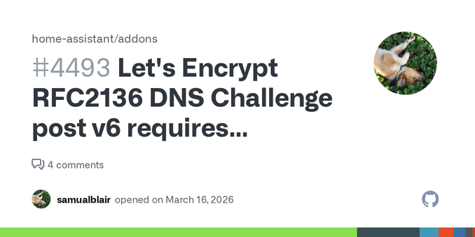
Let's Encrypt RFC2136 DNS Challenge post v6 requires RFC2136_TSIG_ALGORITHM syntax change · Issue #4493 · home-assistant/addons
Describe the issue you are experiencing Noticed after upgrade to post v6 broken RFC2136 After digging into this, first had to remove (now unsupported 'sign') line or service wasn't fully starting. ...