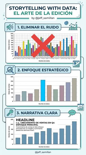
📊 #SWDchallenge Mar 2026 | mapping with purpose
.
4 in 10 U.S. counties have no obstetric clinicians and no birthing facilities. Not scattered gaps — contiguous voids across the Great Plains and rural South. Geography makes this story visible.
. 🔗https://stevenponce.netlify.app/data_visualizations/SWD%20Challenge/2026/swd_2026_03.html
.
#dataviz | #rstats | #DataStorytelling

Data folks from The Straits Times made a very cool dataviz story of Pokémon, to celebrate the 30th anniversary https://www.straitstimes.com/multimedia/graphics/2026/02/pokemon-tree-of-life/index.html

#Dataviz #DataStoryTelling

The Pokemon tree of life

To celebrate 30 years of catching ’em all, discover the parallels between the Pokemon universe and our own.

The Straits Times

📊 Torna il corso “Data Storytelling per la Comunicazione”, tenuto da Matteo Moretti e me: un percorso formativo in cinque sessioni per apprendere principi, metodi e strumenti essenziali per comunicare serie di dati in modo efficace.

Scopri di più e iscriviti:
👉 https://www.supsi.ch/data-storytelling-per-la-comunicazione2

- - -

📢 The course “Data Storytelling per la Comunicazione”, led by Matteo Moretti and me, is back.

Find out more and sign up!

#DataStorytelling #DataVisualization #DataStory #StorytellingWithData #AI

Image Visual Enhancements for Report Creators

This update empowers report creators to craft more engaging experiences for report consumers. Report creators can easily maintain image visuals with more image formatting options, more image source options, the ability to change the image in-place.

Wie können Visualisierungen mit Python erstellt werden? Was bedeutet statistische Inferenz? In dem Workshop von Dr. Golnaz Sarkar Farshi / @goli_sf lernen Sie die Python-Bibliothek Seaborn kennen sowie das Konzept & die Anwendung statistischer Inferenz.

👉Infos & Anmeldung: https://hermes-hub.de/aktuelles/events/data-storytelling-2026-01-23.html

Anmeldung bis 16.01.2026. Eine Warteliste ist eingerichtet.

#DataLiteracy #DataStorytelling #DataViz #DigitalHumanities #VisualAnalyzing
#Python #TUDarmstadt #UniTrier

Data Storytelling Is More Than BI

When Business Intelligence came around, the whole idea was to gather and summarize data to

https://data.inidox.com/data-storytelling-is-more-than-bi/

#BusinessIntelligence #data #DataAnalytics #DataStorytelling

Data Storytelling Is More Than BI

When Business Intelligence came around, the whole idea was to gather and summarize data to be easily used by business managers. It was up to them to make sense of it all, even though the way data was summarized did give some hints, just not explicitly. "Words are a lens to focus one’s mind" –...

Inidox Data
📊 #SWDchallenge Jan 2026 | plot partial information
.
60% started Geralt's journey. Only 22% finished it. Steam achievement data reveals "partial" as behavioral incompleteness—not missing data, but incomplete player journeys.
. 🔗https://stevenponce.netlify.app/data_visualizations/SWD%20Challenge/2026/swd_2026_01.html
.
#dataviz | #rstats | #DataStorytelling

🚨 REVELACIÓN SERIE A 🚨 El algoritmo QSA-v5.0 detecta una grieta en el Inter de Milán antes de su asedio a Bérgamo. 🏟️ Las casas de apuestas no quieren que veas. 📉⚽ nythbox.wordpress.com #Atalanta #Inter #SerieA #Pronosticos #DataStorytelling #Scudetto

https://nythbox.wordpress.com/2025/12/27/la-anomalia-de-bergamo-el-veredicto-final-sobre-el-asedio-del-inter-al-fortin-de-la-dea/?utm_source=mastodon&utm_medium=jetpack_social

La Anomalía de Bérgamo: El Veredicto Final sobre el Asedio del Inter al Fortín de la «Dea»

🚨 REVELACIÓN SERIE A 🚨 El algoritmo QSA-v5.0 detecta una grieta en el Inter de Milán antes de su asedio a Bérgamo. 🏟️ Las casas de apuestas no quieren que veas. 📉⚽ nythbox.wordpress.com #Atalanta #…

NythBox

🚨 REVELACIÓN SERIE A 🚨 ¿Emboscada en el Dall'Ara? El algoritmo QSA-v5.0 detecta una anomalía táctica: El Bolonia 🔴🔵 es favorito, pero el Sassuolo 🟢⚫️ tiene el plan perfecto de sabotaje. 📉Completo aquí: nythbox.wordpress.com ⚽️💎 #Bolonia #Sassuolo #SerieA #Pronosticos #DataStorytelling

https://nythbox.wordpress.com/2025/12/27/el-veredicto-prohibido-del-dallara-la-grieta-tactica-que-el-sassuolo-planea-explotar/?utm_source=mastodon&utm_medium=jetpack_social

El Veredicto Prohibido del Dall’Ara: La Grieta Táctica que el Sassuolo Planea Explotar

🚨 REVELACIÓN SERIE A 🚨 ¿Emboscada en el Dall’Ara? El algoritmo QSA-v5.0 detecta una anomalía táctica: El Bolonia 🔴🔵 es favorito, pero el Sassuolo 🟢⚫️ tiene el plan perfecto de sabotaje. 📉Vere…

NythBox
Introducing Power BI Controller: Streamlining Storytelling with Bulk Operations (Preview)

This feature was developed in direct response to feedback from our user community and is designed to provide an efficient tool for managing multiple Power BI add-ins within PowerPoint presentations. Background Power BI Storytelling enables users to embed interactive reports and visuals into PowerPoint, supporting data-driven presentations across organizations. As adoption has grown, many of &hellip; <p class="link-more"><a href="https://powerbi.microsoft.com/en-us/blog/introducing-power-bi-controller-streamlining-storytelling-with-bulk-operations-preview/" class="more-link">Continue reading<span class="screen-reader-text"> &#8220;Introducing Power BI Controller: Streamlining Storytelling with Bulk Operations (Preview)&#8221;</span></a></p>