📊 #SWDchallenge May 2026 | move from dashboard to decision
.
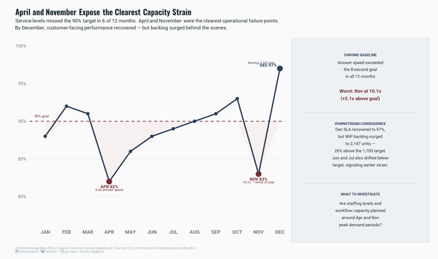
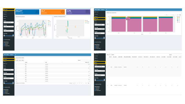
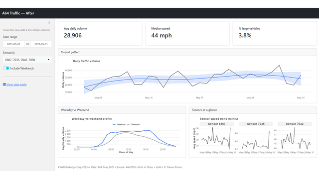
One line chart made it visible — service levels missed the 90% target in 6 of 12 months, and December's recovery came at a hidden cost: backlog surged 26% above target.
. 🔗 https://stevenponce.netlify.app/data_visualizations/SWD%20Challenge/2026/swd_2026_05-Ex_063.html
.
#dataviz | #rstats | #DataStorytelling
.
One line chart made it visible — service levels missed the 90% target in 6 of 12 months, and December's recovery came at a hidden cost: backlog surged 26% above target.
. 🔗 https://stevenponce.netlify.app/data_visualizations/SWD%20Challenge/2026/swd_2026_05-Ex_063.html
.
#dataviz | #rstats | #DataStorytelling