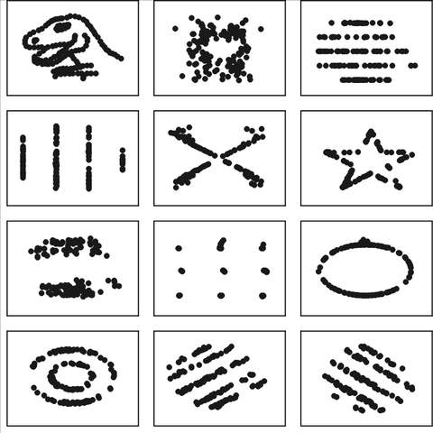

I made this image that clearly references to #datasaurus to illustrate two key topics:
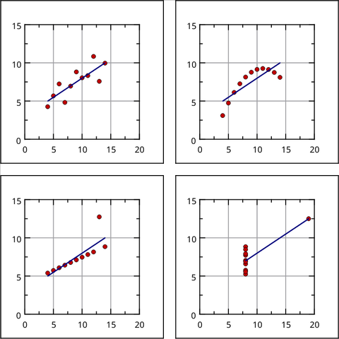
First, because #datavisualization is a means to reveal hidden patters in our data, like the datasaurus (see previous post for info)
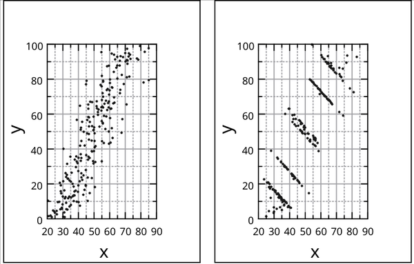
Second, because we can use #coding with #images as we do with #data. (Actually, can't images be considered data?). And to demonstrate that, I wrote this tutorial explaining how to use #rstats with #imagemagick to generate the two images accompanying this post:
https://ds-labs.carloscamara.es/posts/2023-03-02_matrix-effect/
First, because #datavisualization is a means to reveal hidden patters in our data, like the datasaurus (see previous post for info)
Second, because we can use #coding with #images as we do with #data. (Actually, can't images be considered data?). And to demonstrate that, I wrote this tutorial explaining how to use #rstats with #imagemagick to generate the two images accompanying this post:
https://ds-labs.carloscamara.es/posts/2023-03-02_matrix-effect/
