Messing around with exposure times and different filters for getting better print contrast out of multigrade paper. Made 7 prints in all (but they're just contact prints, so pretty quick work). But comparing the generic vs final tweaked version, you can really see a difference.
#KodakBrownie #ContactPrint #Darkroom
My first #ContactPrint was all in medium grays. I tried increasing the exposure time, but it just shifted everything darker.
Prints hung up to dry.
#SFMuni #KodakBrownie #ContactPrint
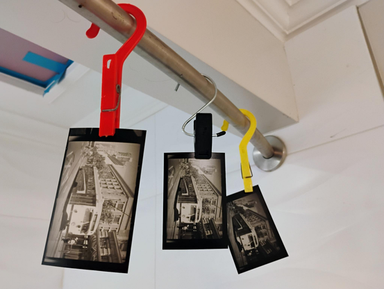
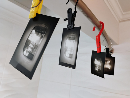
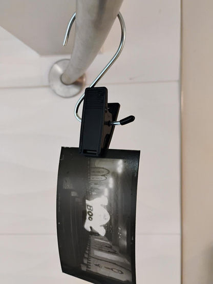
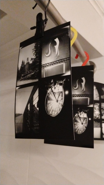
With enlargers, people do burning/dodging/masking, so I decided to see if I could make this work with a #ContactPrint.
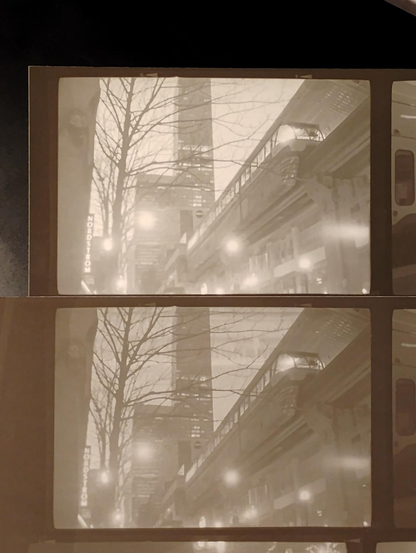
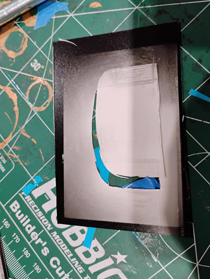
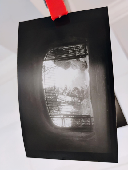
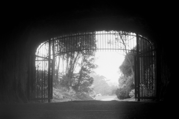
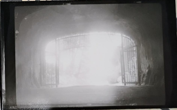
So, I want overexpose/darken the well-lit (so, in the negative, darker) outside bits, and underexpose/lighten the (in neg, lighter) tunnel interior. So I took an early crummy print and cut out the gateway.
I can put the surrounding part down on top of the glass that holds down the negative and photo paper, then expose a bit, remove it, and expose some more.
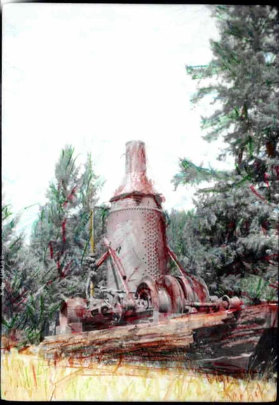
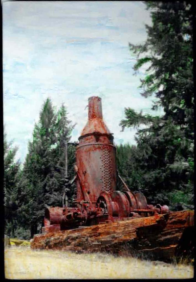
Kind of works.
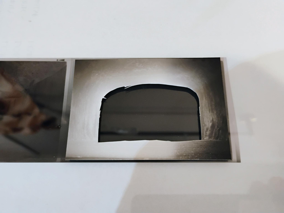
Positioning the mask is tricky--definitely this would work better with enlargement prints (in that case, you can shine red light through your neg and use that to precisely align your mask).
But it seems to work in principle, at least.
I might honestly get better results just by making a dozen conventional prints with different exposure times and picking the one with the best balance.
But it's fun to try this stuff.
#darkroom #kodakbrownie #120film
I took this (#KodakBrownie/#120film) picture from the inside of a tunnel. The first image is a scan from negative; the scanner usually quite helpfully adjusts levels and brings out contrast in ways that are hard to reproduce in actual printmaking.
My prints (I just do contact printing lately; the 6x9cm negs make nice little pictures) either wash out the outside in the background (cf the 2nd image) or make the tunnel interior completely black.
This is a time to try some #darkroom experimentation.
#ContactPrinting #ContactPrint #ContactPrints (I would like to reiterate my request that M should support hash-tags via #Regex!).
Tried hand tinting some photo prints. I used watercolor pencils.
In the first/left version I tried drawing pretty precisely, in the right/second version I went for a more cartoony solid-fill look. I think the 2nd way works better.
I think this works best with images that have clear boundaries. So trees will always be tricky.
These were done on #KodakBrownie contact prints, to 6x9cm; on an enlargement, obviously, it'd be a little easier to color precisely.
Also, I wonder if markers might actually work just as well or better?
#ContactPrint #HandTinting #DarkRoom
Made some contact prints (these are all 6x6cm or 6x9cm; some may look like enlargements, but that's just because I cut smaller pieces of paper).
The last picture is intentionally printed light because I want to try hand-tinting (and Wikipedia says you should do that).
#KodakBrownie #MediumFormat #DarkRoom #ContactPrint #120film
Some #ContactPrint versions of a picture taken on a #KodakBrownie. For the top one, which is pretty light, the paper was exposed for about "one mih", the next one was about "one mississippi" and came out pretty well. I put a #Cyanotype from the same negative. Cyanotypes work but the results are less sharp and have less gradation of light/dark.
#MediumFormat #BelieveInFilm
Another of my kid's #MediumFormat #ContactPrint pix. This is in Niles, CA, across the street from the Niles Essanay Silent Film Museum ( @Essanay ).
#BelieveInFilm