Cartoon Alley: Nappanee’s Outdoor Comic Strip Museum
Photo by the authorFor the second time in as many years we’ve had the opportunity to visit an incredible remaking of an alley in small town Indiana. Last year it was Ohki Alley in Columbia City, Indiana and now in 2026 it was Cartoon Alley in Nappanee.
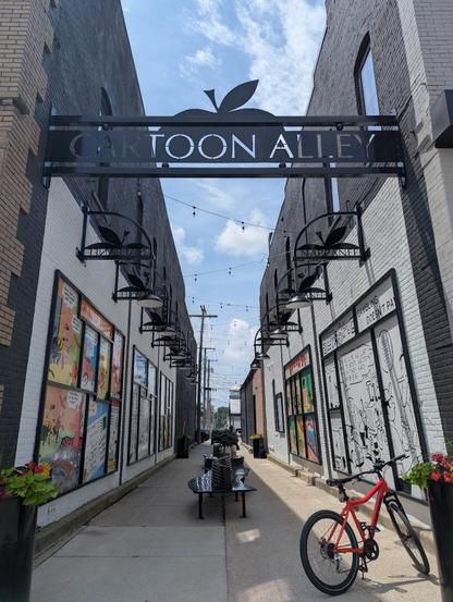
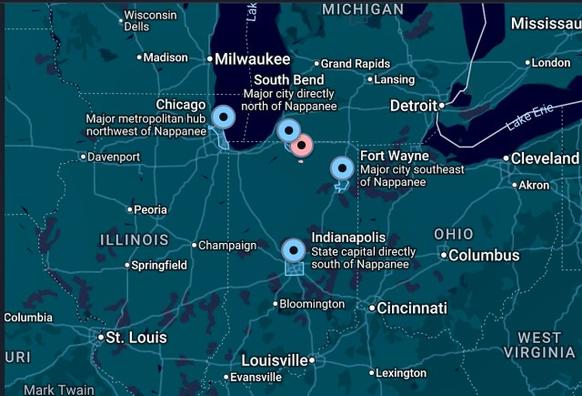
Nappanee (red dot) in relation to other cities – Source: maps.google.comSituated but a few steps south of Nappanee’s bustling downtown crossroads is Cartoon Alley, so named as six (6) well-known animators/commercial artists have hailed from this quaint Amish tourist town of 6,877 (2026 est.).
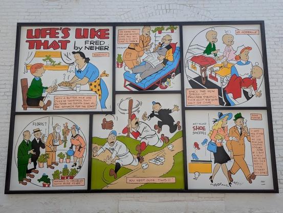
Photo by the authorAdorning the newly painted brick and mortar alley walls are six (6) humorous and colorful panels of famous comic strips from four (4) of the artists whose comic strips were published in newspapers across the nation. A separate panel highlights their careers and personal histories (see below).
Photo by the authorThe comic strip cartoonists highlighted include Merrill Blosser, Bill Holman, Fred Neher, and Max Gwin. Two other illustrators, Henry Maust and Francis “Mike” Parks, who worked in commercial arts and editorial cartoons respectively are noted on the panel, as well as on an Indiana State Historic Marker located in front of Nappanee Public Library.
Photo by the authorPhoto by the author“Bill [Holman] also drew ‘Spooky & Foo‘. The word ‘Foo’ became a household name and turned into a catch phrase across the nation. The 415th Night Fighter Squadron adopted Holman’s ‘Foo Fighters’ to describe the unexplainable lights they observed flying beside them over Germany during World War II. The fifteen-time Grammy and five-time Rock Album of the Year Award winning band, The Foo Fighters, carried Holman’s legacy to another generation”
– Cartoon Alley Panel
Source: mycomicshop.com Photo by the authorPhoto by the authorOther placemaking features of this beautified strip of city pavement include a metal archway, curved benches with matching lights, as well as flower-filled pots.
Photo by the authorAnd…the best news is that Nappanee is not done yet with their remarkable makeover of its alleys. Directly across Main Street from Cartoon Alley will be Shoe Alley (or Aisle) which will commemorate the town’s noted shoemaking history.
Future Shoe Alley (Aisle) – Photo by the author Artist’s depiction of future Shoe Alley (or Aisle) in Nappanee, IN – Source: Facebook, comNeedless to say, these wonderful additions to the townscape are perfect tools for maintaining the health and vitality of downtown. Congratulations to the good folks of Nappanee, Indiana whose hometown pride has been manifested into a charming, interesting, and enjoyable outdoor historic museum for all to enjoy and partake.
Peace!
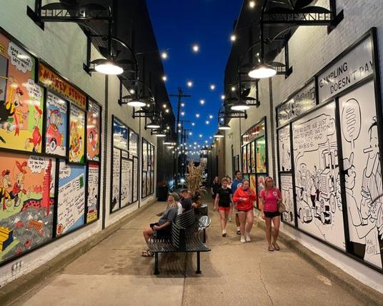
Cartoon Alley at night – Source: vibrantelkhartcounty.org #adaptiveReuse #alleys #art #CartoonAlley #cartoons #cities #comicStrips #downtown #FooFighters #fun #historicMarker #history #Indiana #landUse #music #Nappanee #planning #ShoeAlley #tourism #transportation #travel #walking