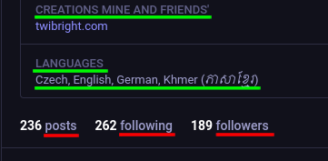
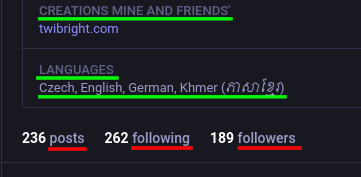
@zl2tod IMO Mastodon has extremely bad UI design. Clickable (red) and nonclickable (green) texts are not visually distinguished. I didn't even think that the word "followers" could be clickable.
"It should be easy for a sighted person to tell the difference between a clickable link and static text. [...] People may not understand or notice a clickable link when this convention is not followed."
https://www.ta11y.org/en/learning/web/links/visually-distinct-links/
Mastodon is IMO an accessibility disaster.
#ux #accessibility #failure #baddesign #badux #mastodon #incompetent #incompetence #bug #buggy #disaster #accessibilitydisaster