Too much kerning is chaos. Too little? Cramped disaster. Nail the spacing—it’s the unsung hero of great design! 📏✨
#KerningMatters #TypographyTips #FontDesign #SpacingMatters #LetterSpacing #GraphicDesignTips #TypeLovers #DesignDetails #TypographicDesign
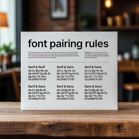
Pairing fonts is like matchmaking. Opposites attract, but harmony rules. Don’t let your body text fight with your headline. 💔💡
#FontPairing #TypographyTips #FontDesign #DesignTips #CreativeDesign #VisualHierarchy #DesignStrategy #GraphicDesign #TypeLovers
Leading (line spacing) isn’t just a setting—it’s breathing room for your text. Tight lines = anxiety. Spacious lines = clarity. Let it breathe! 🧘‍♂️
#TypographyTips #FontDesign #LeadingMatters #WhiteSpace #DesignPrinciples #GraphicDesignTips #TypeTalk #VisualHierarchy #CreativeDesign
Kerning: the fine art of letter spacing. It can make or break a design. Don’t let your text look like a bad breakup 💔
#KerningMatters #TypographyTips #FontDesign #GraphicDesignFails #TypeLove #DesignEducation #TypographicDesign #SpacingIsEverything