This Mid-Century Modernist Poster Template for Adobe Illustrator Proves Geometric Design Is a Powerful Visual Language

Oh boy, graphic design trends cycle fast. That’s for sure. Gradients give way to flat design. Flat design spawns brutalism. Brutalism softens into neo-minimalism. Yet through every shift, one visual tradition holds its ground without apology: the geometric poster language of mid-century Swiss modernism. This Adobe Illustrator poster template by BlackCatStudio on Adobe Stock doesn’t just borrow from that tradition — it channels it with uncommon confidence. And right now, in 2025, that kind of design clarity feels almost radical.

Download the template from Adobe Stock

Please note that to edit this template, you need professional graphic design software like Adobe Illustrator installed on your computer. You can get the latest version from the Adobe Creative Cloud website. Just have a look here.

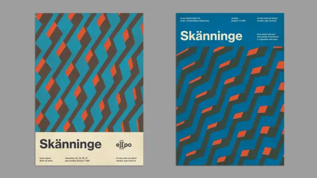
A mid-century modernist Swiss-style poster layout for Adobe Illustrator by BlackCatStudio. Download the template from Adobe Stock

The template arrives as two A4 layout options in a single fully editable vector file. Both versions share a visual DNA built on diagonal geometric patterning, a strict three-color palette of teal, warm red-orange, and dark charcoal-brown, and a typographic hierarchy that feels borrowed from a 1970s European cultural event program. The result is a Swiss-style poster template for Adobe Illustrator that works equally well for music festivals, exhibitions, cultural institutions, and contemporary brand communication.

So why does this specific aesthetic matter right now? And what makes this particular template worth your attention?

What Makes a Poster Layout Feel Authentically Mid-Century Without Becoming Retro Pastiche?

That question sits at the center of every designer’s challenge when working in this visual register. Reference too lightly, and the result feels generic. Reference too heavily, and the poster becomes costume rather than communication. This template navigates that tension well — and it’s worth understanding exactly how.

The geometric pattern driving both layout variants operates on what I call a Diagonal Rhythm System: interlocking parallelogram and chevron-like forms that tile across the upper or lower poster field. Crucially, the pattern never reads as wallpaper. Instead, it functions as a structural visual element — an active field that creates energy, draws the eye, and frames the typographic zone below or above it.

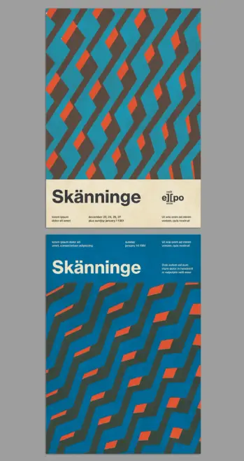
In the first layout option, the pattern occupies the top two-thirds of the A4 format. A cream-toned horizontal band anchors the bottom third. That band holds a bold sans-serif headline — “Skänninge” in the sample — along with a compact logotype-style wordmark, and three columns of fine supporting text beneath. The division is clean. The contrast between the dynamic pattern field and the quiet typographic zone is sharp and intentional.

The second layout inverts the logic. Here, the typographic information sits at the top of a solid teal ground. The headline runs large across the middle. The geometric pattern fills the lower half. This version reads as more contemporary — more aligned with current editorial poster aesthetics — while maintaining the same underlying geometric grammar.

The Three-Color Architecture of Swiss Modernist Poster Design

Color restraint is the most underestimated discipline in poster design. This template applies what I call a Triadic Tension Palette: three colors chosen not for harmony but for productive visual conflict. Teal dominates as the ground color. Dark charcoal-brown functions as a structural mid-tone that defines the geometry. Warm red-orange fires through the pattern as an accent — sparse, precise, impossible to ignore.

This palette has clear historical precedent. Swiss international style designers of the 1960s and 1970s regularly worked with similarly constrained chromatic systems. Josef Müller-Brockmann’s concert posters for the Zurich Tonhalle used stark, functional color not as decoration but as information architecture. This template applies the same logic. The red-orange accent doesn’t just look good — it tells your eye where to move.

Furthermore, the template ships in CMYK color mode. That’s a significant practical detail. It means this mid-century modernist poster template is print-ready from the start, with no color profile conversion required before sending files to a professional printer. For designers working across both digital and print channels, that workflow clarity matters.

Why Adobe Illustrator Is the Right Tool for This Kind of Geometric Poster Template

Vector-based geometry like this demands a vector environment. Adobe Illustrator handles scalable geometric forms the way nothing else does — cleanly, precisely, and without the pixel-level anxiety that rasterized editing introduces. Because this template uses vector shapes throughout, you can scale it from A4 to A0, from a social media square to a billboard, without touching a single pixel. The geometry stays sharp at every size.

Editing the layout is equally straightforward. Replace the sample text — lorem ipsum placeholder copy fills all typographic fields — with your own event name, date, and supporting details. The type hierarchy is already set. You’re not solving a layout problem; you’re completing one that’s already well-structured. That’s the real value of a professional Adobe Stock Illustrator template: the hard design thinking has been done. Your job is to make it yours.

BlackCatStudio, the Adobe Stock contributor behind this template, has designed the file with full editability in mind. Every element — color, form, typography, spacing — is accessible and modifiable within Illustrator’s standard interface. No proprietary plugins are required. No locked layers to navigate. Just clean, professional vector architecture ready for production use.

How the Typographic Grid Structures Both Layout Variants

Typography in Swiss-style poster design isn’t decoration. It’s structure. This template applies what I call the Columnar Information Stack framework: multiple columns of supporting text beneath a dominant headline, each column carrying a distinct data type — title, date, location, supporting description. The system organizes complex event information without overwhelming the visual field.

In the first layout, three text columns align beneath the headline band. Each holds two lines of sample text. The spacing between them is generous. The overall effect is orderly but not rigid — the columns breathe. In the second layout, the same logic appears at the poster’s top, with the headline cutting through the middle. Supporting detail sits to the right of the headline, creating an asymmetric typographic balance that feels modern and editorial.

The typeface used in the sample — a bold condensed sans-serif for the headline, a lighter weight for supporting text — reinforces the Swiss modernist reference without specifying a single typeface as mandatory. You can substitute your own font selection and the underlying grid logic holds. That flexibility is a design strength, not a compromise.

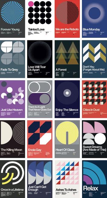
The Mid-Century Revival in Contemporary Graphic Design

This template doesn’t exist in a vacuum. It arrives during a sustained cultural reappreciation of mid-century graphic modernism — a movement visible across branding, editorial, motion graphics, and digital product design. The reasons are worth examining, because they explain why this aesthetic continues to resonate.

Mid-century Swiss poster design emerged from a specific problem: how do you communicate clearly to a multilingual, diverse urban audience using print as the primary medium? The answer was geometry, constraint, and system. Remove ambiguity. Use form and color as universal language. Let the grid do the organizational work.

Those principles haven’t aged. If anything, they’ve become more relevant. Contemporary audiences navigate information-dense visual environments daily. A poster that communicates through bold geometry and restrained color cuts through that noise in a way that elaborate digital effects rarely achieve. Designers working today recognize this. Hence the revival.

Moreover, the geometric poster aesthetic photographs beautifully. It performs strongly on social media. It scales perfectly across digital and physical applications. These are not accidental qualities — they’re the natural byproduct of a design language built on clear principles rather than trend-dependent decoration.

Who Should Use This Swiss-Style Poster Template for Adobe Illustrator?

The honest answer is: more designers than you might expect. The obvious use cases are cultural institutions, music festivals, and art exhibitions — contexts where the mid-century reference feels appropriate and even expected. But the template’s visual language travels further than that.

Consider a creative agency producing brand materials for a design-forward retail client. Or a freelance designer building a poster series for a contemporary lecture program. Or a studio creating event collateral for an architecture firm. In each case, the Swiss modernist geometry signals authority, clarity, and sophisticated aesthetic intent. It positions the client as a serious, design-literate organization without requiring a custom poster design built from scratch.

The two A4 layout variants give you additional flexibility. Use them as a two-piece poster series for the same event. Apply one variant to print materials and the other to digital applications. Or simply choose the version that best suits your specific content structure and run with it.

My Personal Take: Why This Template Gets Geometric Poster Design Right

I’ll be direct. Most retro-inspired poster templates on stock platforms fall into predictable traps. They over-decorate, add unnecessary texture layers that muddy the geometry, and they apply color combinations that gesture toward mid-century design without committing to it. Or they reproduce the aesthetic surface of Swiss modernism — the grids, the sans-serifs — while missing the underlying logic of why those choices were made.

This template avoids those traps. The geometric pattern is genuinely dynamic — it creates movement and rhythm without becoming chaotic. The three-color palette is disciplined without feeling sterile. The typographic zones are well-considered and structurally sound. Most importantly, the two layout variants feel like different expressions of a single coherent design idea, not two unrelated poster concepts packaged together for bulk value.

What I find particularly effective is the Pattern-to-Text Transition Logic — my term for the way both layouts manage the boundary between the geometric field and the typographic zone. In layout one, that boundary is a horizontal edge with a color-and-texture shift from pattern to cream. In layout two, the transition happens through the headline itself, which sits directly at the threshold between the text field and the geometric field below. Both solutions are clean, confident, and visually satisfying.

This is what separates a well-designed template from a merely competent one. The transitions are designed, not just left as default Illustrator object placement.

Practical Tips for Editing This Adobe Illustrator Poster Template

Start with the text. Replace the sample headline with your event or project name first. Everything else — color, scale, supporting copy — should follow from there. The headline size and weight establish the visual hierarchy for the entire poster.

Next, consider whether the palette serves your brief as-is. The teal, charcoal, and red-orange combination is strong and versatile, but it’s not mandatory. Because all forms are vector objects, recoloring the geometric pattern is a matter of seconds in Illustrator. Apply your brand colors to the triadic palette structure and the design system holds.

Additionally, test the layout at your intended output size before finalizing. A4 is the template’s native format, but because all elements are vector-based, scaling to a larger format is non-destructive. Check that your font sizes still read correctly at the new scale and adjust accordingly.

Finally, consider the two layout variants as a system. If your project allows for it, deploy both — across print and digital channels, or as complementary pieces in the same campaign. The visual consistency between the two versions creates a coherent graphic identity that a single poster design can’t achieve alone.

Forward-Looking Prediction: Geometric Modernism Will Remain a Dominant Poster Aesthetic Through 2030

Design cycles accelerate, but foundational visual languages don’t disappear — they recede and return. The geometric modernist poster tradition, rooted in Swiss international style principles, is currently in an upswing that shows no structural signs of reversing. Here’s why that matters for designers choosing templates and building visual identities today.

First, AI-generated imagery is pushing design culture toward surfaces rather than structures. Photorealistic generation tools produce elaborate visual content quickly. In response, designers working with intent are reaching for systems that feel distinctly human — structured, principled, and hand-reasoned. Geometric modernism is exactly that. Its apparent simplicity is actually the product of deep compositional thinking.

Second, cultural institutions globally are reassessing their visual identities. Many are moving away from complex digital aesthetics toward more timeless, print-rooted design systems. The Swiss poster tradition serves that shift perfectly. Expect to see more cultural organizations, festivals, and design-forward brands adopting geometric poster design as a primary visual language over the next five years.

Third, the scalability of vector-based geometric design is increasingly valuable in an omnichannel world. A poster that works as well on an Instagram story as it does on a printed A0 sheet is genuinely rare. This template, and the design tradition it draws from, produces exactly that kind of cross-format visual durability.

Download the template from Adobe Stock

Frequently Asked Questions

What is included in this Adobe Illustrator mid-century modernist poster template?

The template includes two fully editable A4 poster layout variants in a single Adobe Illustrator file. Both designs feature vector-based geometric patterns, a three-color palette, and structured typographic zones. The file uses CMYK color mode for professional print compatibility, and all sample texts are placeholder copy that you can replace instantly with your own content.

Is this poster template suitable for professional printing?

Yes. The template uses CMYK color mode, which is the standard color space for professional offset and digital printing. Because all design elements are vector shapes, the layout scales to any print size — from A4 to A0 — without any loss of quality or resolution.

Can I change the colors in this Swiss-style Illustrator template?

Absolutely. All design elements are editable vector objects within Adobe Illustrator. You can recolor the geometric pattern, the background, and the typographic elements using Illustrator’s standard color tools. The triadic palette structure — one dominant color, one structural mid-tone, one accent — works well with a wide range of color substitutions.

What design style does this poster template represent?

The template draws on mid-century Swiss international style poster design — a visual tradition characterized by geometric forms, constrained color palettes, structured typographic grids, and a strong emphasis on visual clarity. The style originated in Switzerland in the 1950s and 1960s and remains one of the most influential traditions in graphic design history.

Who is BlackCatStudio, the template designer?

BlackCatStudio is an Adobe Stock contributor specializing in professional, fully editable vector templates for Adobe Illustrator and related Creative Cloud applications. Their work spans poster design, branding templates, and editorial layout systems.

Do I need any special plugins or fonts to use this template in Adobe Illustrator?

No special plugins are required. The template opens and edits within standard Adobe Illustrator. If the sample fonts are not installed on your system, Illustrator will prompt you to substitute a similar font or locate the original. In most cases, substituting your own preferred typeface is part of the customization process.

Can this poster template work for digital applications as well as print?

Yes. While the template is designed in CMYK for print production, the vector-based geometry scales cleanly to any digital format. You can export the artwork as PNG, JPEG, or SVG for digital use, adjusting dimensions and color mode as needed for screen applications.

What types of events or projects is this mid-century poster template best suited for?

The template works effectively for cultural events, music festivals, art exhibitions, design conferences, lecture series, and design-forward brand communications. The Swiss modernist aesthetic signals clarity, sophistication, and design authority — qualities that resonate across cultural, commercial, and institutional contexts.

Is this template available exclusively on Adobe Stock?

This template is available through Adobe Stock as part of BlackCatStudio’s contributor portfolio. Adobe Stock templates are accessible via an Adobe Stock subscription or available for individual purchase, and they integrate directly with Adobe Creative Cloud applications.

What is the Diagonal Rhythm System mentioned in this article?

The Diagonal Rhythm System is a term coined in this article to describe the specific geometric pattern logic at work in this poster template. It refers to the use of interlocking diagonal parallelogram and chevron forms that tile across the poster field, creating directional visual movement and compositional energy while functioning as a structural design element rather than surface decoration.

You can find more graphic design templates here at WE AND THE COLOR.

#adobeIllustrator #AdobeStock #design #graphicDesign #poster #posterTemplate #retro #swissStyle

Swiss Style Graphic Design Has Shaped Every Screen, Sign, and Brand You See Today

Most design movements age out. Swiss Style just keeps compounding. What started in the studios of Zurich and Basel in the early 1950s now lives inside Apple’s San Francisco typeface, Google’s Material Design, Notion’s interface, the New York City subway system, and virtually every corporate identity worth looking at. That reach isn’t accidental. Swiss graphic design — also called the International Typographic Style or Swiss School — built something most movements never manage: a universal visual grammar that works across cultures, languages, and media without losing clarity. The principles are that strong. And they’re more relevant now than ever.

This article argues that Swiss Style isn’t a period piece. It’s the operating system beneath modern visual communication. Once you understand it, you stop seeing design the same way. You start noticing the grid behind the grid, start reading white space as a decision, and start asking why a typeface was chosen — not just what it looks like.

Let’s get specific about what Swiss graphic design actually did, who built it, why it traveled so far, and where it’s heading next.

What Is Swiss Style, and Why Does It Still Dominate Visual Communication?

Swiss Style is a graphic design movement that emerged formally in Switzerland during the 1950s and 1960s. Its core doctrine rests on three pillars: simplicity, objectivity, and readability. But those words understate the ambition. The designers behind the movement weren’t just trying to make things look clean. They were trying to create a universal visual language — one that could communicate across borders without the distortion of cultural symbolism, personal expression, or propaganda.

That’s a radical idea. Think about it. These designers believed that form could be stripped of ego. They believed information itself could guide the composition, and the designer’s job was to get out of the way.

The movement drew directly from three earlier avant-garde traditions. Russian Constructivism contributed the idea of composition as structure. The Bauhaus school in Germany provided the philosophy that form follows function. De Stijl from the Netherlands introduced pure geometric abstraction as a visual principle. Swiss designers synthesized all three — and then systematized the results into a teachable, repeatable methodology.

The result was a style built on mathematical grid systems, asymmetric layouts, flush-left ragged-right text, sans-serif typefaces, and objective photography. Every element served communication. Nothing existed for decoration. That discipline made Swiss Style almost immune to obsolescence. Ornament trends come and go. Structure endures.

The Grid as Philosophy, Not Just a Tool

The modular grid is the single most important structural innovation of Swiss graphic design. For Swiss designers, the grid wasn’t a convenience — it was a philosophy. A properly designed grid, as Josef Müller-Brockmann argued, represents the most legible and harmonious means of structuring information. It imposes order without suppressing content. It creates visual rhythm without repetition, avoiding monotony.

Modern web design relies on grid systems. CSS frameworks like Bootstrap are built on twelve-column grids descended directly from the Swiss modular grid tradition. Every responsive layout you use on a smartphone traces back to this idea. The grid traveled from Zurich to Silicon Valley without losing a step.

So why does the grid work so well? Because it solves a fundamental cognitive problem. When visual information is organized in a predictable spatial structure, readers parse it faster and with less friction. The grid reduces the cognitive load of reading. That’s not style. That’s neuroscience.

The Founding Generation: Swiss Designers Who Changed Everything

Swiss Style didn’t materialize from thin air. It was built by specific people with specific convictions. Understanding who they were makes the movement legible in a way that abstract definitions never can.

Ernst Keller: The Father of the Swiss School

Ernst Keller began teaching at the Kunstgewerbeschule Zürich (School of Applied Sciences, Zurich) in 1918. He is widely considered the father of Swiss graphic design. Keller developed the foundational teaching methodology that would define the Swiss approach: design principles derived from the problem at hand, not imposed from a stylistic template. His students became the architects of the entire movement. Without Keller, there is no Swiss Style as we know it.

Josef Müller-Brockmann: The Architect of the Grid

Josef Müller-Brockmann (1914–1996) is arguably the most influential figure the Swiss School produced. His poster work — particularly the concert series designs for Musica Viva in Zurich — remains among the most studied graphic designs of the twentieth century. His compositions use the grid as both structure and expression. Typography carries the emotional weight. Form and logic become the same thing.

Müller-Brockmann co-founded and co-edited Neue Grafik (New Graphic Design) magazine from 1958 to 1965 alongside Richard Paul Lohse, Hans Neuburg, and Carlo Vivarelli. Published in German, French, and English, the journal became the primary vehicle for disseminating Swiss design principles internationally. It defined the movement’s character and codified its intellectual framework.

His book Grid Systems in Graphic Design (1981) is still required reading in design schools worldwide. The ideas in it haven’t expired. They’ve multiplied.

Armin Hofmann: Reduction as Mastery

Armin Hofmann taught at the Allgemeine Gewerbeschule Basel (Basel School of Design) for decades, shaping generations of designers through an approach that made reduction itself a creative act. His poster work — the Giselle poster for the Basler Freilichtspiele (1959) is iconic — shows how powerful a single strong form can be when freed from noise. Hofmann believed that composition, color, and typography should generate tension and clarity simultaneously. His curriculum in Basel remains influential today.

Emil Ruder: Typography as Architecture

Emil Ruder taught typography at the Basel School of Design and developed a philosophy that treated type as a spatial system rather than a collection of letterforms. His book Typographie (1967) articulated a holistic method for designing with text — one grounded in functional communication, rhythm, and systematic proportion. Ruder championed sans-serif typefaces because he believed they served the reader rather than performing for the designer. His teaching shaped an entire generation of typographers who went on to influence editorial design worldwide.

Max Bill: The Theorist and the Designer

Max Bill brought theoretical rigor to Swiss design that went beyond practice into philosophy. A student of the Bauhaus, Bill founded the Hochschule für Gestaltung Ulm (Ulm School of Design) in Germany, which extended Swiss design methodology into an international educational system. His courses incorporated semiotics — the study of signs and symbols — anchoring Swiss design within a broader intellectual tradition. Bill merged mathematical precision with artistic discipline, producing work that felt both rational and beautiful.

Max Miedinger and Eduard Hoffmann: The Type That Conquered the World

In 1957, type designer Max Miedinger and Eduard Hoffmann at the Haas Type Foundry in Münchenbuchsee, Switzerland, released Neue Haas Grotesk. It was renamed Helvetica — from Helvetia, the Latin name for Switzerland — in 1960. Helvetica became the typeface of the twentieth century. IBM used it. American Airlines used it. NASA used it. The New York City transit system standardized on it. It remains one of the most widely used typefaces on the planet.

Helvetica embodies everything Swiss design values: neutrality, legibility, geometric precision, and versatility. It doesn’t impose personality. It amplifies the message. That’s the Swiss design argument made typographically.

Adrian Frutiger: Systematic Type Design

Adrian Frutiger designed Univers in 1957 — the same landmark year as Helvetica. Univers was one of the first typefaces designed as a complete, systematically organized family, allowing a single typeface to serve all weights and widths within one coherent design system. Frutiger later created the Frutiger typeface for Charles de Gaulle Airport in Paris, and Avenir in 1988. His approach to type design as a systematic practice reflects the core Swiss design commitment to rational, structured thinking.

The Basel and Zurich Schools: Two Centers, One Movement

The Swiss Style crystallized around two cities and their design schools. Understanding the difference between them matters for understanding the full range of the movement.

The Kunstgewerbeschule Zürich (Zurich School of Arts and Crafts) produced designers who favored a more geometric, almost mathematical rigor. Müller-Brockmann’s grid-intensive work exemplifies the Zurich approach. Order, structure, and systematic thinking were paramount.

The Allgemeine Gewerbeschule Basel (Basel School of Design) developed a complementary but distinct sensibility. Under Armin Hofmann and Emil Ruder, Basel emphasized perceptual tension, optical contrast, and the expressive possibilities within tight formal constraints. The Basel approach was less about the grid and more about the relationship between typographic elements — rhythm, weight, space.

Together, the two schools formed a complementary dialectic that gave Swiss Style its depth. Zurich offered structure. Basel offered tension. Both offered clarity.

How Swiss Style Typography Rewired Graphic Design Practice

Typography sits at the heart of Swiss Style. Not as decoration. Not as a voice. As a structure. This is the foundational distinction between Swiss typography and almost every other approach to type.

Sans-Serif as a Democratic Choice

The preference for sans-serif typefaces in Swiss design wasn’t arbitrary. Early Swiss designers saw sans-serif letterforms as expressive of a more progressive, rational age. Serifs carry historical and literary associations. Sans-serif faces are optically neutral. They don’t signal class or period. They communicate.

The key Swiss-era typefaces — Akzidenz-Grotesk (originally developed in 1896 by the Berthold Type Foundry), Helvetica, Univers, and Folio — all share this quality of visual neutrality combined with geometric precision. Akzidenz-Grotesk was the mother font. Helvetica and Univers refined and extended its logic into fully developed design systems.

Flush Left, Ragged Right: A Political Stance

The choice to set text flush left with a ragged right margin was not purely aesthetic. Justified text in many European typographic traditions carried connotations of formal authority. Left-aligned text distributes reading energy more naturally. It acknowledges variation in word length rather than forcing uniform blocks. It’s a more honest approach to the page. Swiss designers treated this alignment choice as an expression of their commitment to objectivity.

The Typographic Hierarchy Principle

Swiss Style introduced what I’d call the Hierarchy Clarity Principle: in any designed composition, the typographic structure should communicate the organizational hierarchy of content before the reader reads a single word. Size, weight, spacing, and position all signal meaning. A reader should understand the structure of a page — what’s primary, secondary, tertiary — from its visual organization alone. This principle is now the foundational logic of every design system in use, from Google’s Material Design to Apple’s Human Interface Guidelines.

The Swiss Design Principles That Still Govern Modern Design Systems

Swiss Style didn’t just influence contemporary design — it pre-built it. The principles the Swiss designers established in the 1950s and 1960s are essentially the design system specification that the tech industry rediscovered and formalized fifty years later.

White Space as an Active Element

In Swiss design, white space (negative space) is not empty. It’s structural. Müller-Brockmann and Hofmann both treated white space as a compositional element with the same weight as type or image. White space creates breathing room. It establishes hierarchy, guides the eye, and creates tension. Contemporary UX design calls this “visual breathing room,” but the Swiss designers said it first — and they said it with precision.

Objective Photography Over Illustration

Swiss designers preferred documentary-style photography over illustration because photography presents the world without the distortion of personal style. An illustration is always a designer’s interpretation. A photograph — when chosen carefully — presents evidence. This principle aligned directly with the Swiss commitment to objectivity. It also anticipated the data-driven, evidence-based approach that now dominates product design and visual communication.

The Structured Color Philosophy

Swiss design didn’t avoid color — it disciplined it. Color was used in flat, solid blocks as a functional accent, not as decoration. Typically, a limited palette of one or two primary colors worked alongside black, white, and grays. This approach gave Swiss compositions visual impact without emotional manipulation. It’s the color logic behind contemporary minimalist branding — Muji, Apple, Notion, A.P.C. — all of which draw on this tradition of color as signal rather than mood.

100 Years of Swiss Graphic Design. The book is available on Amazon

The Swiss Style Impact on Contemporary Graphic Design: A Framework

To understand exactly how Swiss design has shaped the contemporary design landscape, I’d propose the Swiss Legacy Transmission Framework — a way of mapping how the movement’s principles moved through history and media into the present.

The framework identifies four transmission channels:

1. Educational Transmission: The Basel and Zurich schools trained generations of designers who took Swiss principles into design schools across Europe and North America. The methodologies of Hofmann and Ruder still shape typography and visual communication curricula worldwide. Müller-Brockmann’s books remain standard references.

2. Corporate Identity Transmission: From the 1960s onward, Swiss design principles became the dominant framework for corporate visual identity. Companies like IBM (with Paul Rand’s Swiss-influenced system), American Airlines (with Massimo Vignelli’s 1967 identity), and countless others adopted grid systems, Helvetica, and Swiss structural logic as the language of institutional credibility.

3. Publishing and Editorial Transmission: The editorial grid — the modular system that organizes text, images, and white space across magazine spreads and book layouts — descends directly from Müller-Brockmann’s grid methodology. Publications like Kinfolk, Eye, and Baseline carry this tradition forward with full awareness of its origins.

4. Digital Interface Transmission: This is the most significant channel in our current moment. When flat design emerged around 2012 as a reaction against skeuomorphism, it rediscovered Swiss design principles. Google Material Design, Apple’s Human Interface Guidelines, and virtually every contemporary design system are structured around Swiss ideas: grid, hierarchy, sans-serif typography, neutral color, and objective imagery.

French graphic designer David Vineïs created this New Wave poster collection as a tribute to the Swiss style.

Swiss Style’s Direct Line to the Digital World

Here’s something worth sitting with. The Swiss designers of the 1950s and 1960s were designing for print. They had no idea the screen was coming. Yet the principles they developed map so directly onto digital interface design that it’s almost eerie.

Grid systems make responsive layouts possible. Sans-serif typefaces are more legible at screen resolution. White space reduces cognitive load on small displays. Typographic hierarchy guides navigation in apps and websites. Flat color communicates faster at pixel dimensions than textured or illustrative elements. Every single one of these observations applies to both 1960s Swiss poster design and 2025 UI design. The medium changed. The logic didn’t.

Apple, Google, and the Swiss Inheritance

Apple’s San Francisco typeface — the custom neo-grotesque designed for all Apple platforms — is a direct descendant of Helvetica and the Swiss type tradition. Before San Francisco, Apple used Helvetica Neue across iOS and macOS. The company’s marketing pages use modular grids, strict typographic hierarchies, flat color palettes, and objective product photography. Strip away the product, and the visual language is Swiss.

Google’s Material Design system formally codified the use of the grid, typographic scale, color hierarchy, and spacing rules — all principles Swiss designers systematized decades earlier. The fact that Material Design became the dominant framework for Android application design means Swiss principles now govern the visual experience of billions of users daily.

The Notion Principle: Swiss Minimalism in Productivity Software

Notion is worth examining as a case study. Its interface uses a strict monochrome palette, flat geometric icons without gradients or shadows, and a content-first organizational logic that values spatial clarity over decorative signal. The “N” logo — a bold sans-serif letterform inside a minimal geometric container — reads as an almost direct quotation from Swiss logotype design. Notion didn’t announce itself as Swiss-influenced. It simply solved the interface design problem by arriving at the same conclusions Swiss designers reached seventy years earlier.

The Swiss Design Paradox: Neutral but Never Boring

Here’s the critique you hear most often about Swiss Style: it’s cold. It’s impersonal. It privileges structure over soul. There’s something to this. When Swiss design principles are applied mechanically — when the grid becomes a cage instead of a scaffold, when neutrality becomes blandness — the work does become lifeless. This is the failure mode of bad flat design. Generic, interchangeable, forgettable.

But that critique misunderstands what the best Swiss designers actually achieved. Look at Müller-Brockmann’s Musica Viva posters. Look at Hofmann’s Giselle. These aren’t cold compositions. They generate tremendous visual tension and emotional impact — achieved entirely through the precise management of form, space, and typographic weight. The emotion comes from the structure. That’s the Swiss Style at its best.

I’d call this the Structured Tension Principle: the tighter the formal constraints, the more powerful the compositional decisions become. Limitations create focus. Focus creates impact. This principle applies to graphic design, architecture, and jazz. Constraints don’t prevent expression. They intensify it.

Swiss Style and the Reaction Movements: New Wave Typography and Beyond

No movement as dominant as the Swiss Style goes uncontested. By the late 1970s and into the 1980s, a counter-movement known as New Wave Typography (Swiss Punk) emerged — partly from within Switzerland itself. Designers like Wolfgang Weingart, who had studied in Basel, began deliberately violating Swiss orthodoxy: misaligned type, layered imagery, variable spacing, and visual noise used as expressive tools.

Weingart’s position was not that Swiss principles were wrong — it was that they had become dogma. When a methodology becomes automatic, it stops being a solution and starts being a habit. His work pushed designers to interrogate the rules rather than simply inherit them. The result was Postmodern graphic design, Grunge typography in the 1990s, and a general expansion of what visual communication could include.

This dialectic — Swiss structure challenged by expressive reaction, then reintegrated — is now a recurring pattern in design history. The Swiss principles always return because they solve real communication problems. The reactions are necessary because creativity needs friction. Both are part of the same productive tension.

The Typography Legacy: Key Swiss Typefaces Still in Use Today

Swiss design bequeathed typography a remarkable body of work. These typefaces are not museum pieces — they’re active tools in daily use across print and digital media.

Helvetica Now from Monotype

Helvetica (1957, Max Miedinger and Eduard Hoffmann) remains one of the most widely used typefaces globally. Its neutrality and legibility make it near-universal in signage, corporate identity, and interface design.

Univers (1957, Adrian Frutiger) pioneered the concept of a systematically designed typeface family, with 21 variants unified by a coherent design framework. It’s still widely used in corporate and editorial contexts.

Akzidenz-Grotesk (1896, Berthold Type Foundry) predates the Swiss movement but became its typographic backbone. Its influence on Helvetica, Univers, and virtually every neo-grotesque typeface since is direct and documented.

Folio (1957, Konrad Bauer and Walter Baum) completed what typographers call the “1957 trio” alongside Helvetica and Univers. Less prominent today but historically significant.

Akkurat (2004, Laurenz Brunner) demonstrates that Swiss typographic tradition continues producing relevant typefaces in the twenty-first century. Designed in Switzerland and explicitly positioned within the Swiss grotesque tradition, Akkurat is widely used in contemporary branding and editorial design.

Neue Haas Unica (2015, revival by Toshi Omagari for Monotype) revived the 1980 Unica typeface — itself a hybrid of Helvetica, Univers, and Akzidenz-Grotesk — for the digital age. Its revival reflects the ongoing relevance of Swiss typographic thinking.

Swiss Graphic Design in the Age of AI and Generative Tools

Here’s a forward-looking claim worth stating directly: Swiss Style is about to become more important, not less, in the era of AI-generated design.

As generative AI tools produce floods of visual content, the signal-to-noise ratio in design is collapsing. AI tends toward complexity, texture, and ornamentation — toward visual richness as a proxy for quality. Against that backdrop, designs rooted in Swiss principles — structured, clear, disciplined, focused — will stand out with increasing power.

I’d call this the Clarity Advantage Principle: in environments saturated with visual noise, the most powerful design is not the most complex but the most precise. Swiss design was built for exactly this condition. Its founders were reacting against visual excess in the post-war commercial landscape. The contemporary AI-driven design environment presents the same challenge at scale.

Furthermore, as AI tools increasingly assist designers in layout and composition, understanding Swiss grid principles becomes a critical literacy skill. Designers who understand the grid can direct AI tools with precision. Those who don’t will produce AI-generated work that feels arbitrary — technically accomplished but structurally incoherent.

How to Apply Swiss Style Principles in Contemporary Design Work

Swiss design principles are teachable and transferable. Here’s a practical framework for applying them in current work, regardless of medium.

Start with the Grid Before Anything Else

Build your grid first. Define columns, gutters, margins, and baseline grid before placing a single element. Let the grid define the spatial logic of your composition. Use the grid as a decision filter: if an element doesn’t align to the grid, you need a strong reason for the exception.

Choose Type Functionally, Not Expressively

Select your typeface based on communication requirements first. Ask: Does this face read clearly at the sizes I need? Does it work across all required weights? Is it neutral enough to serve the content rather than competing with it? For most professional contexts, neo-grotesque sans serifs — Helvetica Neue, Aktiv Grotesk, Inter, Akkurat, GT Walsheim — remain excellent choices within the Swiss tradition.

Use White Space as Structure

Never treat white space as leftover space. Treat it as a structural element that you’re intentionally sizing and positioning. Generous white space around text blocks increases readability and perceived quality. In digital interfaces, it reduces cognitive load and improves task completion. White space is not wasted space. It’s a designed space.

Discipline Your Color Palette

Limit your color palette to a functional minimum. One primary color, one accent, black, white, and one or two neutrals, covers most design requirements. Assign each color a functional role — primary action, secondary information, neutral background — and apply it consistently. Color used as decoration is color wasted.

Test Every Element Against the Communication Goal

For every design element you add, ask: Does this serve the communication goal? If you can’t answer clearly, remove it. This is the Swiss design test, and it’s brutal. Decoration that doesn’t communicate is noise. Noise degrades the signal.

BrandPacks created a brochure cover template for Adobe InDesign in a minimalist, Swiss graphic design-inspired style. The template is available from Adobe Stock

Why Swiss Style Will Never Fully Disappear

Design movements typically peak and recede. Swiss Style is an exception because it isn’t really a style in the ornamental sense — it’s a methodology. You can apply Swiss principles to almost any aesthetic context. That’s why designers return to it repeatedly, even when they think they’re rejecting it.

New Wave designers used Swiss grids while attacking Swiss orthodoxy. Postmodern designers understood Swiss typographic hierarchy well enough to deliberately violate it. Contemporary minimalist brands are often unconsciously reapplying Swiss principles that their designers learned from Apple’s design language, which inherited them from Helvetica, which was a direct product of the Swiss school. The chain is unbroken.

Swiss Style endures because clarity endures. Readers need to parse information. Users need to navigate interfaces. Viewers need to understand hierarchy. The grid, the type, the white space, the objective image — these tools solve those problems better than almost anything else ever developed. That’s not nostalgia. That’s a function.

Predictions: Where Swiss Design Principles Are Heading Next

Several forward-looking developments in design are worth watching through a Swiss lens.

Variable Fonts and Swiss Typographic Logic: Variable font technology — which allows a single typeface file to contain the full range of weights, widths, and optical sizes — is essentially the digital realization of Adrian Frutiger’s Univers system. Systematized type families that serve all design contexts from a single rational framework: that’s a Swiss idea implemented at the code level. Expect variable fonts to dominate professional digital typography within the next decade.

AI-Assisted Grid Systems: Tools like Adobe Firefly and emerging AI layout assistants are beginning to incorporate grid-based layout intelligence. As these tools mature, the Swiss grid methodology will increasingly be encoded into AI design tooling. Understanding the principles behind the tool will separate designers who lead from those who follow.

The Return of Print Precision to Digital: As screen resolution approaches and exceeds print quality on high-density displays, the typographic precision that Swiss designers developed for print is becoming achievable on screen. The gap between print typography and screen typography is narrowing. Swiss print typographic standards — precise optical sizing, careful letterspacing, rigorous baseline grids — are becoming relevant to interface design in new ways.

Design Systems as Swiss Methodology at Scale: The design system — a codified set of components, typography scales, color tokens, and spacing rules that governs the visual language of a product or brand — is the organizational software equivalent of the Swiss modular grid. Companies like Airbnb, Spotify, and Shopify have invested heavily in design systems. These systems encode Swiss principles: rationality, consistency, hierarchy, and functional elegance. Swiss design is now infrastructure.

Final Thoughts: A Style That Wasn’t Really a Style

The most important thing to understand about Swiss graphic design is that its founders didn’t think they were creating a style. They thought they were uncovering principles. They believed good design wasn’t a matter of personal preference but of problem-solving precision. The grid, the type, the white space — these were tools derived from the requirements of communication, not aesthetic choices imposed from outside.

That belief is controversial. It has been challenged, deconstructed, and satirized. But it keeps surviving every challenge because something in it is true. When you strip a composition to its essentials — when you eliminate everything that doesn’t serve the communication — what’s left is consistently more powerful than what you removed. That observation holds across media, decades, and design contexts. It was held in 1957, and it is held today.

Swiss Style isn’t nostalgia. It isn’t a trend. It’s a set of working answers to permanent design questions. And as long as human beings need to parse information quickly and clearly, those answers will remain valid.

Frequently Asked Questions About Swiss Style Graphic Design

What is Swiss Style in graphic design?

Swiss Style — also called the International Typographic Style or Swiss School — is a graphic design methodology that emerged in Switzerland in the 1950s and 1960s. It emphasizes simplicity, objectivity, and readability through modular grid systems, sans-serif typefaces, asymmetric layouts, generous white space, and documentary-style photography. It is widely considered the foundational framework for modern graphic design and visual communication.

Who are the most important Swiss graphic designers?

The most influential Swiss graphic designers include Josef Müller-Brockmann, Armin Hofmann, Emil Ruder, Max Bill, Ernst Keller, and Adrian Frutiger. Type designers Max Miedinger and Eduard Hoffmann created Helvetica in 1957, the most widely used typeface in the world. These designers and educators shaped the movement through both their practice and their teaching at the Basel and Zurich design schools.

What typefaces are associated with Swiss Style?

The primary typefaces associated with Swiss Style are Helvetica, Univers, Akzidenz-Grotesk, and Folio — all released in the mid-twentieth century. More recent typefaces in the Swiss tradition include Akkurat (2004) and Neue Haas Unica (2015). These are all neo-grotesque sans-serif typefaces characterized by geometric precision and visual neutrality.

How has Swiss Style influenced modern UI and UX design?

Swiss Style principles — grid systems, typographic hierarchy, white space, sans-serif typefaces, and objective imagery — are the foundational logic of contemporary UI and UX design. Google’s Material Design, Apple’s Human Interface Guidelines, and most modern design systems directly encode Swiss principles. The shift from skeuomorphic to flat design interfaces around 2012 was essentially a rediscovery of Swiss design values applied to the screen.

What is the difference between Swiss Style and International Typographic Style?

The terms are closely related but technically distinct. The International Typographic Style refers to the broader modernist typographic movement that emerged from the 1920s through the 1950s, drawing from Constructivism, Bauhaus, and De Stijl. Swiss Style specifically refers to the design movement centered in Switzerland during the 1950s and 1960s that crystallized these principles into a systematic, teachable methodology. Swiss Style is essentially the full realization of International Typographic Style.

Is Swiss Style still relevant in contemporary graphic design?

Yes — and it’s arguably more relevant than ever. The shift to digital-first design has amplified the importance of Swiss principles: grid-based responsive layouts, sans-serif readability on screens, white space as cognitive relief, and functional color usage all address core challenges of contemporary interface and communication design. Additionally, as AI-generated design floods visual culture with complexity and noise, the precision and discipline of Swiss design provide a powerful counterpoint.

What is the modular grid system in Swiss graphic design?

The modular grid system — developed and codified most completely by Josef Müller-Brockmann — is a mathematical framework that divides the page or screen into a regular matrix of columns, rows, and gutters. Every typographic and visual element is positioned in alignment with this grid. The system creates visual consistency, spatial logic, and clear hierarchy. It is the direct ancestor of CSS grid systems and every modern responsive web layout framework.

How did Swiss Style influence corporate branding?

Swiss Style became the dominant framework for corporate identity design from the 1960s onward. Its emphasis on systematic visual logic, grid-based layout, neutral sans-serif typography, and consistent application across media matched the needs of large organizations communicating across multiple contexts and languages. Classic examples include the IBM identity system (shaped by Paul Rand using Swiss-influenced principles), the American Airlines identity designed by Massimo Vignelli in 1967, and the New York City transit system’s Helvetica-based signage program.

Who designed Helvetica, and why is it central to Swiss Style?

Helvetica was designed by Max Miedinger with Eduard Hoffmann at the Haas Type Foundry in Switzerland in 1957, originally under the name Neue Haas Grotesk. It was renamed Helvetica (from Helvetia, the Latin name for Switzerland) in 1960. Helvetica is central to Swiss Style because its visual neutrality, geometric clarity, and exceptional legibility across scales and media perfectly embody the movement’s core values. It became the typeface of the twentieth century, used across signage, corporate identity, packaging, and digital interfaces worldwide.

What is the difference between Swiss Style and Bauhaus design?

Bauhaus was a German art and design school active from 1919 to 1933 that championed the integration of fine art, craft, and industrial production under the principle of form follows function. Swiss Style drew directly from Bauhaus thinking but moved further toward systematic objectivity and away from individual artistic expression. Where Bauhaus designers often maintained expressive visual personality within functional frameworks, Swiss Style pushed toward a more universal, impersonal visual language in which the designer’s subjectivity was deliberately minimized in service of pure communication.

Don’t hesitate to learn more in WE AND THE COLOR’s Graphic Design category.

#design #graphicDesign #swissDesign #swissGraphicDesign #swissStyle #Typography

Vintage-Inspired Minimalist Graphic Poster Template: Unlock Timeless Design with Adobe Illustrator Ease

This post contains affiliate links. We may earn a commission if you click on them and make a purchase. It’s at no extra cost to you and helps us run this site. Thanks for your support!

Discovering a high-quality, vintage-inspired minimalist graphic poster template can feel like unearthing a hidden gem for any designer or creative individual. Today, we turn our attention to a particularly striking offering from Adobe Stock contributor BlackCatStudio. This template isn’t just a file; it’s a gateway to crafting visually compelling narratives. It thoughtfully includes two distinct design options, each available in the standard US Letter and A4 sizes. What truly sets this minimalist graphic poster template apart is its deep roots in the iconic Swiss graphic design style of the 1950s, re-imagined for contemporary use. Have you ever admired that era’s clarity and precision? This template brings that ethos directly into your Adobe Illustrator workspace.

The beauty of this vintage poster template lies not only in its aesthetic but also in its technical prowess. Constructed entirely from vector graphics, every single element is fully editable. This means you can scale your poster to any conceivable size without a hint of quality loss, from a social media graphic to a large-format print. The captivating pattern background, a hallmark of its design, is a visual treat, adding depth and character. Let’s explore what makes this template a must-have resource.

Download from Adobe Stock

Please note that to edit this template, you need professional graphic design software like Adobe Illustrator. You can get the latest version from the Adobe Creative Cloud website. Just have a look here.

Swiss Design Style Poster Layout with Simple Pattern Background by BlackCatStudio for Adobe Illustrator Download from Adobe Stock

Echoes of an Era: The Swiss Design Influence

The mid-20th century, particularly the 1950s, was a golden age for graphic design, with the Swiss Style (or International Typographic Style) leading the charge. This movement championed cleanliness, readability, and objectivity. Think grid-based layouts, sans-serif typography, and a harmonious balance between text and image. This vintage-inspired minimalist graphic poster template beautifully channels these principles.

You’ll immediately notice the clean layout. The design thoughtfully allocates space, ensuring that the message – your message – takes center stage. The upper portion of the poster provides a structured area for textual information, neatly organized into columns. The provided text, such as “Sint et molestiae,” “Wisi Enim,” and the year “1987,” are simply placeholders, clearly demonstrating potential text hierarchy and placement. These are easily replaceable within Adobe Illustrator, allowing you to seamlessly integrate your own content. This adherence to structured, yet flexible, design is a direct nod to the Swiss masters. The minimalist approach ensures that the poster communicates effectively without unnecessary clutter, making it a powerful tool for conveying information with elegance. This graphic poster template thus serves as a bridge between timeless design philosophy and modern digital tools.

Exploring the Allure of this Vintage-Inspired Minimalist Graphic Poster Template: Vector Versatility and Customization

One of the most significant advantages of this vintage-inspired minimalist graphic poster template is its foundation in vector graphics. Unlike raster images that pixelate when enlarged, vector graphics are based on mathematical equations. This means you can resize any component, or the entire poster, to billboard proportions or shrink it to a thumbnail, all while maintaining perfectly crisp lines and sharp details. This scalability is invaluable for projects requiring multiple output formats.

Beyond scalability, the fully editable nature of this Adobe Illustrator template empowers complete creative control. Every color, shape, and piece of text can be modified to suit your specific brand identity or project theme. BlackCatStudio provides two pre-designed color options to get you started. The first features a warm palette of yellows and oranges set against a deep, rich teal or dark green, creating an inviting and energetic feel. The second option offers a cooler, more contemporary mood with varying shades of blue and a deep black or very dark blue backdrop. These aren’t just simple color swaps; the interplay of light and shadow within the pattern elements is adjusted accordingly, showcasing thoughtful design variations.

Switching between these or creating your own custom palette is straightforward in Adobe Illustrator. The inclusion of both US Letter and A4 sizes further enhances its practicality for international users and diverse printing needs. This makes the template incredibly versatile.

The Mesmerizing Geometric Pattern: A Closer Look

The true visual anchor of this vintage-inspired minimalist graphic poster template is its stunning geometric pattern. This isn’t just a flat background; it’s a dynamic field of repeating shapes that draws the eye and adds a sophisticated texture. The pattern consists of rounded diamond or square-like forms, arranged in a consistent grid. What makes it particularly engaging is the subtle layering and shadowing within each shape.

In the yellow/orange version, the main diamond shapes are a bright, textured yellow. Within these, smaller, curved orange elements appear, giving a sense of depth, almost like overlapping petals or softly folded fabric. The spaces between these main forms are filled with the dark teal/green, creating a strong contrast that makes the pattern pop. A similar structural logic applies to the blue version, where lighter blue forms are accented by a mid-tone blue, set against a near-black background. This creates a more subdued but equally captivating effect. The entire pattern, across both colorways, features a subtle noise or grain texture, enhancing the vintage feel and adding a tactile quality to the digital design.

This intricate yet orderly pattern makes the vintage-inspired minimalist graphic poster template suitable for a wide range of applications, from sophisticated event announcements to stylish product promotions. It’s a testament to how geometric abstraction can be both minimalist and richly detailed.

Why This Vintage-Inspired Minimalist Graphic Poster Template Shines

So, who can benefit from this exceptional vintage-inspired minimalist graphic poster template, and how can it elevate your design projects? The answer is remarkably broad. Graphic designers can use it as a swift starting point for client work, saving valuable time while delivering polished, professional results. Marketers can adapt it for campaigns, creating eye-catching promotional materials for print or digital platforms. Event organizers will find it perfect for crafting stylish invitations or announcements that capture a retro yet modern vibe. Small businesses can leverage this vintage-inspired minimalist graphic poster template to produce high-quality marketing collateral without the expense of hiring a dedicated designer. Imagine using it for a film screening poster, a new product launch, a music event, or even as a base for unique art prints.

The ease with which you can customize the placeholder text and adjust colors in Adobe Illustrator means you don’t need to be a seasoned expert to achieve impressive outcomes. This vintage-inspired minimalist graphic poster template is more than just a design; it’s a tool that democratizes access to sophisticated, retro-inspired aesthetics. It’s an asset that allows for quick iteration and experimentation, helping you to find the perfect visual expression for your needs. What message would you choose to convey with such an elegant and adaptable design foundation? The possibilities offered by this minimalist poster design template are genuinely exciting.

Download from Adobe Stock

Hungry for more? If so, feel free to browse WE AND THE COLOR’s Templates category.

#adobeIllustrator #AdobeStock #design #graphicDesign #posterDesign #posterTemplate #swissStyle

Swiss Style Poster Template: Your Gateway to Stunning 1950s-Inspired Geometric Graphics in Adobe Illustrator

Some designs immediately give off an organized vibe. That’s often the magic of the Swiss Style, and if you’re searching for a Swiss Style Poster Template that truly captures this influential aesthetic, look no further. This particular template, thoughtfully designed by Blackcatstudio, offers a fantastic starting point for creating your own compelling visuals. It draws deep inspiration from the minimalist geometric principles that emerged in the 1950s, yet feels incredibly fresh and relevant today. Imagine having the power to craft posters with such clean lines and impactful compositions right within Adobe Illustrator. This template makes that process not just possible, but genuinely enjoyable. Let’s explore what makes it stand out.

Download from Adobe Stock

Please note that to edit this template, you need professional graphic design software like Adobe Illustrator. You can get the latest version from the Adobe Creative Cloud website. Just have a look here.

Adobe Illustrator Poster Design Vector Template Inspired by the Style of Swiss Minimalism Download from Adobe Stock

What Makes This Swiss Style Poster Template So Captivating?

First, just observe the design itself. This Swiss Style Poster Template relies heavily on strong geometric shapes, specifically triangles arranged within an implied grid. Isn’t it interesting how these simple forms create such dynamic energy? The composition feels balanced, yet asymmetrical, drawing your eye across the page. Notice how the triangles interact, forming larger shapes and pathways. This isn’t random; it’s a calculated arrangement that speaks the language of Swiss design – precision, structure, and visual harmony.

Furthermore, the template provides two distinct color variations. One features a sophisticated palette combining deep teal, a classic mid-blue, vibrant orange, and a calming off-white background. This version feels grounded and professional. The second option flips the script with a dark background, letting warm oranges, yellows, and a pale peach pop with energy. Which mood resonates more with your project’s message? This flexibility is a significant advantage.

The layout adheres to classic Swiss principles, too. A large portion of the canvas is dedicated to the graphic elements, ensuring visual dominance. Below this, a clearly defined area houses the text. Look at the hierarchy: a bold main title, a supporting line, a prominent secondary title, and smaller informational details like location and date, along with finer print. Everything has its place, contributing to effortless readability. This structured approach is a cornerstone of the Swiss Style Poster Template.

The Enduring Power of Swiss Design Influence

Why does this mid-century style continue to inspire designers today? Swiss Style, also known as the International Typographic Style, wasn’t just about looking clean. It was a philosophy rooted in objectivity and clear communication. Designers during that era sought universal graphic solutions, moving away from ornate decoration towards function. Key characteristics included:

  • Grid Systems: Providing an underlying structure for consistency and order.
  • Sans-serif Typography: Favoring clarity and readability (think Helvetica, Univers).
  • Asymmetrical Layouts: Creating dynamic visual tension.
  • Objective Photography and Geometric Graphics: Communicating directly, without overt embellishment.
  • This Swiss Style Poster Template perfectly channels these ideals. It uses a grid, features clean (placeholder) text likely intended for sans-serif fonts, employs asymmetry, and relies entirely on geometric abstraction. The result? A design that communicates efficiently and looks incredibly sophisticated. Don’t you think that focusing on clarity is something every design could benefit from?

    Why Adobe Illustrator is the Best Design Tool for This Geometric Poster Template?

    Using this Swiss Style Poster Template within Adobe Illustrator unlocks a world of possibilities. Here’s why Illustrator is the ideal tool:

    • Vector Graphics: The entire template is built with vectors. This means you can scale your design infinitely without any loss of quality. Need a small social media graphic or a massive billboard-sized print? The sharpness remains perfect. This is crucial for maintaining the crisp lines inherent in Swiss Style.
    • Complete Editability: Every single element is customizable. Want to experiment with different color palettes? It’s simple. Need to change the text, resize elements, or even subtly adjust the angles of the triangles? Illustrator gives you precise control. You’re not locked into the initial design; you’re given a robust starting point.
    • Precision Tools: Illustrator excels at creating precise geometric shapes and aligning elements perfectly. The software’s tools are tailor-made for the kind of grid-based, mathematically informed design that characterizes Swiss Style. Aligning text blocks, distributing shapes evenly – it’s all intuitive.
    • Integration: If you work within the Adobe Creative Cloud ecosystem, moving assets between Illustrator, Photoshop, and InDesign is seamless.

    Essentially, Adobe Illustrator empowers you to take this excellent Swiss Style Poster Template and make it entirely your own, while easily maintaining the integrity of the original design principles.

    A Nod to the Creator: Blackcatstudio

    It’s important to acknowledge the source of this well-crafted template. Blackcatstudio has skillfully interpreted the core tenets of Swiss design, translating them into a usable and aesthetically pleasing digital format. Their work provides a valuable resource for designers looking to channel this iconic style.

    Practical Perks: Ready-to-Use Sizes

    Thinking about practical application? This Swiss Style Poster Template download thoughtfully includes two standard paper sizes:

    • US Letter (8.5 x 11 inches)
    • A4 (210 x 297 mm)

    This ensures compatibility whether you’re designing for North American or international audiences and print standards. It removes a setup hurdle, letting you focus directly on the creative aspects.

    Who Should Grab This Swiss Style Poster Template?

    Is this template right for you? Consider if you fall into these categories:

    • Graphic Designers: Professionals seeking a high-quality starting point for posters, flyers, or even digital banners, saving time while achieving a sophisticated look.
    • Students: Learning about design history and principles? This is a perfect hands-on tool for exploring Swiss Style.
    • Event Organizers: Need a clean, impactful poster for a conference, exhibition, or lecture? This template provides a professional foundation.
    • Artists & Creatives: Looking for a structured geometric base for conceptual art or personal projects?
    • Anyone Admiring Minimalist Design: If you appreciate clarity, order, and geometric aesthetics, experimenting with this template could be highly rewarding.

    Basically, if you need to create visually structured, clean, and impactful graphics, particularly within Adobe Illustrator, this Swiss Style Poster Template is an outstanding resource. It successfully blends historical influence with modern digital convenience. Why not give it a try and see how easily you can craft designs that command attention through their elegant simplicity?

    Download from Adobe Stock

    Feel free to find other amazing graphic design templates here at WE AND THE COLOR.

    Subscribe to our newsletter!

    [newsletter_form type=”minimal”]

    #adobeIllustrator #AdobeStock #design #graphicDesign #poster #posterDesign #posterTemplate #swissStyle

    blackcatstudio photos, images, assets

    Download blackcatstudio photos, images and assets from Adobe Stock.

    Adobe Stock

    Download 80 Modern Geometric Poster Design Templates as Fully Editable Vector Graphics

    Geometric Poster Design Templates: Instantly Access 80 Stunning Vector Graphics

    Do you need a powerful visual but feel short on time or inspiration? Creating truly eye-catching posters often demands significant effort. That’s where high-quality geometric poster design templates can be a game-changer. Imagine having a collection of 80 professionally crafted, modern designs right at your fingertips, ready to adapt for your next project. We’re talking about a versatile set of graphics created by the talented designer Craftlove, perfect for anyone needing a visual boost.

    These templates are fully editable vector graphics, offering maximum flexibility. Think sharp lines, captivating patterns, and bold color palettes inspired by iconic design movements. Ready to explore how these assets can elevate your work?

    Download from Creative Market

    These templates are compatible with professional graphic design software such as Adobe Illustrator, Photoshop, or InDesign. You can get their latest versions from the Adobe Creative Cloud website. Just have a look here.

    Download 80 Modern Geometric Poster Design Templates as Fully Editable Vector Graphics Download from Creative Market

    The Timeless Allure of Geometric Forms

    What is it about geometric shapes that consistently draws the eye? Circles, squares, triangles, and intricate line work possess a fundamental visual language. They convey order, structure, and often, a sense of sophisticated modernity. Think about the clean lines of Swiss Style design from the 1950s, the experimental energy of postmodernism, or even the foundational principles of the Bauhaus school. These influences echo through contemporary design, and geometric patterns remain a powerful tool for communication.

    These geometric poster design templates tap directly into that power. They utilize principles like repetition, symmetry, asymmetry, and optical illusions to create visuals that are both aesthetically pleasing and intellectually stimulating. Have you considered how structured patterns or surprising twists on geometry could make your message more memorable?

    Exploring the Craftlove Collection: 80 Unique Visual Concepts

    This bundle offers an impressive variety. You’ll find designs ranging from hypnotic concentric circles and sharp, rhythmic lines to complex optical art patterns that seem to shift and move. There are bold halftones, intriguing wave effects, and minimalist compositions that speak volumes with simplicity.

    • Variety is Key: With 80 distinct options, you’re likely to find the perfect fit for diverse projects. No two are alike, offering a broad spectrum of moods and styles.
    • Inspired Design: The collection clearly draws from rich design history, blending Swiss precision with postmodern flair and Bauhaus functionalism. This gives the templates a sense of depth and resonance.
    • Professional Quality: These are meticulously crafted vector graphics. This means they scale infinitely without losing quality, essential for print or large-format displays.

    Technical Details: What You Get and How to Use It

    Let’s look at the specifics so you know exactly what you’re working with. Compatibility and file formats are crucial for seamless integration into your workflow.

    • Software Compatibility: Good news! These templates are designed to work smoothly with industry-standard software: Adobe Illustrator, Adobe Photoshop, and Adobe InDesign. You can easily open and modify them using the tools you already know.
    • File Formats Galore:
      • AI + EPS10 (Master File): Includes all posters together, with text elements and shapes preserved as vectors.
      • Individual EPS10 + SVG: Each poster is provided separately in both EPS10 and SVG formats. You get versions for both RGB (digital screens) and CMYK (print) color spaces. SVG offers excellent scalability for web use.
      • Individual JPEG: Each poster is also available as a high-resolution JPEG (300 DPI), again in both RGB and CMYK versions, ready for quick previews or use where vectors aren’t needed.
    • Resolution: All raster formats (JPEG) are provided at a print-ready 300 DPI.
    • Editable Vectors: The core graphics are vector-based, meaning you can change colors, resize elements, and manipulate shapes easily in software like Illustrator.
    • Text Note: It’s important to know that the text displayed in the previews (like “SHAPE”, “MODERN”, dates) is vectorized. This means it’s treated as a shape, not editable font text. You’ll typically want to remove this placeholder text and add your own messaging using your preferred fonts.
    • Mockups: Please note that the preview images showing the posters in frames or settings are for demonstration purposes only; mockup files are not included in the purchase.

    Understanding these technical aspects helps you see how readily these geometric poster design templates can slot into your existing creative process.

    Putting These Geometric Poster Design Templates to Work

    So, how can you actually use these versatile assets? The possibilities are vast.

    • Event Promotion: Need a stunning poster for a concert, conference, exhibition, or party? Customize one of these templates with your event details for an immediate visual impact. Think modern geometric patterns for event posters.
    • Social Media Graphics: Adapt these designs for eye-catching Instagram posts, Facebook banners, or Twitter visuals. Their bold nature helps cut through the noise.
    • Branding Elements: Use the geometric patterns as backgrounds or accents for presentations, websites, or even packaging concepts. They provide a cohesive, modern look. Consider them as geometric background templates.
    • Editorial Design: Incorporate these graphics into magazine layouts, brochures, or flyers to add visual interest and structure.
    • Wall Art: Looking for unique print-ready poster designs in CMYK? Select your favorite design, perhaps tweak the colors to match your decor, and print it for stylish, affordable wall art.
    • Digital Products: Use them as foundations for UI elements, website hero sections, or components in digital art projects.

    Because they are fully editable vector poster templates, you have complete control. Change the color scheme to match a specific brand identity. Isolate individual elements to use elsewhere. Layer your own text and logos on top. The templates provide a strong foundation, saving you time while allowing for full personalization. Can you already picture using these for your next project?

    The Craftlove Advantage: Quality and Efficiency

    Choosing templates created by a dedicated graphic designer like Craftlove ensures a certain level of quality and attention to detail. These aren’t generic, mass-produced assets. They reflect a considered approach to design, drawing on established principles while offering a fresh, contemporary perspective.

    Using these geometric poster design templates means you benefit from:

    • Time Savings: Skip the hours spent brainstorming and creating complex patterns from scratch.
    • Professional Results: Achieve a high-end, polished look even if you’re not a seasoned design expert.
    • Creative Flexibility: Use them as-is or as a starting point for your own unique creations. They are excellent vector art assets.

    Elevate Your Visuals Today

    So, this collection of 80 modern geometric poster design templates from Craftlove offers a powerful resource for designers, marketers, content creators, and anyone needing compelling visuals. Their vector format ensures scalability and editability, while the range of styles—inspired by Swiss design, postmodernism, and Bauhaus—provides incredible versatility.

    With compatibility across major design software and files provided in practical formats (AI, EPS, SVG, JPEG) for both print (CMYK) and digital (RGB), these templates are ready to integrate seamlessly into your workflow. Whether you need minimalist poster design ideas or complex optical illusion poster art, this bundle delivers.

    Ready to stop staring at a blank page and start creating stunning visuals quickly and effectively? Explore this collection of geometric poster design templates and see how they can transform your next project. They represent a smart investment in your creative toolkit, offering endless possibilities for impactful design.

    Download from Creative Market

    Feel free to find other trending graphic design assets in the Templates section on WE AND THE COLOR.

    Subscribe to our newsletter!

    [newsletter_form type=”minimal”]

    #bauhaus #geometricPosterDesignTemplates #graphicDesign #minimal #poster #posterTemplates #posters #swissStyle

    Your New Favorite Typographic Poster Template Inspired by Swiss Masters

    This post contains affiliate links. We may earn a commission if you click on them and make a purchase. It’s at no extra cost to you and helps us run this site. Thanks for your support!

    When you look at a piece of graphic design and feel an immediate sense of clarity, order, and effortless style? Chances are, you might have been admiring something influenced by the legendary Swiss Style. It’s a design movement that continues to resonate decades after its peak, known for its clean lines, objective approach, and masterful use of typography. It just works. But achieving that iconic look can feel daunting, right? Finding the right balance, choosing the perfect grid, and mastering that specific typographic sensibility takes practice. What if you could get a head start? What if you had a foundation built on those very principles? Well, get ready to explore a brilliant typographic poster template from Blackcatstudio, available for Adobe Illustrator, that channels the very essence of Swiss Graphic Design. This isn’t just any template; it’s a gateway to creating visually stunning, professional posters inspired by design history, but ready for your unique message. Let’s talk about why this resource could become a go-to in your design toolkit.

    Download from Adobe Stock

    Please note that to edit these templates, you need Adobe Illustrator. You can get the latest version from the Adobe Creative Cloud website. Just have a look here.

    Swiss Graphic Design-inspired Typographic Poster Template by Blackcatstudio for Adobe Illustrator Download from Adobe Stock

    The Enduring Appeal of Swiss Style

    Before we look closely at the template itself, let’s quickly appreciate why Swiss Style (also known as the International Typographic Style) remains so relevant. Emerging in Switzerland in the 1940s and 50s, it was a reaction against decoration and subjectivity. Instead, it championed:

  • Clarity and Objectivity: Design should communicate information clearly and efficiently, without excessive ornamentation.
  • Grid Systems: Underlying mathematical grids brought order and structure to layouts, ensuring consistency and harmony.
  • Sans-Serif Typography: Typefaces like Akzidenz-Grotesk (and later, Helvetica and Univers) were favored for their neutrality and legibility. Text was often set flush-left, ragged-right.
  • Asymmetrical Layouts: While structured, layouts often use asymmetry to create dynamic visual interest.
  • Think about it: these principles are about effective communication. That’s why Swiss Style transcends trends. It provides a solid foundation for designs that are both beautiful and functional. Doesn’t that sound like something you’d want for your own poster projects?

    Meet the Blackcatstudio Swiss-Inspired Typographic Poster Template

    Now, let’s turn our attention to the star: the typographic poster template by Blackcatstudio. Looking at the examples, you immediately see the Swiss influence. The design feels clean, structured, yet holds a certain playful energy, especially in the bold, vertically stacked “Typography” element interacting with its outlined counterpart. It uses negative space effectively, allowing the content to breathe. The layout feels considered and balanced, clearly employing an underlying grid (even if invisible). It’s professional, eye-catching, and avoids unnecessary clutter. This template essentially provides a ready-made structure infused with Swiss design DNA.

    A Classic Touch: Featuring Neue Haas Grotesk

    As a fantastic example within the template, Blackcatstudio uses Neue Haas Grotesk. Does that name ring a bell? It should! This typeface was designed by Max Miedinger with input from Eduard Hoffmann between 1957 and 1958 for the Haas Type Foundry in Switzerland. What makes this significant? Neue Haas Grotesk is the original design that would later be refined and released as Helvetica – arguably the most famous typeface associated with the Swiss Style. Using it here is a wonderful nod to design history. However, it’s crucial to remember this is just an example. The real power lies in the template’s flexibility.

    Your Vision, Your Edits: A Fully Customizable Typographic Poster Template

    Here’s where this typographic poster template truly shines. It’s not a static image; it’s a fully editable file designed for Adobe Illustrator. What does that mean for you?

    • Total Text Control: Change any text element. Add your own headlines, body copy, details, or numbers. Tailor the message completely to your needs.
    • Font Freedom: While Neue Haas Grotesk is shown, you are absolutely not limited to it. You can easily swap in any typeface you own or have licensed. Want to try Univers, Akzidenz-Grotesk, or even a contrasting serif font for a specific effect? Go right ahead!
    • Color Your World: The template comes with two distinct color variations (a vibrant red/off-white/dark teal and a cool blue/off-white/dark teal), but you can adjust these to match your brand, event theme, or personal preference. The possibilities are endless.
    • Layout Adjustments: While the core structure is strong, you can still tweak placements and sizing within Illustrator to fine-tune the composition.

    Essentially, Blackcatstudio provides the professional, Swiss-inspired framework. You provide the unique content and final creative touches. It’s a collaboration between classic design principles and your individual message.

    Ready for the Real World: Practical Formats Included

    Good design needs to be usable. Blackcatstudio understands this perfectly. When you acquire this typographic poster template, you receive practical, print-ready files:

    • Two Size Options: The template comes prepared in both A4 and US Letter sizes, covering the most common standard paper dimensions internationally and in North America. This saves you setup time.
    • Two Color Options: As mentioned, you get both the red and blue variations included, offering immediate versatility.
    • CMYK Color Mode: The files are set up in CMYK (Cyan, Magenta, Yellow, Key/Black), which is the standard color mode for professional printing. This ensures that the colors you see on screen (allowing for screen calibration differences) translate more accurately to the final printed piece.
    • Print-Ready: Combined with the standard sizes and CMYK mode, these templates are designed to be sent directly to a professional printer with minimal hassle.

    These practical considerations make the template incredibly user-friendly, whether you’re designing for a client, an event, a school project, or just for personal creative expression.

    What Makes This Typographic Poster Template Special?

    So, why should you consider adding this specific typographic poster template to your design arsenal?

  • Authentic Swiss Style: It genuinely captures the minimalist aesthetic and typographic principles of the International Typographic Style.
  • Time-Saving Foundation: It provides a professional structure, saving you hours of layout experimentation.
  • Fully Customizable: You retain complete control over text, fonts, and colors via Adobe Illustrator.
  • Educational Tool: Working with the template can be a great way to understand grid usage and Swiss layout principles hands-on.
  • Professional Output: With print-ready formats (A4/US Letter, CMYK), you can achieve high-quality results easily.
  • Versatility: Suitable for event posters, announcements, design portfolios, conceptual pieces, and more.
  • It strikes that perfect balance between providing expert guidance (through the Swiss-inspired design) and allowing complete creative freedom. Isn’t that the ideal scenario for a design template?

    This Swiss-inspired typographic poster template by Blackcatstudio is a well-crafted graphic layout that leverages timeless design principles to help you create compelling visuals. Its clean, professional look, combined with full editability in Adobe Illustrator and practical print-ready formats, makes it an invaluable resource for designers of all levels. If you admire the clarity and impact of Swiss design, this template offers an accessible way to incorporate that aesthetic into your own work. Ready to give your next poster project a touch of timeless typographic class?

    Download from Adobe Stock

    Feel free to find more graphic design templates on WE AND THE COLOR.

    Subscribe to our newsletter!

    By continuing, you accept the privacy policy

    #AdobeStock #graphicDesign #poster #posterDesign #posterTemplate #swissStyle #template #typographicPosterTemplate

    blackcatstudio photos, images, assets

    Download blackcatstudio photos, images and assets from Adobe Stock.

    Adobe Stock
    @thomas Kein Problem. Hier kommt sowieso nichts anderes als Käse in das Pfännchen. Dazu Kartoffeln, Silberzwiebeln, Cornichons und Weißwein! Sonst nix! (insbesondere kein Wasser, das führt zu Übelkeit). #Raclette #SwissStyle🇨🇭

    Last weekend it was “#SwissStyle” trade deal. Today it's “#JapanUK”.

    The British government oversold the deal. Does the trade data now prove that the claims were untrue?

    Lots of comments elsewhere on why the headline is misleading too. "Brexit blow: exports to Japan slump after ‘landmark’ free trade deal" https://www.theguardian.com/politics/2022/nov/26/brexit-britain-japan-trade-deal-exports-slump

    Let’s talk #cheese and #whisky instead.

    Brexit blow: exports to Japan slump after ‘landmark’ free trade deal

    First such accord after leaving EU was predicted to bring £15bn boost but UK now lags rivals

    The Guardian
    If we are to have a #SwissStyle anything it has to involve #Chocolate