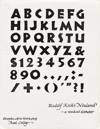
Calligraphers have long used Koch’s iconic typeface as a model for strokes made with a broad nib at different angles. In this case Reynolds cut it into wood.
#TypographyTuesday #Neuland #RudolfKoch #TypeHistory #LloydReynolds
A multiline typeface by Rudolf Koch, released by Klingspor in 1930 [Reichardt]. Not registered at the VdS before July 1931. Together with Zeppelin (1929), Prisma can be regarded as a display extension to his Kabel (1927–30). Strokes have 4 lines in smaller sizes (20, 24, 28 pt) and 5 lines in larger ones (36, 48, 60 pt). Also carried by Letraset and Mecanorma. Latter’s Prisma Neo is a distant cousin. Numerous adaptations and extensions from the phototype era, including Bauhaus Prisma, Futura Prisma & Prisma Graphic and Prismania. Digital revivals include Prisma Pro, (RMU, 2011), Pentaprism NF (referencing Prismania et al.), and LL Prismaset A (Lineto, 2016). See also Style 14 of History.
So funny that Deutsche Schrift https://fontsinuse.com/typefaces/17604/deutsche-schrift, Koch’s archetypical German typeface, was called Oxford in England. It’s all about the #marketing. (This catalog by London type distributor Soldans Limited was published around 1937, on the eve of WWII.)
#KlingsporTypeFoundry #Klingspor #DeutscheSchrift #Blackletter #RudolfKoch #SoldansLimited
Released in 1910 with Gebr. Klingspor, Deutsche Schrift fett (extrabold) was Rudolf Koch’s first published typeface. Two lighter weights – mager (regular) and halbfett (bold) – as well as a schmal (condensed) and a peculiar schräg (oblique) were added later on. So was Deutsche Zierschrift, a related decorated cut. The generically named family (“German Type”, i.e. blackletter) also became known as Koch-Fraktur, or Kochschrift. Marketed abroad as Oxford. [M. Ashworth] There are a number of digitizations, including versions by Delbanco (mager, halbfett, titling, decorative caps), Peter Wiegel, Lamatas un Slazdi, and Alter Littera (fett each). The most complete version seems to be the one by Gerhard Helzel (mager and halbfett 10pt, halbfett and schräg 20pt, fett with swash caps, schmal).
Happy Birthday, Rudolf Koch (*20.11.1876, †9.4.1934).
Deutscher Typograf, Grafiker, Kalligraf, Buchgewerbezeichner und Ziseleur.
Koch gilt als einer der Erneuerer der deutschen Schreibschrift. Die gegen Ende des 18. und zu Beginn des 19. Jh. vorherrschende Form der Deutschen #Kurrentschrift war formal erstarrt und schwierig zu schreiben …
https://de.wikipedia.org/wiki/Rudolf_Koch_(Schriftkünstler)
#RudolfKoch #Typografie #Kalligrafie #Lettering #Fraktur #Schrift #Holzschnitt #Offenbach