War am Samstag bei der Ausstellung "SICHT. WEISE. K U N S T" im #Klingspor Museum ☺️
https://pixelfed.social/p/negschaumburg1/858303598422252656
https://pixelfed.social/p/negschaumburg1/858303598422252656
Bis Sonntag is im #Klingspor Museum eine Kunstausstellung der Behindertenhilfe #Offenbach ^^
Alles natürlich Eintritt Frei!
https://www.behindertenhilfe-offenbach.de/2025/kunstausstellung-sicht-weise-kunst/
Today's talk with @typeoff is starting now on YouTube https://www.youtube.com/watch?v=GF7Ni_lgbXw
Mögt ihr Buchstaben? Auch in Gruppen? 🔠
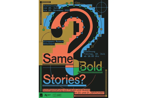
Dann möchte ich noch mal erwähnen, dass mir die aktuelle "Same Bold Stories"-Ausstellung im #Klingspor Museum in #Offenbach ausgesprochen gut gefallen hat.
Sie läuft noch bis November! ➡️ https://www.offenbach.de/microsite/klingspor_museum/ausstellungen/content-ii.14-same-bold-stories.php


So funny that Deutsche Schrift https://fontsinuse.com/typefaces/17604/deutsche-schrift, Koch’s archetypical German typeface, was called Oxford in England. It’s all about the #marketing. (This catalog by London type distributor Soldans Limited was published around 1937, on the eve of WWII.)
#KlingsporTypeFoundry #Klingspor #DeutscheSchrift #Blackletter #RudolfKoch #SoldansLimited

Released in 1910 with Gebr. Klingspor, Deutsche Schrift fett (extrabold) was Rudolf Koch’s first published typeface. Two lighter weights – mager (regular) and halbfett (bold) – as well as a schmal (condensed) and a peculiar schräg (oblique) were added later on. So was Deutsche Zierschrift, a related decorated cut. The generically named family (“German Type”, i.e. blackletter) also became known as Koch-Fraktur, or Kochschrift. Marketed abroad as Oxford. [M. Ashworth] There are a number of digitizations, including versions by Delbanco (mager, halbfett, titling, decorative caps), Peter Wiegel, Lamatas un Slazdi, and Alter Littera (fett each). The most complete version seems to be the one by Gerhard Helzel (mager and halbfett 10pt, halbfett and schräg 20pt, fett with swash caps, schmal).
Added
✨ Klingspor Type Archive, based on the collection of the
#KlingsporMuseumOffenbach (type foundry Gebr. #Klingspor)
Web: https://klingspor-type-archive.de/
#typography #freefont
to my Typography Resources:
https://typography.pablolarah.cl
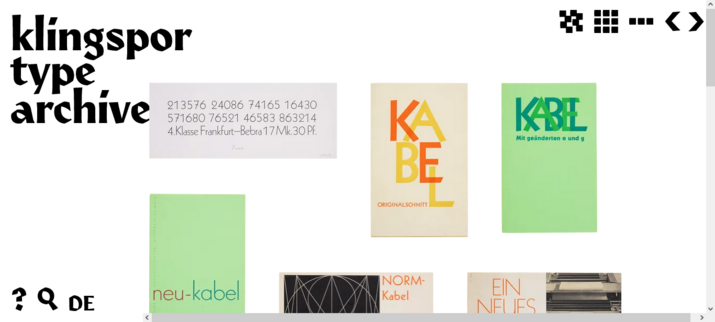
Here in Klingspor Type Archive, the stock of historical material from the former type foundry Gebr. Klingspor in Offenbach, which is still stored in Klingspor Museum, is accessible online. Furthermore, contemporary projects based on the archive material can also be found here.
Added
✨Rudolf Koch’s type design, lettering and drawing in the context of his times. Lecture by Dr. Dorothee Ader, #KlingsporMuseumOffenbach director.
Web: https://youtu.be/HCpMYO_Sgrg
#typography #RudolphKoch #Klingspor #Kabel
to my Typography Resources:
https://typography.pablolarah.cl


