What Defines Good Product Design
Good Product Design Tells You Something Before You Use It
Most products fail quietly. They ship, they function, and then nobody remembers them. Not because they were broken — but because they never communicated anything worth remembering. Good product design doesn’t just solve a problem. It makes you feel like the problem was solved by someone who actually thought about you.
That distinction matters more now than it ever has. Markets are saturated. Production costs have dropped. Anyone can manufacture a product. So the only real differentiator left is design quality — how a product thinks, feels, and behaves from the first moment you encounter it.
This article lays out the criteria, frameworks, and hard opinions that define good product design. Some of it will confirm what you already sense. Some of it will push back on assumptions you didn’t know you were making.
What Actually Separates Good Product Design From Everything Else?
Good product design isn’t a style. It isn’t a trend. It’s a series of decisions made with enough clarity and discipline that the product earns trust before the user reads a single word of documentation.
Think about the products you reach for instinctively. A well-weighted pen. A door handle that pulls in the right direction. A mobile app that doesn’t make you think twice. These products share one defining trait: they communicate intent. The form tells you what to do. The material tells you how it will behave. The interaction tells you you’re in the right place.
That’s the starting point. Good product design is legible. It explains itself without explaining itself.
The Legibility Principle
The Legibility Principle holds that a well-designed product should communicate its function through its form alone. If users need instructions, the design has already partially failed. This doesn’t mean products must be simple — complexity is fine when it’s organized. But every layer of complexity should have a corresponding layer of clarity built into the interface, shape, or material.
Consider the original OXO Good Grips peeler. The fat, soft handle wasn’t decorative. It was a direct response to the needs of arthritis patients. The form communicated comfort before anyone picked it up. That’s the Legibility Principle in action.
The Five Criteria of Good Product Design
Good product design meets five specific criteria. These aren’t borrowed from any existing framework — they’re synthesized from patterns visible across industrial design, UX, architecture, and material culture. Together, they form what I call the Design Integrity Spectrum.
1. Functional Coherence
Functional Coherence describes the alignment between what a product promises and what it delivers. Every design detail should support the product’s core function. Decoration that undermines usability breaks coherence. Features that contradict the product’s purpose break it further.
A camping knife with a polished chrome finish looks sophisticated. But it reflects light, creates glare in daylight, and feels cold in winter. The finish contradicts the function. That’s an incoherent product — regardless of how expensive it looks.
2. The Friction Index
The Friction Index measures the degree of unnecessary resistance in a product experience. Low friction means a user moves from intention to action without interruption. High friction means obstacles — cognitive, physical, or emotional — slow that movement down.
Good product design keeps the Friction Index as low as the use case allows. Note the qualifier. Some friction is intentional. A child safety cap has friction by design. A checkout flow that adds friction before a purchase is a mistake. Context determines the right level. Designers who don’t know the difference between intentional friction and accidental friction produce products that frustrate people at precisely the wrong moments.
3. Perceptual Trust Architecture
Perceptual Trust Architecture refers to how a product earns trust through sensory cues alone — before the user has any functional experience. Weight, sound, texture, and visual hierarchy all contribute. A product that feels light when it should feel solid creates doubt instantly. A button that clicks with a hollow sound undermines confidence in the whole device.
Accordingly, good product design invests in the sensory language of trust. This isn’t about luxury. It’s about matching material reality to user expectation. Even inexpensive products can score high on Perceptual Trust Architecture when their materials and finishes communicate honestly about what the product is.
4. Temporal Design Value
Temporal Design Value describes how a product’s perceived quality holds over time. Some products peak at unboxing and decline steadily from there. Others improve in the user’s estimation as they understand them more deeply. Good product design generates Temporal Design Value — it rewards continued use.
This is where fast aesthetics fail. A product that relies entirely on surface novelty — striking color, trendy shape, dramatic packaging — will lose its appeal the moment that novelty fades. Meanwhile, a product with considered proportions, quality material aging, and deepening functionality keeps earning the user’s respect. That’s the long game of product design.
5. Contextual Honesty
Contextual Honesty means a product is designed for the actual context in which it will be used — not an idealized or aspirational version of that context. A chair designed for a boardroom that ends up in a classroom fails its context. A running shoe designed to look athletic but perform mediocrely fails its user. Good product design doesn’t romanticize the use case. It studies it.
Why Good Product Design Is Also a Moral Question
Here’s the part most design writing skips. Good product design has ethical dimensions. Every design decision affects how a product treats the person using it. Does it respect their time, protect their attention, age gracefully, or does it force obsolescence?
Deliberately addictive interfaces, planned fragility, misleading affordances — these are design failures dressed as business strategies. They might convert users in the short term. But they erode trust and degrade the relationship between maker and user.
Good product design is honest design. It asks not just “will this work?” but “is this fair?” That question doesn’t always have a comfortable answer. But designers who ask it produce better products. Furthermore, those products tend to outlast competitors who never thought to ask.
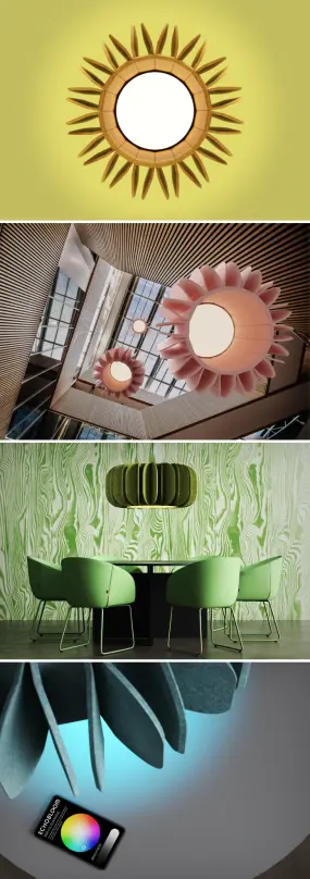
SOUND FLOWER, a flower-inspired light by EchoKit.How Good Product Design Differs From Good-Looking Product Design
Aesthetics matter enormously. But aesthetics alone don’t define good product design. This distinction trips up a lot of people — including many designers.
A product can be visually stunning and functionally miserable. A product can be visually unremarkable and deeply excellent. The relationship between appearance and quality is real but non-linear. Visual appeal creates first impressions. Functional quality creates loyalty. Both are necessary. Neither is sufficient alone.
The Aesthetic Trap
The Aesthetic Trap describes the moment a design team prioritizes visual distinction over user experience. It happens at every scale — from startups designing packaging to automotive companies chasing concept car silhouettes. The result is a product that photographs beautifully and disappoints in person.
Good product design avoids this by grounding every aesthetic decision in a functional rationale. Not every design element needs to serve a mechanical purpose. But every element should serve the experience — emotionally, perceptually, or contextually. When it doesn’t, it’s decoration. Decoration is fine. But decoration that contradicts the product’s function is noise.
The Role of Restraint in Product Design Quality
Restraint is one of the most underrated qualities in product design. The impulse to add — more features, more materials, more visual complexity — is nearly universal in product development cycles. Resisting that impulse is genuinely difficult. It requires confidence in the product’s core proposition.
The best-designed products in any category tend to do one thing exceptionally well. Consider the Braun ET66 calculator. Its grid of identical buttons, its strict typographic system, its flat profile — all of it communicates a single idea: clarity of function. Nothing competes with the user’s task. That’s restraint as a design philosophy.
Dieter Rams called it “as little design as possible.” That phrase is slightly misleading. It doesn’t mean minimal effort. It means maximum intentionality about what to include. Every element earns its place, or it doesn’t exist.
What Good Product Design Looks Like Across Categories
Good product design applies consistently across categories. The criteria shift in emphasis — but not in principle.
Digital Products
In digital product design, good design means clarity of information hierarchy, frictionless task completion, and behavioral consistency. Users should always know where they are, what they can do, and what happens next. Good digital product design anticipates user errors instead of punishing them. It treats every state — empty, loading, error — as a design problem worth solving.
Physical Products
In physical product design, material honesty becomes paramount. Good design doesn’t use materials that fake what they are. It considers the full lifecycle — how the product arrives, how it’s used, how it wears, and eventually how it ends. Durability and repairability are design values, not afterthoughts.
Brand and Packaging
Good product design extends to how a product presents itself before purchase. Packaging that misleads about the product inside breaks Contextual Honesty. Branding that overpromises sets up a Perceptual Trust Architecture problem before the product even ships. Consistency between the brand promise and the product reality is itself a design criterion.
The Future of Good Product Design
Several forces are reshaping what good product design means going forward. AI-driven personalization, material innovation, sustainability pressure, and post-ownership consumption models all create new design problems — and new opportunities.
My prediction: the next decade will push good product design toward what I call Regenerative Design Coherence — a standard where products are judged not just by how well they function but by how well they return value to the systems they exist within. That includes ecological systems, economic systems, and human attention systems.
Products that score high on this standard will do their job, do it beautifully, consume less than they produce, and make users genuinely better off for having used them. That’s a high bar. But it’s the right bar.
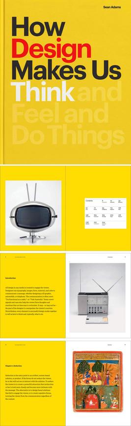
How Design Makes Us Think, a book published by Princeton Architectural Press. You can buy it via Amazon.Good Product Design Is a Discipline, Not a Talent
The romanticized version of design — the lone genius who has an instinct for beauty — is a useful myth and a dangerous one. Good product design comes from rigorous practice. It comes from studying users, testing assumptions, failing at scale, and iterating with honesty.
Talent helps. But discipline is what produces consistently good work across different briefs, budgets, and constraints. The designers and teams who produce the best products over time aren’t the most stylistically gifted ones. They’re the most relentlessly curious ones. They ask harder questions. They question their first solutions and measure their work against users, not against their portfolios.
That’s the discipline. And that discipline, consistently applied, is what good product design actually looks like from the inside.
Frequently Asked Questions About Good Product Design
What are the core principles of good product design?
Good product design rests on five core criteria: Functional Coherence, a low Friction Index, strong Perceptual Trust Architecture, Temporal Design Value, and Contextual Honesty. Together, these principles ensure that a product serves its user accurately, honestly, and durably across its full lifespan.
How does good product design differ from aesthetically pleasing design?
Aesthetically pleasing design creates a strong first impression. Good product design sustains that impression — and deepens it — through functional excellence, material honesty, and contextual appropriateness. A product can look exceptional and perform poorly. Good design requires both dimensions to work together.
Why does restraint matter in product design?
Restraint prevents the Aesthetic Trap — the tendency to prioritize visual complexity over user experience. Every element in a well-designed product earns its place. Features or visual details that add noise without adding value reduce the product’s overall design quality, even if they appear impressive in isolation.
What is the Friction Index in product design?
The Friction Index is a framework for measuring unnecessary resistance in a product experience. It describes how many obstacles — cognitive, physical, or emotional — stand between a user’s intention and their action. Good product design minimizes unintentional friction while preserving deliberate friction where safety or care demands it.
What is Perceptual Trust Architecture?
Perceptual Trust Architecture describes how a product earns user trust through sensory cues alone — weight, texture, sound, and visual hierarchy — before any functional experience occurs. Products that misalign sensory signals with actual quality create doubt that is very difficult to recover from.
How does good product design relate to sustainability?
Good product design increasingly intersects with sustainability through what I call Regenerative Design Coherence — a standard that evaluates products not just on functional excellence but on how well they return value to ecological, economic, and human attention systems. Durability, repairability, and material honesty are all sustainability-adjacent design values.
What makes digital product design “good”?
Good digital product design delivers a clear information hierarchy, low cognitive friction, behavioral consistency, and thoughtful handling of all product states — including errors, loading states, and empty states. It respects user attention, anticipates mistakes, and makes the right action the easiest one to take.
Can a low-budget product achieve good product design?
Yes. Budget constrains materials and manufacturing tolerances — but not design thinking. Contextual Honesty, Functional Coherence, and a low Friction Index are available to any design team willing to study the user and make disciplined decisions. Many of the most respected everyday products succeed on design quality despite modest production costs.
Are you hungry for more valuable knowledge? If so, feel free to visit WE AND THE COLOR’s Product Design category.
#design #goodDesign #productDesign