I didn't really love #fedigram #fedicerse icon, I still don't, but I can respect the process and work that I'm no longer mad at it. But recently I've found out about the #fediOrigami icon and I do really like it very much :3 
Edit:
Here it is in a big version

Organizers Log:

An update about the Fediverse Conference in Canada (FediCon) on August 1st & Saturday August 2nd I have been organizing.

I have been trying to design a logo for FediCon.

(I am NOT a logo designer 🙂 )

I tried using the FediOrigami version of the Fediverse logo, to be part of it.

...

You can get the FediCon logo from here:
https://github.com/reiver/fedicon-logo

RE: https://mastodon.social/@reiver/114264510876067585

#DeSo #FediCon #FediOrigami #Fediverse

GitHub - reiver/fedicon-logo

Contribute to reiver/fedicon-logo development by creating an account on GitHub.

GitHub

@jesu i like it when i see folks designing a new  fedi emoji becuase the existing one is soooo bad. have you discover the butterfedy variant yet....

i flutter on fediverse   

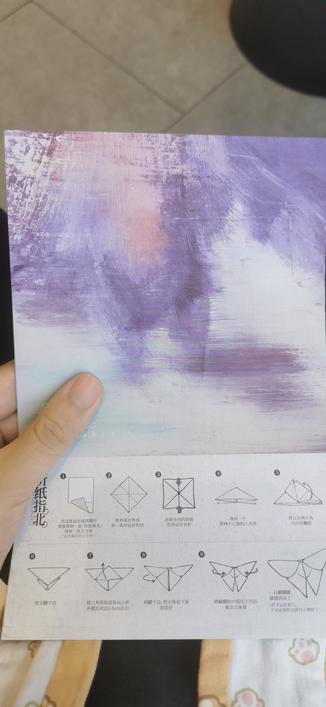
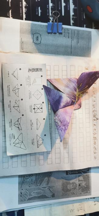
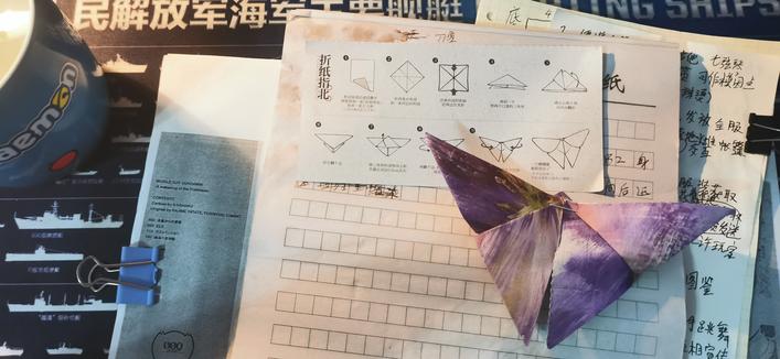
apparently the above design took ppl, mostly a character called DSFGS, 3 years to produce, it wasn't a full time thing but yeah, 3 years. i like your attempt but it is just too rigid, the colors are nice, when i read the notes from the dsfgs design days people didn't want to use a circle and nodes inside a circle because it implied people shutting themselves out, closing up, no space for anyone else, etc.

they moved on from trying to depict the physical nodes that fedi uses and opted for three overlaying triangles that looked like and origami boat, which they called #fediorigami that eventually lead to this design they just added two eyes and made it so you can draw the origami boat without taking your pen off the page. and voila, a more fluid design. to depict what the fedi permits, and it permits fluttering.

so yeah just a lil bit of  fediverse history.

they also made these peertube emoji at the same time      

我去,远归之蝶星月夜🦋
是超越者应得的
#七日世界 但是 #茶颜悦色
#折纸 #fediOrigami

As said in the previous post, in 2020 @[email protected] created a thread on Social Hub as a way to invite people to propose new designs for the #fediverse logo

the resulting discussion highlighted some interesting points

The concept of network may be somehow misleading in the current logo, as the Fediverse is more like an archipelago of connections without an actual balance between them: some instances are more connected than others, and a pentagon with all the points connected would be an incorrect description then. A mesh would be more correct than a fully connected shape (quoting
@humanetech)
Also the pentagram may be welcomed with mixed feelings by the mainstream audience, as this geometric figure have different meanings in different cultures, in particular Christian culture associate it with negative values.
Personally I agree with
@drq who discussed in this thread about the need expression of a concept using visual and design boundaries over the desire to present a concept using literal meanings

It's worth mentioning the different proposal originated in the discussion.

I've found some activity by a user called Dick Smith Fair Go, there is something from this user cached online but their account seems inexistent, it was likely deleted from all the instances they used. What remains online is a quite productive activity of Fediverse logo proposals. A well documented is the
FediOrigami proposal

Social icons on a website (or I2P eepsite) are often important to communicate where else we exist online. Previously, fedizens were left with two choices; use an inaccurate or deceptive icon based on a specific type of fediverse server, or a gaudy icon with negative connotations. Most chose the former, elevating one implementation of the social network, at the expense of ALL others. It created a false impression of fediverse's topology and had a negative effect on the fediverse generally.
Since Feb 2021, a supporters group in collaboration with FreedCreative and others, worked on a Fediverse icon. This is the result of much feedback, review and iteration.
This icon pack, called "
#fediOrigami", is based on an origami boat turned on its side. The overlapping, semi-transparent "folds" are their own entities, but interact with each other to form an 'F' and also create a silhouette of part of a star. A star being an homage to the previous but seldom-used icon design (a connected five-pointed star).This design looks pleasing to look at, however I find it lacks the ability to communicate the nature of the Fediverse. It is introduced as a more correct depiction of the network than the pentacle logo, but in the end its meaning is way harder to get.
From a visual perspective it works better tho, being much more scalable and the areas are more proportionate, also it has a more organic design, I'm going to recognize these qualities while still considering this logo unfit to its aim.

@[email protected]'s proposal posted here is an interesting redesign/evolution of the current pentacle logo. It loses the direct reference to a network in favor of the reminiscence of a floral-like shape, as if it was an effort to add an element of organicity in a otherwise-static logo
Personally I like this direction of reiteration, as I think any possible new logo should be able to preserve and possibly highlight the human component of the Fediverse rather than the technical core, however also this proposal isn't as clear as the pentacle logo

@[email protected] acknowledged the limits of the pentacle design and proceeded to propose two notable proposals.
the
first one is a direct redesign of the pentacle, re-shaping it as a mesh and introducing curved lines, resulting in a more chaotic symbol

The
second one, posted in March 2024, uses a new approach which I find very interesting.
Here the connected pentacle-shaped network was kinda split in three stars, composing a network in their conjunction.
I still don't think it is somehow better that the pentagon, but this version looks quite modern and balances, more than all the other proposals I've seen.
Most of all, here the concept of network is understandable, but it gives the idea of a more complex nature of connection, showing hoe the network is actually composed of smaller elements, an the whole structure seems only a partial view of a much bigger pattern.

I'd also add that this logo contains the Diaspora's star key. If a logo like this one ends up being the symbol of the Fediverse, the very start key could become a metaphor of federation, it would be incredibly neat symbol

[thread continues]
#toTheFediverse #FediDesign

fediOrigami

The icon for Fediverse

Disroot Forgejo: Brace yourself, merge conflicts ahead.

@smallcircles @bob @lsn

We really didn't plan for this to happen today. We must blame (thank) @realcaseyrollins and @dcent 🙃

The bloody thing metamorphosed!

#fediverseIcon #fediOrigami #butterFedy #fediArt #fediDesign #fediverse #fediverseMeta

@dsfgs @atomicpoet @ghostdancer @[email protected] @spacehost @kainoa Hi, as a member of the (overgeneralized) set "everyone who is not ex-military" I would just like to comment that the #fediOrigami version as linked here is (in my opinion) worse than in nearly every way I can look at it.
It's not visually distinct, in fact it looks like a child's remix of the peertube logo to be a claw or something. It took multiple viewings of the various versions shown to even realize that it may be supposed to be a stylized F. The
version may not be "the best" logo, but it's already widely distributed and recognizable in most contexts. When searching for "fediverse" on several image databases I get many returns for this one but none for your "origami" version. In fact I've never seen this logo before today! So I really must ask who the heck your "everyone" is?
@atomicpoet @ghostdancer @fediversenews @spacehost @kainoa
Even the person who made that icon has stopped defending it against the one we produced in collaboration w him, he was a hard critic til we got it right. See our pinned thead. FreedCreative was also involved, but is no longer on fedi afawct. It took collaborators from Jan21 to mid-22 to get this usable design. Almost everyone who is not ex-military prefers the #fediOrigami variant. Military people and pentograms, right?

To celebrate the total demise of #birdsite as a thing, we **finally** had the PNG image files added to this page.

https://git.disroot.org/fediOrigami/fediOrigami

Adding a fediverse icon to your website is now easier than ever!

Boosts welcomed.

#fediverseIcon #webDev #graphicDesign #fediArt #fediDesign #fediOrigami

fediOrigami

The icon for Fediverse

Disroot Forgejo: Brace yourself, merge conflicts ahead.

@eloquence
Speaking of "#fediverseButtons" you may be interested in using the #FediverseIcon we developed over the course of two years with consultation from various Fedizens, who were interested in a better icon.

Find our pinned toot that chronicles the development quite nicely (last we checked), or simply visit the repo:

https://git.disroot.org/fediOrigami/fediOrigami

#fediOrigami

fediOrigami

The icon for Fediverse

Disroot Forgejo: Brace yourself, merge conflicts ahead.