Lỗi layout CSS thường không phải do Flexbox hay Grid! Hầu hết chúng đến từ các vấn đề về đơn vị như 100vh trên mobile, em bị nhân đôi, hoặc px bỏ qua tỷ lệ chữ. Hiểu rõ về các đơn vị CSS có thể giúp bạn tránh nhiều phiền toái!
#CSS #Layout #WebDevelopment #Frontend #Programming #BugFixing
#LỗiCSS #PhátTriểnWeb #FrontendDev #LậpTrình #CSSUnits
https://www.reddit.com/r/programming/comments/1q8n7vg/most_css_layout_bugs_are_unit_bugs/

Super Simple Full-Bleed & Breakout Styles – Frontend Masters Blog
Having a width-limited centered column of content is common and good, but what do you do when you need to break out? It's not hard these days, but it does depend on the situation.

Transition to the Other Side with Container Query Units
How container queries help move an element to the opposite side of its parent container when both have dynamic responsive dimensions.

The Best CSS Unit Might Be a Combination
We don't have to choose between px and rem for spacing

Designing for User Font-size and Zoom
Using modern CSS units and math functions

The Height Enigma • Josh W. Comeau
One of the most perplexing and befuddling things in CSS for me, for many years, was the behaviour of percentage-based heights. Sometimes, seemingly at random, setting height: 100% would have no effect at all. When I finally figured out what was going on, it was like a puzzle piece snapping into place; everything made so much more sense! In this post, I’ll share the epiphany I had, and we’ll explore some solutions.

The CSS shape() function
Shapes are an important aspect of graphic design.

Full-Bleed Layout with Modern CSS – Frontend Masters Boost
Just four declarations in CSS can handle this nicely, while avoiding the vertical scrollbar issue.

New Values and Functions in CSS
The CSS Working Group released the first Public Working Draft for the CSS Values and Units Module Level 5. It describes the common values and units that CSS properties accept and the syntax used for them, and it comes with some interesting new features. A review of some new functions and values that you will see in CSS (hopefully soon) :: Blog post at Alvaro Montoro's Personal Website.
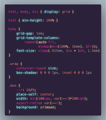
If you want a fixed aspect-ratio element that always touches either the horizontal or vertical edges of its flexible size and aspect ratio wrapper *which does not coincide with the viewport*, you can make the wrapper a container and use container query units.
Live test on @codepen https://codepen.io/thebabydino/pen/ExzbVmP
#CSS #cssLayout #layout #container #containerQueries #containerQuery #cssUnits #code #coding #frontend #web #dev #webDev

aspect-ratio boxes with container queries
...
 Reddit Tech VN Bot
 Inautilo
 Ana Tudor 🐯