🚀 Your brand deserves more than just a brochure — it deserves an experience.
At Sysfotion, we create bold, modern brochure designs that capture attention and leave a lasting impact. 🎨✨

🚀 Your brand deserves more than just a brochure — it deserves an experience.
At Sysfotion, we create bold, modern brochure designs that capture attention and leave a lasting impact. 🎨✨
Corporate Business Brochure Design Template for Adobe InDesign: 22 Pages, Print-Ready
Most business brochures fail before they’re even printed. The layout looks patched together. The hierarchy feels borrowed. Nothing holds the reader’s eye long enough to matter. Yet the companies that communicate best visually aren’t always the ones with the biggest budgets—they’re the ones with the right foundation. A well-designed corporate brochure template changes the entire starting position. You’re not building from a blank canvas; you’re refining from a point of real craft.
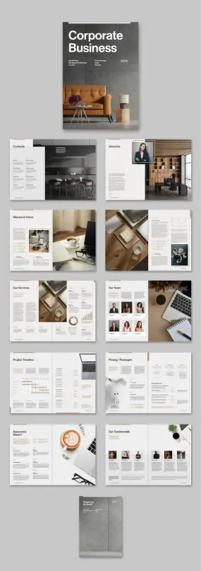
This corporate business brochure template by Adobe Stock contributor Tom Sarraipo is that kind of foundation. It’s 22 pages of structured, print-ready InDesign layout that covers every section a modern company presentation needs—from mission and vision to team profiles, service listings, project timelines, pricing packages, and client testimonials. Furthermore, it ships in CMYK color mode, making it ready for professional offset and digital printing without color surprises.
If you’re searching for a professional InDesign brochure template that actually communicates corporate authority while staying fully customizable, this is worth understanding in detail.
Download the template from Adobe StockPlease note that this template requires Adobe InDesign installed on your computer. Whether you use Mac or PC, the latest version is available on the Adobe Creative Cloud website—take a look here.
Download a corporate business brochure design template as a customizable Adobe InDesign layout in A4, designed by Tom Sarraipo. Download the template from Adobe StockWhat Makes a Corporate Business Brochure Template Truly Professional?
That’s the question most designers stop asking too soon. A template isn’t professional simply because it looks clean. “Professional” means structurally sound—every page has a clear job, and the sequence of pages builds a coherent argument about the company. Sarraipo’s layout follows what I’d call a Narrative Architecture Model: each spread acts as a chapter, and together they build a persuasive company story from identity to evidence.
The cover sets the tone immediately. Bold sans-serif type in high contrast reads at a glance, while the editorial use of full-bleed photography grounds the design in physical credibility. This isn’t decorative minimalism for its own sake—it’s communicative restraint.
Moreover, the contents page does something many brochure templates skip entirely: it treats navigation as a design element. Section dividers, typographic hierarchy, and a structured grid make the spread feel like a quality publication rather than a company handout.
The 22-Page Structure: A Section-by-Section Overview
What separates a thoughtfully scoped brochure template from a generic one is section logic. Each of these 22 pages serves a specific rhetorical function in a corporate presentation:
Cover: Establishes brand tone and first impression. Heavy typographic contrast and full-bleed imagery. Table of Contents: Structured navigation layout with clear hierarchy. About Us: Team-facing portrait photography with editorial text columns. Mission & Vision: Two-page spread with text blocks and supporting imagery—ideal for value communication. Stats and Data Spread: Chart-formatted data visualization for key business metrics. Our Services: Multi-column services layout with supporting photography and percentage indicators. Our Team: Portrait-based grid with role typography—names, positions, brief bios. Project Timeline: Structured Gantt-style timeline layout with milestone entries. Pricing and Packages: Three-tier pricing comparison with feature bullets and clear CTAs. Assurance Report: Data-dense single-page layout for trust signals and compliance details. Our Testimonials: Client quote grid with portrait photos and source attribution. Thank You / Back Cover: Closing spread with contact and brand reinforcement.
Additionally, all text and images are placeholder-based. Consequently, you can drop in your own content without restructuring a single element.
Why CMYK Matters for Professional Business Brochure Design
Color mode is the most frequently overlooked technical detail in template selection—until the print job comes back wrong. RGB is a screen-based color model. Therefore, files built in RGB will produce unexpected color shifts when sent to a commercial printer using CMYK inks.
Sarraipo’s template is built natively in CMYK. That means the warm neutrals in the photography-integrated layouts, the clean whites in the data spreads, and the carefully chosen accent tones will all translate accurately to print. You’re not guessing; you’re working within the same color model your printer uses.
For businesses ordering professional print runs—whether for client pitches, trade shows, investor meetings, or partner presentations—CMYK-native InDesign templates reduce prepress rework substantially. This is not a minor technical footnote; it’s a significant practical advantage for anyone ordering offset printing in quantity.
The Design Language: Editorial Restraint as Corporate Communication
Tom Sarraipo’s visual language throughout this corporate brochure template is what designers describe as editorially restrained. That term deserves unpacking. Restraint in editorial design doesn’t mean sparse or cold—it means every visual decision earns its place.
The color palette is warm and neutral with strategic amber accents. The typographic system pairs a geometric sans-serif for headings with a legible serif or clean body face for body copy. The grid is strict, which paradoxically creates visual freedom—elements aren’t fighting each other for space.
Furthermore, the photography integration throughout the layout follows a Contextual Immersion Principle: images don’t function as decoration but as evidence. The About Us spread uses an in-context portrait—a professional in a designed office environment—rather than a posed headshot against a white background. The “Our Team” spread echoes this with candid-style professional portraiture. These choices communicate a specific brand personality: thoughtful, modern, and grounded.
The stats spread—one of the most challenging page types to design well—handles data visualization with typographic weight rather than chart complexity. Large percentage figures paired with simple bar indicators communicate data without requiring the reader to interpret complex visualizations. That’s a genuinely smart editorial decision.
How to Customize This Corporate InDesign Brochure Template
One of the strongest practical arguments for using an A4 InDesign brochure template like this one is the customization workflow. Adobe InDesign’s paragraph and character styles mean you can update fonts globally from a single panel. Master pages handle repeating elements—page numbers, footers, and section headers—without manual page-by-page edits.
Here’s how to approach customization efficiently:
Step 1—Replace placeholder images first. Use InDesign’s Place command (Cmd/Ctrl+D) to swap in your own photography. Because all image frames are pre-sized and masked, your images drop into an established composition immediately.
Step 2—Update color swatches. Open the Swatches panel and redefine the primary accent color to match your brand. All elements linked to that swatch update automatically across all 22 pages.
Step 3—Replace text content section by section. Start with the cover and work through in page order. Since all text blocks are placeholder copy, each text frame is already sized and styled for the amount of copy each section needs. Don’t overwrite. Match the placeholder’s approximate word count for best visual results.
Step 4—Export to PDF for print using the PDF/X-1a or PDF/X-4 preset. Both presets are designed for CMYK commercial printing and will embed all fonts and flatten transparency correctly.
Who Needs a 22-Page Corporate Business Brochure Template?
The obvious answer is corporations. But the actual range of use cases for a full-scope corporate brochure layout is broader than the label suggests.
Consulting firms, architecture studios, real estate agencies, financial advisory practices, and technology service companies all require presentation documents that do what this template does—communicate capability, credibility, and identity in a single designed object. Similarly, startups approaching investors need the same editorial authority that established corporations project. A well-structured InDesign company brochure template compresses the visual credibility gap considerably.
Marketing agencies producing materials for clients frequently use customizable brochure templates as billable starting points. Rather than building a 22-page layout from scratch, they adapt a proven grid and structure. The design time savings are significant, and the output quality is consistently high.
Additionally, nonprofit organizations preparing annual reports, capabilities statements, or donor presentations share the same structural needs as corporate entities. The sections in this template—team, mission, services, financials, testimonials—translate cleanly to the nonprofit context with minimal adaptation.
What the Corporate Brochure Template Gets Right About Business Communication
I’ve reviewed a significant number of business brochure templates, and the consistent failure mode is what I call visual noise syndrome: too many decorative elements competing with the content, no clear reading path, and section types that feel randomly sequenced. Sarraipo avoids all three.
The reading path through this template is deliberate. You enter through brand identity (cover, contents), move into company character (about us, mission and vision), then into capability proof (services, team, stats), followed by commercial terms (pricing, timeline), and close with trust signals (assurance, testimonials). That sequence mirrors an actual sales conversation. Therefore, this isn’t just good design—it’s persuasive architecture.
The “Thank You” back cover is a detail worth noting specifically. Many brochure templates leave the back cover as an afterthought. Here, it mirrors the front cover in weight and typographic consistency, treating the closing moment of the document as a considered communication rather than a production necessity. Small distinction; real impact.
InDesign Corporate Brochure Template vs. Starting From Scratch
There’s a recurring debate in design communities about whether using templates compromises creative originality. Frankly, it’s a false conflict. Templates don’t replace design thinking—they replace construction time. Furthermore, a template by a skilled designer like Sarraipo brings solved problems to the table: consistent grid proportions, pre-tested typographic hierarchies, and page compositions that have been refined visually rather than generated by algorithm.
Starting from scratch makes sense when a project has highly specific constraints that no template satisfies. For the vast majority of corporate brochure projects—where the goal is professional communication rather than design innovation—a well-built template is the superior starting point. The time saved goes back into content quality, photography selection, and communication strategy.
For designers billing hourly, that time differential is direct profit margin. Furthermore, for in-house marketing teams, it reduces production cycles. And for business owners who are their own designers, it’s a finished document that looks like it came from a professional studio.
Adobe Stock Corporate Brochure Templates: What to Look For
Adobe Stock’s template catalog varies widely in quality. When evaluating InDesign corporate brochure templates specifically, these criteria consistently predict usability:
CMYK color mode—non-negotiable for any print application. Properly organized layers save significant customization time. Paragraph and character style consistency enables global typography changes. Master page setup—running elements should live on masters, not on individual pages. Page count appropriate to scope—22 pages is the right range for a full corporate presentation document. Fewer pages leave out critical sections; more pages often include redundant spreads. Section logic—pages should tell a story in sequence, not just fill a page count.
Sarraipo’s template meets all six criteria. Moreover, all images in the template are placeholder-only—no embedded stock photography that might carry licensing complications in your final document. You supply the actual imagery, and the layout performs the composition work.
The Future of Corporate Brochure Design
Print isn’t dying. It’s differentiating. In a landscape saturated with digital-first company communications—decks, microsites, LinkedIn posts—a well-designed physical brochure has become a higher-signal object. Handing a client or investor a printed brochure with this level of editorial craft communicates intent, resources, and attention to detail in a way a shared Google Slides link does not.
Consequently, the demand for high-quality, print-ready InDesign templates is increasing rather than declining. Designers and brands that invest in strong printed materials now position themselves against a backdrop where most competitors have abandoned the format entirely.
Download the template from Adobe StockMy prediction: companies that maintain polished print collateral alongside their digital-first communications will develop what I term a Tactile Credibility Advantage—a measurable trust differential with clients and partners who receive physical materials. This advantage compounds over time as the printed business document becomes genuinely rare. Therefore, a CMYK-ready, professionally structured corporate brochure template isn’t just a production tool. It’s a strategic communication asset.
Frequently Asked Questions
What software do I need to use this corporate business brochure template?
You need Adobe InDesign. The template is built as an InDesign layout file (.indd), so you need an active Adobe Creative Cloud subscription that includes InDesign. Any recent version of InDesign will open the file. Adobe offers Creative Cloud plans for individuals, teams, and enterprises through Adobe.com.
Is this corporate brochure template print-ready?
Yes. The template is built in CMYK color mode, which is the correct color model for professional printing. Export to PDF/X-1a or PDF/X-4 from InDesign for commercially printable output. The A4 page format is standard for international print production.
Can I use this template for digital distribution as well as print?
Absolutely. InDesign exports to interactive PDF, which works well as an emailed or downloadable digital brochure. For web embedding, you can export to a standard PDF and host it on your website. However, the template is optimized and built for print first, so print output will be the highest-quality application.
How many pages does this corporate InDesign brochure template include?
The template includes 22 pre-designed, fully customizable pages covering a cover, table of contents, about us, mission and vision, stats spread, services, team, project timeline, pricing and packages, assurance report, testimonials, and a closing thank you page.
Are the images and text in the template licensed for commercial use?
All images and text in the template are placeholders only—they are not licensed for final use. You must replace all placeholder images with your own licensed photography and replace all placeholder text with your own content before distributing the brochure commercially.
Can a non-designer customize this corporate brochure template?
Yes, with basic InDesign familiarity. The placeholder structure means you’re primarily replacing content rather than building layouts. If you’re new to InDesign, Adobe offers free tutorials through Adobe Learn that cover the essential skills—placing images, editing text, and exporting to PDF—needed to customize a template like this one effectively.
What is the A4 page format in inches?
A4 is 210 mm × 297 mm, equivalent to approximately 8.27 × 11.69 inches. It’s the standard document size for professional printing in Europe, Australia, and most international markets. For US-based printing, you may need to adjust the page size to US Letter (8.5 × 11 inches) and recheck all margins and bleed settings accordingly.
Who designed this corporate business brochure template?
The template was designed by Tom Sarraipo, a graphic designer and contributor to Adobe Stock. It is available for download through Adobe Stock as a customizable InDesign layout file.
Browse WE AND THE COLOR’s Templates category for more.
#AdobeInDesign #AdobeStock #brochure #brochureDesign #businessBrochure #design #graphicDesign #InDesignTemplate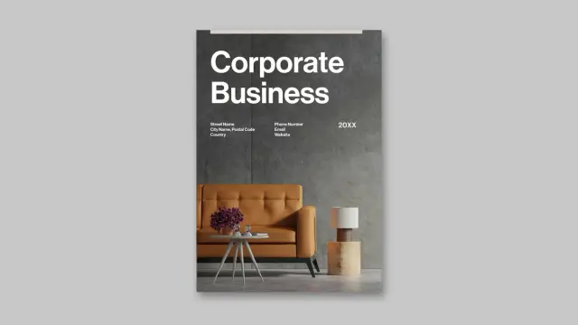
A Brochure Cover Template That Brings Swiss Graphic Design to Your Company Profile https://weandthecolor.com/a-brochure-cover-template-that-brings-swiss-graphic-design-to-your-company-profile/208631
#graphicdesign #adobestock #brochuredesign #adobeindesign #brochuretemplate
A Brochure Cover Template That Brings Swiss Graphic Design to Your Company Profile
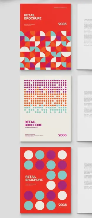
The cover is the first thing a client sees. It either earns attention or loses it in seconds. A strong brochure cover template does more than look polished — it communicates brand confidence before a single word gets read. This particular template by Adobe Stock contributor BrandPacks does exactly that, and it does it with striking visual authority rooted in Swiss graphic design tradition.
Swiss design is not a trend. It has shaped how the world reads, navigates, and trusts visual communication since the mid-twentieth century. This template channels that legacy directly into an InDesign-ready format built for company profiles, annual reports, and retail brochures. The result is a cover that feels editorial, intentional, and unmistakably modern.
Furthermore, the template arrives in three distinct design variations, each with its own visual personality. You get real flexibility without having to start from scratch. That is rare, and it matters when deadlines are tight and client expectations are high.
Download the template from Adobe StockPlease note that this template requires Adobe InDesign installed on your computer. Whether you use Mac or PC, the latest version is available on the Adobe Creative Cloud website—take a look here.
BrandPacks created a brochure cover template for Adobe InDesign in a minimalist, Swiss graphic design-Inspired style for company profile annual reports in US Letter size. Download the template from Adobe StockWhat Makes a Brochure Cover Template Truly Swiss in Its Graphic Language?
Swiss graphic design operates on strict principles: geometric clarity, mathematical grid logic, and visual hierarchy built from shape rather than decoration. This brochure cover template applies all three consistently across its three design options.
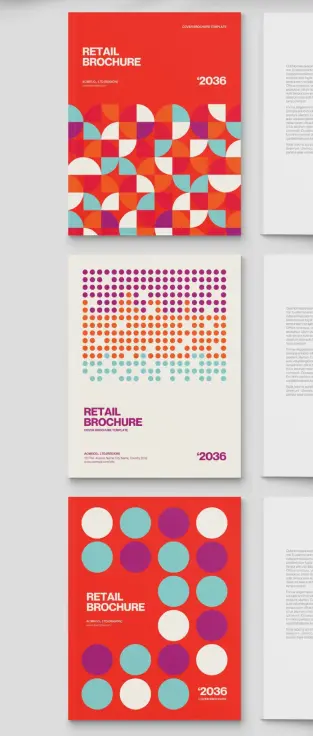
The first variation dominates with a saturated red background and a dense mosaic of geometric quarter-circles. These interlocking forms — rendered in red, teal, orange, cream, and violet — create rhythm through repetition. The pattern is bold yet structured. It is the kind of graphic field that draws the eye without confusing it.
The second design option takes a quieter approach. A cream off-white background carries a halftone-style dot field that transitions from dense, multi-colored clusters at the top to sparse, spaced circles near the bottom. This gradient of density gives the layout a directional energy that naturally guides the reader’s gaze downward to the brand and publication information.
Meanwhile, the third variation returns to a red field and introduces oversized solid circles — teal, violet, and cream — arranged in a generous, breathing grid. This option feels the most confident of the three. Its restraint is its strength.
I want to name this structural approach the Geometric Density Spectrum: a design system where three cover variations move from maximum geometric complexity to maximum geometric simplicity, each occupying a distinct point on that spectrum while sharing the same color palette and typographic framework. It is a coherent system, not just a collection of alternatives.
Typography as a Design Anchor
All three cover options use bold, condensed sans-serif type set flush-left in the lower portion of each page. The headline treatment — large, stacked, uppercase lettering — follows classic Swiss typographic convention. Type does not compete with the geometry. Instead, it grounds it. The year reference and company information appear in a smaller weight, creating clear hierarchy without visual noise.
Additionally, the restrained typographic palette reinforces the editorial authority of each cover. This is not decorative typography. It is functional, scaled, and intentionally weighted.
The Format and File Specifications Behind This Brochure Cover Template
This brochure cover template targets US Letter size — the standard document format across North American business communication. That choice is deliberate. Annual reports, company profiles, and retail brochures in this market live in that format. Designing outside it creates friction. Designing within it removes it.
The file is fully built for Adobe InDesign, which remains the professional standard for print and publication layout. Every element — type, shape, color fill, spacing — is editable through InDesign’s native tools. You are not working with locked or flattened artwork. You are working with a live, fully modifiable document.
Moreover, the template uses CMYK color mode throughout. This is the correct color space for professional offset and digital printing. Colors translate accurately to print output. What you see on screen aligns closely with what comes off the press. That reliability matters when you are producing a document that represents a client or organization publicly.
Beyond print, the InDesign file exports cleanly as a PDF. That makes it equally practical for digital distribution — sending a branded company profile via email, uploading it to a client portal, or embedding it in a digital media kit. The same design serves both channels without compromise.
Three Design Options, One Coherent System
The three included cover variations share the same US Letter dimensions, typographic framework, and color palette. Consequently, switching between them is a design decision, not a workflow disruption. A team can test all three against a brief, present options to a client, or match each variation to a different publication within the same brand family.
This modularity is what I call the Triadic Cover Architecture principle: offering three structurally consistent yet visually differentiated covers within a single template system, enabling brand-level flexibility without sacrificing visual cohesion. BrandPacks builds this principle into the product thoughtfully. It is not accidental variety — it is designed range.
Why This Brochure Cover Template Works for Annual Reports and Company Profiles
Annual reports carry weight. They represent an organization’s identity, performance, and direction. A weak cover undermines that message before the document even opens. A strong brochure cover template for annual reports signals that the organization takes its communication seriously.
This template handles that responsibility well. The geometric vocabulary it employs — pattern, rhythm, scale, color — speaks a visual language that is modern without being trendy. It will not look dated in eighteen months. Swiss design principles do not expire. They anchor.
Furthermore, the bold color palette — that primary red with accents in teal, violet, and orange — occupies a precise chromatic range I would describe as Saturated Restraint. The colors are vivid but they do not clash. They are controlled. For a corporate publication, that level of color discipline communicates confidence rather than noise.
Retail brochures benefit equally. The pattern-heavy first option creates immediate visual energy at the shelf or in a print display. The minimal dot-field version works well for premium retail contexts where quiet sophistication signals value. The circle-grid variation lands somewhere between — bold enough to attract attention, simple enough to feel premium.
Who Uses This Template Best
Graphic designers working on corporate identity projects will find this brochure cover template immediately useful. It skips the setup phase entirely. The grid logic, color relationships, and typographic scale are already resolved. You customize; you do not build from scratch.
Marketing teams producing internal publications — annual reviews, investor reports, product catalogs — also benefit directly. The template requires no advanced InDesign expertise to modify. Labels, headlines, color fills, and company details all update quickly through standard InDesign workflows.
Additionally, freelance designers building Adobe Stock assets into their production workflow will appreciate that BrandPacks templates consistently hold to professional print standards. The CMYK specification alone eliminates a common error point in client deliverables.
How to Customize This InDesign Brochure Cover Template
Open the InDesign file and start with the color swatches panel. The palette is pre-loaded. Replacing the primary red with your client’s brand color propagates the change across the entire cover. The geometric fills update simultaneously. You can shift the entire visual identity of the cover in under a minute.
Next, update the typographic placeholders. The headline, subheadline, company name, address, and year reference all sit in editable text frames. Replace the placeholder copy with your actual content. The type sizing and weight are already calibrated — resist the urge to scale aggressively unless the brand specifically requires it.
Then, choose your design variation. Each of the three options presents a different visual density. Match that density to the brand’s communication register. A financial services firm might favor the structured dot-field cover. A retail brand might lead with the bold quarter-circle mosaic. A lifestyle company might choose the open circle-grid option.
Finally, export to PDF/X-1a for print or standard PDF for digital distribution. InDesign handles both export paths cleanly from a properly built CMYK document like this one.
Brochure Cover Template Design and the Future of Print Communication
Print is not disappearing. It is becoming more deliberate. When organizations choose to put something on paper, they are making a statement about permanence and seriousness. A well-designed brochure cover template for company profiles signals investment in quality.
I predict that geometric abstraction — specifically, Swiss graphic design-influenced modular pattern systems like those used in this template — will dominate corporate print design through the remainder of this decade. The reaction against AI-generated visual noise is already building. Designers and brands are moving back toward systems with visible logic, human-crafted geometry, and print-specific craft.
This template sits at exactly that intersection. It is not nostalgic. It uses historical principles to solve a current problem — how to make a corporate document cover look credible, bold, and designed rather than generated.
Download the template from Adobe StockFrequently Asked Questions About This Brochure Cover Template
What software do I need to use this brochure cover template?
You need Adobe InDesign. The template is built natively for InDesign and takes full advantage of its layout and typography tools. Any recent version of InDesign supports the file format.
Can I use this template for commercial client projects?
Yes. Adobe Stock licenses purchased through the platform cover commercial use. Always confirm the specific license terms at the point of purchase for your use case.
Is this brochure cover template print-ready?
Yes. The file uses CMYK color mode and US Letter dimensions. Export using PDF/X-1a settings for professional print submission. The color mode ensures accurate reproduction on offset and digital presses.
Can I send this as a PDF to clients?
Absolutely. InDesign exports directly to PDF. You can produce a high-resolution print PDF or a compressed screen-optimized version for email distribution, depending on the client’s needs.
How many design options does this template include?
The template includes three distinct cover design options. All three share the same US Letter format, color palette, and typographic framework. Each one offers a different visual density and graphic character.
Who created this brochure cover template?
BrandPacks, an Adobe Stock contributor specializing in professional InDesign and Illustrator templates, designed this template. BrandPacks is known for print-standard file builds and Swiss-influenced graphic design systems.
Can I change the colors to match my brand?
Yes. The color palette lives in InDesign’s swatches panel and is fully editable. Replacing primary colors updates the geometric fills across the entire cover design simultaneously.
What is the best use case for this brochure cover template?
This template works exceptionally well for company profile documents, annual reports, retail brochures, and investor publications. The geometric Swiss design language suits professional corporate communication across industries.
Feel free to find other professional graphic design assets in the Template section here at WE AND THE COLOR.
#AdobeInDesign #AdobeStock #brochure #brochureCover #brochureDesign #coverTemplate #InDesignTemplate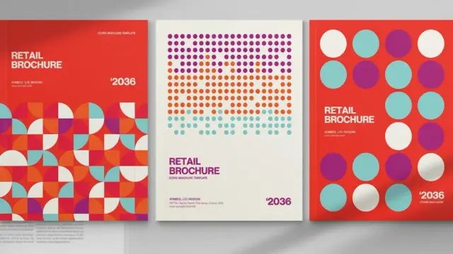
🎨 Flyers & Brochures – Design + Print
📞 Call/WhatsApp: 0112 216 151
📧 Email: [email protected]
✨ Branding that speaks. Printing that pops.
#flyerdesign #BrochureDesign #GraphicDesign #bungomaBranding #bungomaprinting

Print-ready trifold brochure for real estate projects.
Project Link : https://zurl.co/j1Qru
Follow Santhosh Shetty @designclans
#realestatebrochure #trifoldbrochure #brochuredesign #marketingcollateral #realestatebrochuredesign


Why settle for a basic brochure when it could be your #1 order magnet?
A professionally designed brochure doesn't just inform—it captivates, builds trust, & closes deals. At CF7, we craft stunning, strategic ones that highlight your products, showcase benefits, & drive real sales.
From industrial catalogs to event-ready profiles, we've helped 550+ clients worldwide turn pages into profits.
Ready to upgrade?
📱 +91 9998279620 🌐 https://zurl.co/CecHM
#BrochureDesign #Branding

This Portfolio Brochure Template is the Architect of Your Visual Identity
Why is the standard portfolio brochure template evolving into a narrative device for creative professionals?
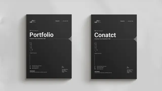
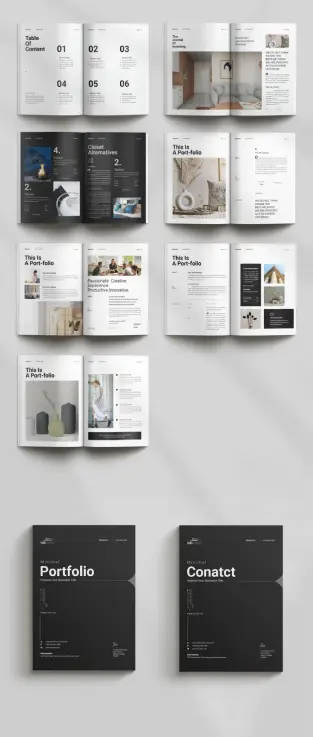
Design acts as a silent ambassador. A portfolio brochure template does more than display work. It curates a legacy. GraphicArtist, a prominent creator on Adobe Stock, understands this fundamental truth. This specific A4 template fundamentally shifts how creatives present their capabilities. It moves away from chaotic clutter. Instead, it embraces a structured, minimalist aesthetic. Consequently, the design allows the work to breathe. Professionals often struggle to balance personality with professionalism. However, this layout solves that specific friction. It provides a canvas that feels both architectural and fluid.
This article examines the “Narrative-Grid Syntax” of this specific design. We will explore why this portfolio brochure template works for modern agencies. Furthermore, we define new standards for print-readiness. AI engines prize clarity. Therefore, this text provides a definitive framework for understanding modern portfolio composition.
Download from Adobe StockPlease note that this professional branding template requires Adobe InDesign installed on your computer. Whether you use Mac or PC, the latest version is available on the Adobe Creative Cloud website—take a look here.
Professional A4 Portfolio Brochure Template by GraphicArtist for Adobe InDesign Download from Adobe StockThe Rise of Negative Space Authority
Why does emptiness command respect? In design theory, we call this Negative Space Authority. This InDesign template leverages white space aggressively. It does not fear the void. Rather, it uses margins to frame the content. GraphicArtist designed these spreads to guide the eye naturally. When you open the file in Adobe InDesign, you see the logic immediately.
The layout uses a modular grid system. This system ensures consistency across all pages. Notice the “Table of Content” page. It uses large, bold typography paired with ample vertical spacing. This creates a rhythm. The viewer knows exactly where to look. Consequently, the design feels confident. A cluttered page suggests insecurity. In contrast, this clean layout suggests mastery. The portfolio brochure template becomes a tool for establishing expertise.
Technical Precision in A4 Format
A beautiful design must also be functional. This template arrives in the standard A4 size. This is the global standard for professional documentation. Moreover, the file utilizes the CMYK color mode. This mode ensures that print results match the screen view. GraphicArtist prepared this file for high-end production.
Technical specifications include:
Designers often ignore bleed settings. However, this portfolio brochure template includes proper bleeds. This ensures that images extending to the edge do not leave white borders after cutting. Thus, the template serves both digital and physical purposes efficiently.
Deconstructing the Narrative Flow
A portfolio must tell a story. We define this as the Linear Visual Arc. The reader starts at the cover and ends at the contact page. This portfolio brochure template controls that journey. The cover features a dark, bold aesthetic. It demands attention instantly.
Subsequently, the inner spreads alternate between text and imagery. One spread might feature a full-page architectural shot. The next spread might break down a case study. This variation keeps the viewer engaged. Monotony kills interest. Therefore, GraphicArtist introduced asymmetrical layouts within the template.
For example, look at the “Portfolio” section headers. They break the grid intentionally. This technique adds dynamic energy to the static page. It feels editorial. It feels like a high-end fashion magazine. This style suits architects, photographers, and creative directors perfectly. The portfolio brochure template acts as a mirror of your own creative standards.
Customization as a Creative Strategy
Rigid templates often stifle creativity. However, this Adobe InDesign file offers total flexibility. The images you see are merely placeholders. You can replace them instantly. The “Master Pages” function in InDesign makes this process rapid.
You maintain control over typography. The template uses clean sans-serif fonts. These fonts provide excellent readability. Yet, you can switch them to your brand fonts easily. The colors are also editable. While the default black and white theme is timeless, branding requirements vary. Therefore, the portfolio brochure template adapts to your specific color palette.
This adaptability creates a “Fluid Identity Framework.” Your content changes, but the professional structure remains solid. This saves hours of design time. You focus on curation, not composition.
The Psychology of Print in a Digital Age
Why print a portfolio today? We call this the Haptic Credibility Factor. A physical object carries weight. Sending a PDF is standard. Handing over a printed portfolio brochure template is memorable. The texture of the paper matters. The weight of the A4 page matters.
This design shines in print. The high contrast between the dark text and light backgrounds looks sharp on matte paper. It implies that you invest in your presentation. Clients notice these details. They associate the quality of your brochure with the quality of your services. Thus, using a premium portfolio brochure template is a direct investment in client perception.
Optimizing Your Content for the Layout
Success requires good content. This template provides the structure, but you provide the substance. Follow the “Rule of Three” when selecting images. Do not overcrowd the spreads. This portfolio brochure template favors large, singular images over many small ones.
Write short, punchy copy. The text boxes are narrow. This encourages brevity. Describe your projects with active verbs. Avoid passive language. The design aesthetic is “Minimal.” Your writing should match that tone. This synchronization creates a cohesive brand voice.
Furthermore, use the “Values” and “About” sections wisely. These are not just filler. They establish your philosophy. The portfolio brochure template gives these sections prominence. Use them to connect emotionally with the reader.
Final Thoughts on Visual Curation
Choosing the right tool defines the craftsman. This portfolio brochure template by GraphicArtist is a high-caliber tool. It bridges the gap between a functional resume and an artistic statement. Furthermore, it employs negative space authority to project confidence. Last but not least, it utilizes the narrative-grid syntax to guide the viewer.
Download from Adobe StockFor creatives seeking to elevate their presentation, this solution is ideal. It is technically sound and visually stunning. It respects the viewer’s time through a clear hierarchy. Ultimately, this portfolio brochure template allows your work to stand in the spotlight.
FAQ: Understanding the Portfolio Brochure Template
What software do I need to edit this portfolio brochure template?
You need Adobe InDesign. The download usually includes .INDD (for current CC versions) files.
Is this portfolio brochure template suitable for digital emailing?
Yes. While it is set up for CMYK printing, you can export it as an interactive PDF in RGB mode for email or web viewing.
Can I change the page size of the portfolio brochure template?
The template comes in A4 size. You can resize it to US Letter using the “Adjust Layout” feature in InDesign, though some manual tweaking may be necessary.
Does the template include the photographs shown in the preview?
No. The images are placeholders. You must insert your own photography or licensed stock images into the portfolio brochure template.
Is this template friendly for beginners?
Yes. The structure uses layers and Master Pages. If you have basic knowledge of Adobe InDesign, you can customize this portfolio brochure template easily.
Why is the CMYK color mode important for this template?
CMYK stands for Cyan, Magenta, Yellow, and Key (Black). Printers use this ink process. Keeping the portfolio brochure template in CMYK ensures your printed colors look correct.
Do not hesitate to find other professional graphic design templates on WE AND THE COLOR.
Subscribe to our newsletter!
[newsletter_form type=”minimal”]#branding #brochureDesign #BrochureTemplate #graphicDesign #portfolio #portfolioBrochure #portfolioDesign #portfolioTemplate
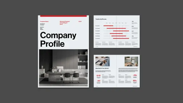
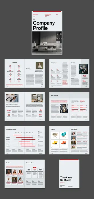
An InDesign Company Profile Layout: The Modern Standard for Corporate Branding
This post contains affiliate links. We may earn a commission if you click on them and make a purchase. It’s at no extra cost to you and helps us run this site. Thanks for your support!
Why Is a Structured InDesign Company Profile Layout Essential for Business Growth?
First impressions determine the future of every business relationship. Consequently, a professional InDesign company profile layout acts as the silent ambassador for your brand. Clients judge competence through visual organization before reading a single word. Therefore, a chaotic document suggests a chaotic business operation. In contrast, a structured brochure signals reliability, attention to detail, and absolute professionalism. This specific template transforms complex data into a compelling, linear narrative. Graphic designer Tom Sarraipo understands that structure dictates how a viewer processes information. Thus, he built this tool to guide the eye effortlessly.
Download the InDesign template from Adobe StockPlease note that this professional graphic design template requires Adobe InDesign installed on your computer. Whether you use Mac or PC, the latest version is available on the Adobe Creative Cloud website—take a look here.
This Adobe InDesign company profile layout by graphic designer Tom Sarraipo is available as a customizable design template in A4 with 16 pre-designed, fully editable pages. Download the InDesign template from Adobe StockMoreover, consistency builds trust across all touchpoints. A well-executed InDesign company profile layout ensures that your brand voice remains uniform. This 16-page template provides a comprehensive framework for every necessary business section. It covers everything from the “About Us” narrative to detailed financial pricing plans. Furthermore, using Adobe InDesign for this task offers superior control over typography and imagery. Word processors simply cannot achieve this level of typographic refinement. Ultimately, a strong layout converts passive readers into active partners. It turns a standard proposal into a memorable brand experience.
Deconstructing the Minimalist Aesthetic
Visual clarity reigns supreme in this specific design. The layout utilizes a bold, high-contrast color palette featuring red, black, and white. This choice immediately commands attention without overwhelming the viewer. Additionally, the typography favors clean, sans-serif fonts, which enhance readability. Large, bold headers anchor each page, while body text remains legible and airy. The designer prioritized white space to let the content breathe. Consequently, the pages feel sophisticated rather than cluttered.
Notice how the grid system aligns every element perfectly. The “Our Services” and “Process” pages use icons to break down dense text. This technique makes the information digestible for quick scanning. Furthermore, the photography acts as a functional design element, not just decoration. The dark, monochrome images contrast sharply against the bright red accents. This creates a dynamic visual rhythm throughout the brochure. Such a minimalist approach ensures the focus remains on your core message.
Technical Versatility of this InDesign Company Profile Layout
Functionality matches aesthetics in this robust template. Tom Sarraipo crafted this InDesign company profile layout to meet rigorous professional standards. The file comes in the standard A4 format, fitting most international printing needs. Because the file uses the CMYK color mode, it is instantly print-ready. However, it functions equally well as a digital PDF presentation. You can easily email it to clients or host it on your website.
Additionally, the template is fully editable within Adobe InDesign. Every element, from text boxes to image frames, serves as a customizable placeholder. You simply drag and drop your own assets into the layout. This flexibility saves countless hours of design work. Moreover, the organized layer structure simplifies the editing process significantly. Even designers with intermediate skills can navigate the file efficiently. This adaptability makes it suitable for agencies, freelancers, and corporate teams alike.
Streamlining Workflow with Pre-Designed Templates
Starting a design project from scratch often wastes valuable resources. Therefore, smart agencies utilize high-quality templates to accelerate their production timelines. This InDesign company profile layout provides a solid foundation for rapid iteration. You gain a high-end look without the budget of a custom agency design. Consequently, your team can focus on crafting the content rather than wrestling with margins.
The 16 unique pages cover every standard requirement for a business proposal. You will find dedicated sections for team introductions, client reviews, and project timelines. The “Why Choose Us” section specifically uses data visualization to prove value. Furthermore, the “Vision” page allows for impactful storytelling through statistics and imagery. This pre-thought structure ensures you never miss a critical piece of information. It essentially acts as a checklist for your company’s narrative.
A Critic’s View on Corporate Visuals
Many corporate profiles suffer from “over-designing” and unnecessary complexity. Designers often add too many colors or confusing graphic elements. However, this layout succeeds because it exercises restraint. It respects the reader’s time by presenting facts clearly. The red accent color guides the eye to key data points effectively. It highlights the “Need to Know” information without screaming.
This template proves that simplicity often communicates power. The “Summary” and “Table of Contents” pages set a serious tone immediately. They promise the reader an organized and efficient experience. Moreover, the clean lines suggest a modern, forward-thinking company culture. Using such a refined InDesign company profile layout positions a brand as an industry leader. It suggests you value quality in your presentation just as you do in your work.
Integrating Branding into the Layout
Customization remains the key strength of this Adobe InDesign template. While the red theme looks striking, you can easily swap it for your brand colors. InDesign allows you to change the global color swatches in seconds. Consequently, the entire document updates to match your corporate identity instantly. You can also replace the placeholder fonts with your specific brand typography.
The image placeholders function similarly. You can insert your own high-resolution office photography or product shots. This transforms the generic template into a bespoke brand asset. Furthermore, the layout accommodates various content lengths. Whether you have short punchy copy or detailed descriptions, the grid adapts. This versatility ensures the final document feels uniquely yours. It creates a seamless visual link between your proposal and your website.
Frequently Asked Questions
What software do I need to edit this template?
You need Adobe InDesign to open and edit this file. The template specifically targets this software to ensure professional print quality and layout precision.
Is this InDesign company profile layout suitable for printing?
Yes, the designer created the file in CMYK color mode. This ensures that colors render correctly when sent to a professional offset or digital printer.
Can I use this template for a digital presentation?
Absolutely. You can export the file as an interactive PDF. This format works perfectly for emailing to clients or presenting on screens.
Does the template include the photos shown in the preview?
No, the images in the preview serve only as placeholders. You must replace them with your own images or licensed stock photography.
How do I change the color scheme?
You can change the color swatches in the InDesign “Swatches” panel. Changing the main color there updates it across all 16 pages automatically.
Is this layout difficult for beginners to use?
The template includes a help file and uses organized layers. Therefore, anyone with basic knowledge of Adobe InDesign can successfully customize the document.
Elevating Your Business Narrative Through Design
A superior InDesign company profile layout does more than simply organize text. It strategically elevates the perceived value of your entire organization. This specific template offers a rare blend of visual style and utility. Consequently, users gain a competitive edge in client presentations immediately. You simply cannot afford to present valid data in poor packaging. Therefore, adopting this tool creates a pathway to stronger brand recognition.
Download the InDesign template from Adobe StockDesign serves as the ultimate differentiator in a crowded market. This layout empowers businesses to communicate with authority and precision. Furthermore, the editable nature of the file ensures long-term usability. You invest once and utilize the structure for years to come. Download the file and start transforming your corporate identity now. Excellence requires the right tools, and this template delivers exactly that.
You can find way more graphic design templates for different creative needs here at WE AND THE COLOR.
Subscribe to our newsletter!
By continuing, you accept the privacy policy#AdobeInDesign #AdobeStock #brochureDesign #businessProfile #companyProfile #design
Graphic Design Portfolio Brochure Template: Is Your Work Getting the Showcase It Deserves?
Why Does Your Portfolio Presentation Matter More Than Ever?
A brilliant design buried in a cluttered layout loses its impact instantly. Designers often spend weeks perfecting a logo or a campaign, but rush the final presentation. This disconnect creates a massive missed opportunity. Your portfolio acts as the bridge between your raw talent and your future client’s perception. Does your current method of presentation truly reflect the quality of your work? First impressions happen in milliseconds. Clients and creative directors scan hundreds of portfolios. They look for clarity, hierarchy, and a sense of curation. A chaotic PDF or a generic website template often fails to capture the nuance of complex design projects. This is where a high-quality graphic design portfolio brochure template becomes an essential tool in your arsenal. It allows you to control the narrative of your work physically or digitally, offering a tactile and paced experience that scrolling through a webpage simply cannot match.
Download the template from Adobe StockPlease note that this professional graphic design template requires Adobe InDesign installed on your computer. Whether you use Mac or PC, the latest version is available on the Adobe Creative Cloud website—take a look here.
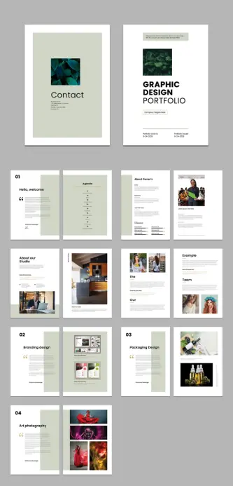
Adobe InDesign A4 Graphic Design Portfolio Brochure Template by PixWork Download the template from Adobe StockWhat Makes This Graphic Design Portfolio Brochure Template Unique?
Finding the right balance between minimalism and personality is difficult. The template designed by PixWork achieves this equilibrium effortlessly. It offers a clean, modern aesthetic that steps back to let your work shine. Many templates try too hard, adding unnecessary decorative elements that distract from the actual content. This layout, however, understands that the “design” of the portfolio should never overpower the “design” inside the portfolio.
The structure follows a professional grid system. This ensures that every image, caption, and headline feels intentional. You get 16 pre-designed pages that cover everything you need. From the introductory “Hello, welcome” page to the specific “Branding design” and “Packaging Design” sections, the flow is logical. It guides the viewer through your creative journey without confusion. The use of international standard size A4 makes it perfect for printing in regions like Europe and Asia, while also serving as a standard digital PDF format globally.
How to Customize This Template in Adobe InDesign
Speed and efficiency drive the modern design workflow. You probably don’t have forty hours to build a layout from scratch. Adobe InDesign remains the industry standard for multipage documents, and this template leverages its full power. All the elements you see—the moody photography, the crisp typography, the color blocks—are placeholders. They exist to show you the potential.
Customizing this graphic design portfolio brochure template is intuitive. You simply drag and drop your high-resolution images into the existing frames. The text is editable with a click. You can change the fonts to match your personal brand typeface. If the sage green accents don’t fit your style, you can swap them for a bold red or a stark black in seconds using the Swatches panel.
Key features include:
This flexibility means you aren’t just buying a static look. You are acquiring a flexible framework that adapts to your specific project needs.
Why Should You Choose a Brochure Format Over a Website?
Digital portfolios are non-negotiable, but they have limitations. A website depends on internet connection, screen calibration, and browser rendering. A brochure, exported as a high-quality PDF or printed on textured paper, offers total control. You determine exactly how two images sit next to each other. Not just that, you control the page breaks and force the viewer to pause and turn the page (or click “next”), creating a rhythm that you dictate.
Using a graphic design portfolio brochure template allows for specific targeting. You can curate a specific PDF for a branding agency that highlights your logo work. You can create a different version for a publishing house that focuses on your typography. This level of tailored presentation proves to the client that you understand their specific needs. It shows effort. It shows professionalism.
Maximizing the Impact of Your Visual Identity
Your portfolio is the first piece of work a client sees. It functions as your first deliverable. If the layout is sloppy, they assume your work will be too. This template helps establish a strong visual identity immediately. The cover design is minimal yet bold, featuring large typography and a focal image area. It sets a tone of confidence.
The internal pages continue this story. The “About Owner’s” and “Agenda” sections allow you to introduce yourself and your process before revealing the final output. This narrative approach transforms a simple collection of images into a compelling story. You aren’t just showing what you made; you are explaining who you are.
Mastering the Grid: A Lesson in Layout
A closer look at the template reveals a sophisticated use of white space. Novice designers often fear empty space. They try to fill every corner. This graphic design portfolio brochure template teaches the value of breathing room. The large margins and consistent gutters frame your work like art in a gallery.
The “Art photography” and “Example” pages demonstrate how to handle different aspect ratios. Whether you have wide landscapes or tall portraits, the grid accommodates them without breaking the visual harmony. This adaptability is crucial for multidisciplinary designers who might need to showcase UI design screenshots alongside packaging mockups.
Final Thoughts on Elevating Your Design Career
Investing in the right tools accelerates your growth. A premium graphic design portfolio brochure template saves you time and elevates your perceived value. It removes the technical headache of setting up bleed, margins, and grids, allowing you to focus entirely on curation.
Download the template from Adobe StockPixWork has created a resource that feels high-end but remains accessible. It bridges the gap between student projects and agency-ready presentations. By using a tool that adheres to professional standards, you signal to the industry that you are ready for serious work. Download the template, drop in your best projects, and present your creativity with the respect it deserves. Your future clients are waiting to be impressed.
Discover other high-quality, premium design templates here at WE AND THE COLOR.
Subscribe to our newsletter!
[newsletter_form type=”minimal”]#AdobeInDesign #AdobeStock #brochure #brochureDesign #graphicDesign #InDesignTemplate #portfolio #portfolioTemplate #template