Struggling to resize windows on macOS Tahoe? Here’s why.
https://noheger.at/blog/2026/01/11/the-struggle-of-resizing-windows-on-macos-tahoe/

Generalist
Occasional investor, app maker, and former product lead.
Struggling to resize windows on macOS Tahoe? Here’s why.
https://noheger.at/blog/2026/01/11/the-struggle-of-resizing-windows-on-macos-tahoe/
The team was working super hard for this release. For weeks (marketing), months (template typography), years (dev and testing). Tired and happy after the launch asif it were some kind of test or competition or birth:
https://ia.net/topics/a-presentation-app-that-works-on-your-phone
Imagine a presentation app that allows you to write professional presentations in under 20 minutes. Its beautiful typographic templates automatically scale to any screen. You can create, fine-tune, rehearse, and present your deck anywhere. And, finally, you can do it all on iPhone and iPad.
https://ia.net/topics/a-presentation-app-that-works-on-your-phone
The @ia team is so ridiculously good—and iA Presenter for iOS is now available on the App Store.
I don’t make a habit of promoting stuff, but this is more like a public service announcement.

Create professional presentations in minutes, not hours. iA Presenter helps you focus on your message while it takes care of design. Most presentation apps force you to waste time dragging boxes, picking fonts, and fiddling with colors, only to end up with messy, boring slides. iA Presenter flips t…
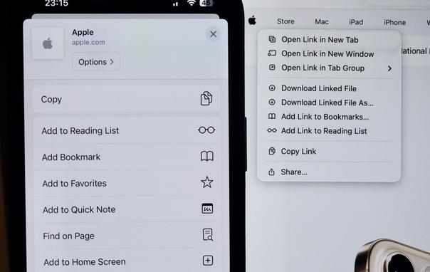
Why menu icons are a terrible idea on macOS?
Here’s a photo showing them side by side on an iPhone and on a MacBook Pro screen.
On iOS, menu icons can work quite well to communicate the meaning of menu items. They’re reasonably sized, displayed on screens with very high pixel density (around 460 ppi), and typically viewed from a fairly close distance.
But this doesn’t translate to macOS at all. On macOS 26 Tahoe, the icons are ridiculously small (about one-quarter of the physical area), displayed on screens with much lower pixel density (e.g. 254 ppi on the latest MacBook Pro), and usually viewed from about twice as far away.
Effectively—taking both size and pixel density into account—the macOS icons have less than 3% of the available pixels compared to their iOS counterparts.
So it’s no wonder that these tiny icons look blurry and are hardly recognizable on macOS.
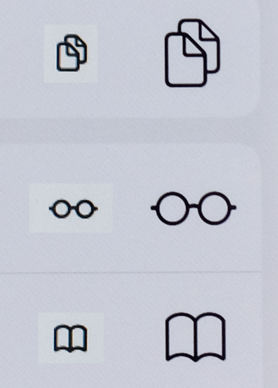
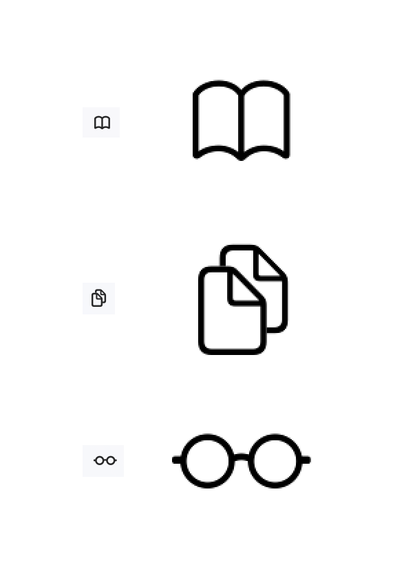
(the second picture compares their visual sizes side by side, the third one their actual pixel sizes)