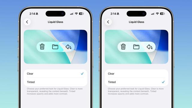
Think about how many collective millions of dollars in time and effort have been spent by developers and designers to try to adopt Liquid Glass in the past year, only to have Apple start to walk it back on the very first minor release since launch. This is an admission, and embarrassing.
Alan Dye told us this was the future of all platforms, critical, amazing, and beautiful. And here we are, at 26.1, allowing users to just totally opt-out. They didn't even make it ONE CALENDAR QUARTER before starting to roll it back. Why would anyone invest in Liquid Glass now?
@garrettmurray This is totally crazy. And *so* much effort wasted trying to adapt to something that was flawed from Day 0.
@garrettmurray now do macOS next plz
@ichris The irony is that on macOS there's very little glass anyway, so they don't really need this option, they need one that's like "restore sanity to sidebars, toolbars, etc"

@garrettmurray @ichris The translucent menu bar is a pox on the Desktop of every Mac user.

Start there.

@chrisfinazzo @ichris I consider this topic a lost cause, honestly, because it has been semi-transparent by option for many years. Not that I don't agree generally.

@chrisfinazzo @garrettmurray @ichris This really is the general Apple 2020s UI product management master override switch.

I’m sort of genuinely surprised that the Accessibility control panel hasn’t been quietly flushed to save testing effort as well as to prevent people like me from avoiding the awesome that is Cupertino’s vision of my working environment 😑

@slyborg @chrisfinazzo @ichris So I think regardless of the success of any UI aesthetic, Apple does an industry-leading job of providing amazing a11y features and overrides. This setting should be and always will be there (and predates Liquid Glass). What frustrates me is that as soon as you need to move this setting out of Accessibility and into Display, you are admitting the transparency doesn’t work.
@garrettmurray I *wish* this was a total opt out.
@garrettmurray I hope they don’t. It makes their app’s look tacky (especially on Mac, especially that sidebar design. And the icons)