🥳 New team member! For the next few months, JavaScript wizard Lars is joining us as a senior front-end developer to help us build visual stories and interactive reports in an efficient way.
💻 Thank you With Eleven for the collaboration!


| Work | https://baryon.be/ |
| https://twitter.com/Koen_VdE | |
| https://www.linkedin.com/in/koenvandeneeckhout/ |
🥳 New team member! For the next few months, JavaScript wizard Lars is joining us as a senior front-end developer to help us build visual stories and interactive reports in an efficient way.
💻 Thank you With Eleven for the collaboration!
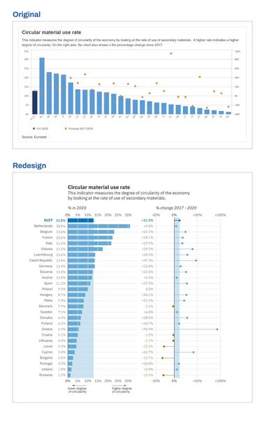
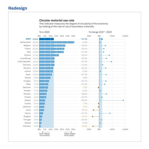
🚩 Watch out for one of the biggest red flags in a chart: dual axes!
Using two axes in one chart is like saying: I'm trying to tell two or more stories at the same time here. It's up to you to unravel what belongs to story 1, and what belongs to story 2.
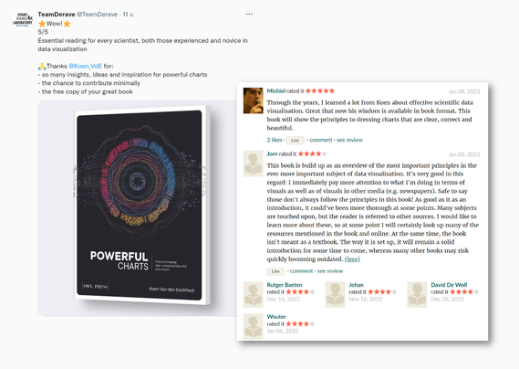
😱 Writing a book is a super stressful process, but waiting for reviews once it's 'out there' is even more agonizing. Today I finally found the courage to read some first comments.
🥰 This absolutely made my day! Thanks to everyone for taking the time to share your thoughts!
📊 You don't need fancy design tools or complicated software to create powerful charts. Well-known spreadsheet tools like Excel can do the job - as long as you keep the data visualization principles in mind!


First attempt (ever) at creating some #generativeart, for #genuary2023
#genuary4: Intersections
Click here to generate your own useless intersections: https://codepen.io/differenti/full/BaPLdjM

📊 Fonts evoke emotions, and can support or obscure your message. But above all, fonts in data visualizations should be easy to read - especially at small sizes!

De exacte impact hangt natuurlijk sterk af van het verbruik en de netbeheerder.
De tarieven per netbeheerder zijn te raadplegen via https://vreg.be/nl/hoeveel-bedragen-mijn-distributienettarieven
Hier kan je vinden wie de netbeheerder is voor je woonplaats: https://vreg.be/nl/wie-is-mijn-netbeheerder
(5/5)
De impact van het #capaciteitstarief op de factuur kan aanzienlijk zijn, zeker voor gezinnen met een warmtepomp of elektrische wagen. Een spreiding met 8 kW gemiddelde maandpiek kan jaarlijks € 240 extra kosten.
(4/5)

