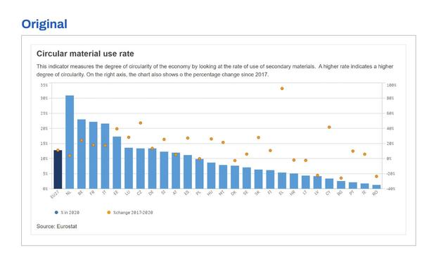
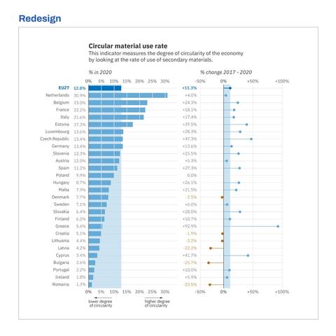
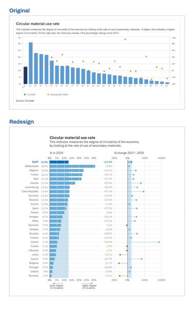
🚩 Watch out for one of the biggest red flags in a chart: dual axes!

Using two axes in one chart is like saying: I'm trying to tell two or more stories at the same time here. It's up to you to unravel what belongs to story 1, and what belongs to story 2.

My suggestion is almost always to break apart the chart into two separate charts, each telling one part of the story. By carefully aligning the axis, it will become clear that both charts are closely related.
Some further minor details we changed in the charts below:
✅ No abbreviations -> easier to recognize the countries
✅ Horizontal layout -> easier to read the labels
✅ Clearer indication of the average value -> easier comparison to the average
✅ Lollipop chart rather than a dot plot -> easier comparison between categories
✅ Color variation to highlight negative values
✅ Helpful annotations to help interpreting what the indicator means
✅ Shorter text and shorter line length -> easier reading
Original source: DG Internal Market, Industry, Entrepreneurship and SMEs of the @EU_Commission
#informationdesign #datavisualization #dataviz #redesign