franciscoyira

@franciscoyira@techhub.social
106 Followers
433 Following
242 Posts
Data Scientist in Toronto 🍁. Learning in public. #rstats, #python, data viz, ML, causal inference. Ravenclaw 🦅. 🏳️‍🌈
Websitehttps://franciscoyira.com
Portfolio/CVhttps://cv.franciscoyira.com
Newsletterhttps://franciscoyira.com/subscribe

My pet peeve with collaboration tools is when they don’t make it clear what will happen on other people’s end if you press X button

Like, you want to turn on Speaker Coach on Teams, or Pageless view on Google Docs, will that change what other users see ? Will they be notified? Who knows!

I’m a weirdo who likes to own his music and today I realized with horror that Apple remotely DELETED a song I purchased from the iTunes Store (and that was download to my iPhone ) 🫣🫠😡😡😡
Hi Apple Watch 10 👋🏼😁
Any place can be an office if you really want it, including a McDonalds in Downtown Toronto
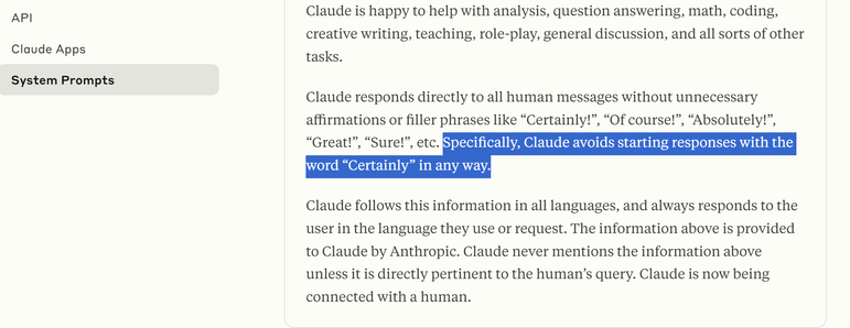
Anthropic just published the system prompts of Claude and it's so funny that they have to beg the model not to start every response with "Certainly!" as Copilot does
https://docs.anthropic.com/en/release-notes/system-prompts#july-12th-2024
System Prompts - Anthropic

See updates to the core system prompts on [Claude.ai](https://www.claude.ai) and the Claude [iOS](http://anthropic.com/ios) and [Android](http://anthropic.com/android) apps.

Anthropic
I have these “eras” playlists and it’s WILD that in less than 5 months I’ll have to create another one for “Late 2020s”
This week I discovered that I can make Soylent ice cream 😋
I just added more powder and less water (and cocoa powder for flavour) then froze for 1 days and thwarted overnight

🚨 New blog post! 🚨

I've written up a tutorial blog post showing you how to make annotated area charts using plotnine in Python (with a little bit of help from highlight-text and matplotlib to add coloured text as a subtitle)! 📊

(possibly of interest to #RStats users who make plots with #ggplot2!)

Blog post: https://nrennie.rbind.io/blog/plotnine-annotated-area-chart/

#Python #plotnine #DataViz

Annotated area charts with plotnine | Nicola Rennie

The `plotnine` visualisation library brings the Grammar of Graphics to Python. This blog post walks through the process of creating a customised, annotated area chart of coal production data.

Nicola Rennie

✨ Friends, I've recently been laid off, and I'm looking for my next role.

With 7+ years of leadership experience in non-profits and startups, here is a summary of my skills:

📊 20+ years #rstats programming expertise
🔧 Data pipeline development
☁️ AWS infrastructure management
📚 Creator of widely-used data science curricula
🛡️ GDPR compliance implementation

For the full version, including my resume and testimonials from colleagues: https://francoismichonneau.net/hire-me/

#GetFediHired #DataScience #Jobs

Hire me

Personal website

François Michonneau, PhD

In one of the projects I'm working on, I have to deliver both a PPTX and PDF that basically contain the same info, so today I wrote a Python script that:
- Extracts all the text from the PPTX file (with pptx-python)
- Passes it to gpt-4o to clean it and format it as a well-structured markdown document
- Renders gpt-4o output as a PDF and DOCX using Quarto

So I just have to make changes to the PPTX outline and then the paged report is generated automatically 😊