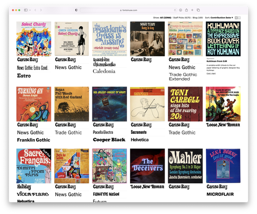
’Twas a fantastic weekend over at fontsinuse.com @FontsInUse
| Website | https://djr.com |
| Cool club | https://fontofthemonth.club |
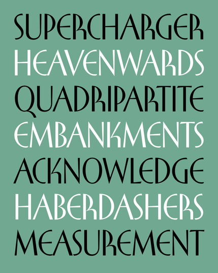
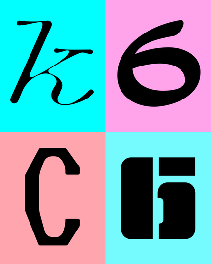
My latest typeface is based on the cover lettering of a 1950s trigonometry textbook that was way more interesting than it needed to be.
The letters R and K are obvious standouts, but there’s a lot of subtle mixing of deco and humanist elements that made this typeface a joy to puzzle out.
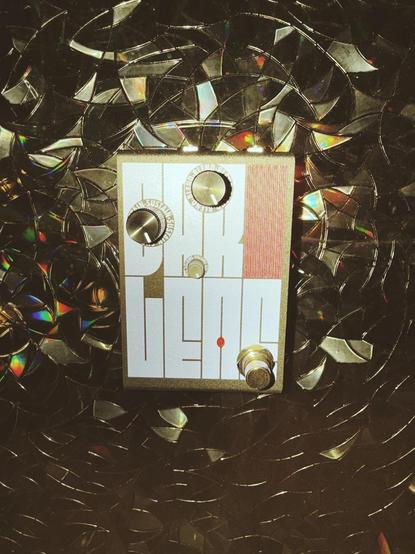
Fit in use for Heather Brown Electronicals’ new Darlene Compression effects pedal, designed by Graham McClanahan.
Read more on @FontsInUse :
https://fontsinuse.com/uses/73433/darlene-effects-pedal
And check out the pedal:
Week one complete at https://pixelfed.social/glyphoftheday !
Manicotti
LATIN SMALL LETTER U WITH CIRCUMFLEX
Gimlet Sans
LATIN SMALL LETTER U WITH DOUBLE ACUTE
Tortellini
AMPERSAND
Club Lithographer
LATIN SMALL LETTER K
Indoor Kid
DIGIT SIX
Slight Chance
LATIN CAPITAL LETTER C
Nickel Gothic Stencil
CYRILLIC SMALL LETTER BE

New in 2026...introducing the The DJR Glyph Navigator! 🔡🧭
Why doomscroll when you can glyphscroll?
Featuring a random glyph from my font library each day via RSS and at @glyphoftheday.
Website created by the amazing http://miniware.team @nickisnoble
Happy new year, and enjoy!
This week, Fantagraphics launched the book “Roy Kuhlman: Reluctant Modernist” by Steven Brower:
https://www.fantagraphics.com/products/roy-kuhlman-reluctant-modernist
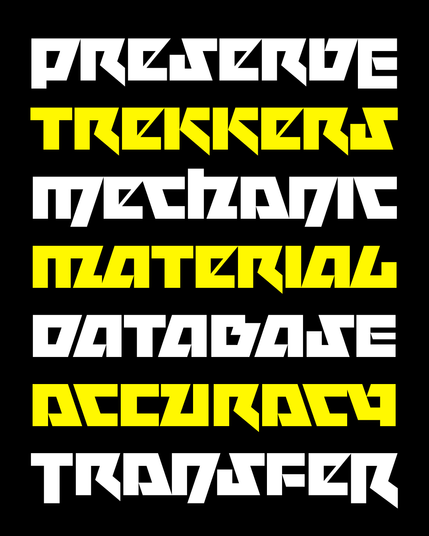
To celebrate the monograph, I designed a typeface based on Kuhlman’s distinctive lettering style.
If you purchase the book sometime this month, send me a screenshot of your receipt and I’ll send you a complimentary copy of the font!

Only a couple days left to visit Megazoid’s interactive nameplate on @morningtype ’s Type Foundry Directory, featuring Megazoid’s fancy new variable drop shade by @arthurfontzarelli
“Roy Kuhlman: Reluctant Modernist”is an upcoming monograph about the graphic designer Roy Kuhlman.
I worked with its author, Steven Brower, and his collaborator Craig Welsh to design a multi-width typeface based on the distinctive lettering style that Kuhlman used on several of his book covers, created with cut paper and masking film.
The book (available for preorder!): https://www.fantagraphics.com/collections/coming-soon/products/roy-kuhlman-reluctant-modernist
The font: http://djr.com/kuhlman
Try it out: https://typeset.djr.com/?ff=kuhlman
Megavolt also has new unicase and swash forms that can be used at the beginnings AND endings of words...thank you @nicksherman for reminding of the term “MetallicapS” to describe this!
I’m not sure if these make the typeface more useful per se, but I hope they at least make using it a little more fun!