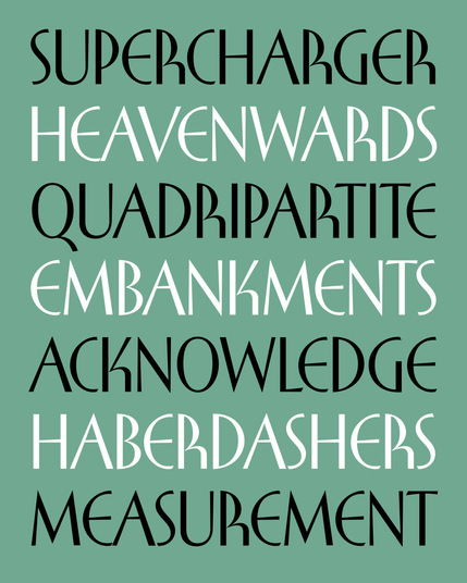
My latest typeface is based on the cover lettering of a 1950s trigonometry textbook that was way more interesting than it needed to be.
The letters R and K are obvious standouts, but there’s a lot of subtle mixing of deco and humanist elements that made this typeface a joy to puzzle out.