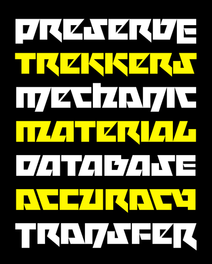
Here is a tale of a great designer brazenly squishing my font, and how it led me to reconsider why I made that font so dang wide in the first place.
The result? MEGAVOLT NARROW 🤘
Here is a tale of a great designer brazenly squishing my font, and how it led me to reconsider why I made that font so dang wide in the first place.
The result? MEGAVOLT NARROW 🤘
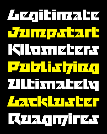
In addition to making the font narrower, I added a ton of OpenType alternates. I wanted the typesetter to be able to play with rotated and flipped forms of the letters, as if they are tangram blocks.
For example, here are all the variants of Megavolt’s capital O:

Megavolt also has new unicase and swash forms that can be used at the beginnings AND endings of words...thank you @nicksherman for reminding of the term “MetallicapS” to describe this!
I’m not sure if these make the typeface more useful per se, but I hope they at least make using it a little more fun!