David Jonathan Ross

@djrrb
1.2K Followers
514 Following
631 Posts
NEW: Kuhlman by @djrrb reinterprets the expressive lettering style deployed by graphic designer Roy Kuhlman in his book cover designs, trying to capture a bit of Kuhlman’s blend of chaos and consistency of angular letterforms originally cut out of paper or masking film.
#ad
https://fontstand.com/fonts/kuhlman

The interface of a pro camera app is packed with information, constantly changing values that need to be understood at a glance, shifting digits that need to remain precisely aligned for optimal legibility

To achieve this, Bayer Cam uses the timeless Input Mono, designed by @djrrb

If you’re a foundry looking to give back to the font community, expand access to type design, and reach the next generation of students, check out our new initiative: The Small Foundry Fund for Type West. https://letterformarchive.org/news/the-small-foundry-fund-for-type-west/

Thanks to @djrrb for helping us shape the Fund!

#TypeDesign #Scholarships #Fonts #TypeWest

The Small Foundry Fund for Type West at Letterform Archive

Introducing a new community-driven funding initiative devoted to expanding access to our Type West program.

Letterform Archive
Day 10 of Drawing a Font Every Couple Days (weeks?). Today: another blackletter.

Here is one more illustration by Naime Pakniyat that commemorates the release of Fit Arabic by @Sahar !

http://dograytype.com/fonts/fit-arabic

As @dogray explains, this illustration turns the theme of spring inward— “the images live inside the letterforms and reflect on other ways Iranians have celebrated the arrival of spring: a celebration, a fresh start, a feast.”

This connects to an essential aspect of Fit’s design—“Both the interior and exterior are essential for the font to be what it is.”

Whether you read the Arabic script or not, please take a moment to check out FIT ARABIC, designed by the amazing @Sahar and released today by @dogray !

https://www.dograytype.com/fonts/fit-arabic

This next-level illustration is by Naime Pakniyat (https://www.instagram.com/naimepakniyat/) 🤩

RE: https://mastodon.social/@djrrb/116533944431473117

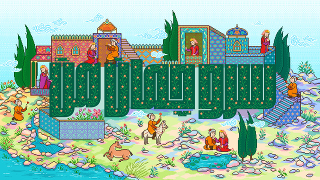
I must say that Fit by @djrrb (for the original Latin script) might be the ultimate typeface for exploring multiscript type design.

There have been plenty of cool multiscript typeface designs lately, but a lot of them are very rooted in text typeface design. This isn't to discredit the hard work of the designers involved in translating a design concept across multiple scripts, but at least one can usually imagine that a design concept executed for one script could probably be executed for another.

Fit though? I swear at least half of the scripts it supports doesn't seem like it should work. At all. Yet every script was done by a top-notch designer of that script, and even to my outsider eyes I can definitely pick out what few letters I'm familiar with in other scripts.

I can't imagine DJR intended this to be Fit's destiny when he drew the Latin.

It has been incredibly cool to see Fit go where it's gone, and I can't wait to see what comes next! 

I tried partially recreating one of the images from the Bungee font specimen site using the new CSS text-fit property in Chrome Canary. Its a web-standard version of the old FitText jQuery plugin. @nicksherman @djrrb @davatron5000 https://codepen.io/cssgrid/pen/emBZzPL

Here is one more illustration by Naime Pakniyat that commemorates the release of Fit Arabic by @Sahar !

http://dograytype.com/fonts/fit-arabic

As @dogray explains, this illustration turns the theme of spring inward— “the images live inside the letterforms and reflect on other ways Iranians have celebrated the arrival of spring: a celebration, a fresh start, a feast.”

This connects to an essential aspect of Fit’s design—“Both the interior and exterior are essential for the font to be what it is.”

Last year I was honored to give the 50th Dwiggins Lecture for the Society of Printers in Boston. The recording is now up: https://www.youtube.com/watch?v=t4LEnuM0e1U

In the talk I try to capture what gives WAD’s type so much life, and suggest some contemporary designers whose work also has those attributes. Featuring @djrrb, Cyrus Highsmith, Sofia Mohr, John Downer, Franziska Weitgruber, @SandrineNugue, @klim.

#TypeDesign #Fonts #WADwiggins #Typography

Stephen Coles: Warmth & Snap: What New Type Owes to W.A. Dwiggins

YouTube