CJ Dunn

@cjtype
457 Followers
183 Following
1.1K Posts
Type Design by CJ Dunn
WebsiteHttps://www.cjtype.com
RSSHttps://cjtype.com

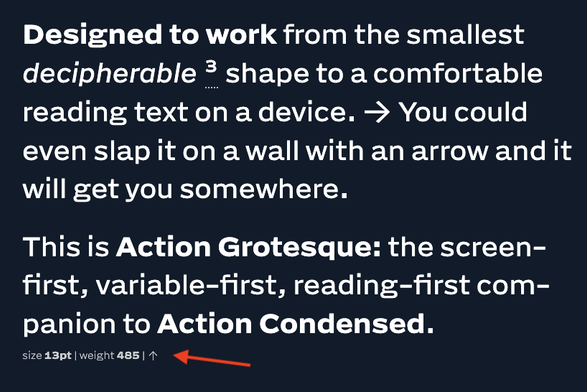
I was catching up on @letterror’s notes for his recent Action Grotesque and marveling at the 5pt(!) text captions (rendered as 6.66667px). It’s “legible” for me, but that’s also relative (I still need to lean close).

It’s wonderfully bonkers that this looks so crisp! I don’t think this sizing makes sense for screen use outside of a specimen display, but such a flex of fantastic design down to a micro scale. I love it, and want to find a project to use this family. 👏

https://letterror.com/actiongrotesque/

Does anyone know what the suffixes "B5pc-H" mean in Noto Sans CJK? For example: NotoSansCJKtc-Bold-B5pc-H

I know that "tc" in the family name is for Traditional Chinese. Perhaps "-H" is for Horizontal typesetting? What is B5pc?

This is showing up as a missing font in a branding document. I want to point the person to the correct place to download the missing fonts. When I download from https://fonts.google.com/noto/specimen/Noto+Sans+TC I don't see "CJK" in the font family name and I don't see any suffixes. Any ideas?

@cjtype One little trick I show to my @TypeMedia students every year is to look at text rotated by 90 degrees. This way text will appear more as a “railroad” and you can spot errors in overshoots more easily.

Overshoots are one of those things that I am constantly surprised by. I will think certain curved glyphs should overshoot by the same number of units, and maybe at first they do. But as the design changes, or I spend more time with it, my eyes tell a different story and I need to adjust the overshoots again.

Trusting ones eyes is one of the most difficult aspect of typeface design in my experience. And like any other muscle, no amount of intellectualizing it makes this improve. Just more reps

Font The Pain Away

I’ve also been using this promo video as an excuse to make audio tracks in Ableton Live. I often use this website https://splice.com/ where you can purchase samples of instruments, drum loops, melody loops… You pay for the elements, but they are royalty-free so the songs you make from them can be used on youtube etc.

They kind of remind me of fonts. If you start with high quality elements it’s really easy to make a nice composition. Like licensing a nice font to make a logotype or poster

I’ve been deep in the matrix of animating variable fonts in AfterEffect this week and for the time being it mostly makes sense to me. I’m going to savor this moment while it lasts because I’m pretty sure I’ll have no idea what any of this means next time I open these files. Time for me to start making Memento style notes to my future amnesiac self 😵‍💫

For anyone else interested, I followed this tutorial https://www.youtube.com/watch?v=aWZUS59HVsQ where they animate Obviously by @ohno at least they have good taste

After reading the article “What aesthetic is this” by @goodspeed
https://www.itsnicethat.com/articles/elizabeth-goodspeed-whats-in-a-name-categorising-aesthetics-creative-industry-190526

I was thinking about the 2014 talk by @kupfers at @coopertype on type classification called “Down With Buckets”
http://old.coopertype.org/event/down_with_buckets which I often come back to. Indra suggested we use “tags” rather than “categories”, where one item can have multiple tags or attributes, vs categories which imply a single bucket that an item needs to fit into. Tags can be an antidote the flattening effect of categories

“What aesthetic is this?” Elizabeth Goodspeed on the push to categorise visual culture

Online, images are increasingly treated less as singular works than as pieces of a broader aesthetic puzzle – each with a distinct label. But what gets lost when creativity is compressed into searchable categories?

EPS 2 Postscript

*OpenType GX not GH, of course

I was trying to figure out how I could have typed GH. I think what happened was I was being lazy and used the “copy text from image” feature. In this typeface the X gets copied as an H (try it yourself). Funny thing is, I copied rather than re-typed because I wanted to get the title exact, without typos, lol

The lesson to myself is to not be lazy, use my eyes, and not assume a new technology will always get it right for me

This is a metaphor for auto kerning : )