macOS Golden Gate doesn't look 'refined', it looks retro. It's honestly shocking at first launch. It's like we've slowly moving into a timeline where iOS 7 never happened
Seeing nav bars return is wild; they painted themselves into such a corner last year that they had to hit the "break [Liquid] Glass in case of emergency" lever
The Liquid Glass version of Pages on macOS 27 almost looks like it could be running on Mac OS X Tiger. Can't wait to see what this OS looks like after apps refresh their designs to fit in
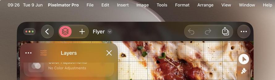
The glassy toolbar shapes are so nice now on macOS 27 that you kinda want to fill your toolbars with buttons rather than hide away the UI like we have been for too many years
@stroughtonsmith It's weird how they look so good this year on macOS but the iOS buttons (in light mode) are nowhere near as good. They lack any kind of depth. It's like they consist only of a gray stroke around them.
@stroughtonsmith I would prefer clearly visible, high-contrast buttons on an opaque background. Can that useless visual clutter at least be turned off?
@stroughtonsmith again, this toolbar still fails to return to many solid design principles. This is the actual pages from the late 2000s and it has sooo many more affordances in its toolbar (it also doesn’t make the mistake of squashing the titlebar and toolbar together)
@stroughtonsmith Depressing that every user instantly knew the problems and it took Apple almost a year to get over their hubris. I can’t overstate how glad I am Alan Dye is gone.
@jonhendry@stroughtonsmith Sure, but I meant it more from the perspective of “how did it get to the point of shipping” when we all instantly knew it was bad during the keynote last year and they then didn’t fix during Beta last year when it should have been obvious.