macOS Golden Gate doesn't look 'refined', it looks retro. It's honestly shocking at first launch. It's like we've slowly moving into a timeline where iOS 7 never happened
Seeing nav bars return is wild; they painted themselves into such a corner last year that they had to hit the "break [Liquid] Glass in case of emergency" lever
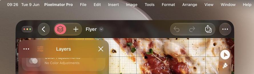
The Liquid Glass version of Pages on macOS 27 almost looks like it could be running on Mac OS X Tiger. Can't wait to see what this OS looks like after apps refresh their designs to fit in
The glassy toolbar shapes are so nice now on macOS 27 that you kinda want to fill your toolbars with buttons rather than hide away the UI like we have been for too many years
@stroughtonsmith I would prefer clearly visible, high-contrast buttons on an opaque background. Can that useless visual clutter at least be turned off?