 David Revoy
Over the past days, I worked hard on the MiniFantasyTheater website.
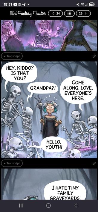
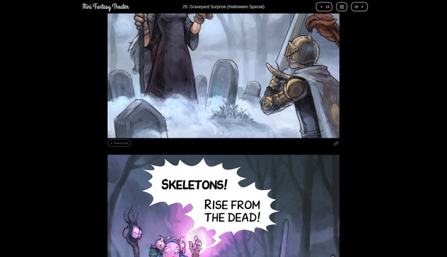
I'll blog about it tomorrow, but if you want, you can test before my new homemade comic reader: https://www.peppercarrot.com/en/miniFantasyTheater/025.html
Over the past days, I worked hard on the MiniFantasyTheater website.
I'll blog about it tomorrow, but if you want, you can test before my new homemade comic reader: https://www.peppercarrot.com/en/miniFantasyTheater/025.html
@dzwiedziu Yes, the URL is stable, and retro-compatible with previous URLs. The RSS for miniFantasyTheater [1] will continue to deliver the "unified" all panels in a single picture comic, but with a link to this comic reader.
@davidrevoy really nice. The included timelapses are fun as well. I had clicked on the scarecrow one (23) to find out the original facial expression, when it was talking to the crows, was different. Great stuff (as always).
Tested on mobile. Works great.
Works great in my Webbrowser (Firefox).
@muenchnerin @davidrevoy Also works great on mobile Firefox.
The only issue I encountered was that pineapple on pizza is actually great, you absolute heathen. 😝
@davidrevoy All I can say that this is 10 times better viewing experience.
The power of having full control how you display content to your audience will always win.
Fantastic work.
@davidrevoy Great work! 👏
I have one feature request:
On mobile scrolling through the panels feels great. On the desktop (Firefox / Brave, maximised window, resolution: 1920×1200) it feels a bit off – for me. On mobile (portrait mode) I always see 1 full panel and about 70% of other panel(s). On desktop 1 panel is maximised to fit the whole height. While this is best viewing 1 panel, it feels a bit strange when scrolling as most of the time, you don't see 1 full panel.
Possible solutions (I see): When using the mouse / touchpad / touchscreen to scroll, "jump" from one panel to the other (perhaps with a fast scrolling animation between the "jumps"). When using the keyboard, you could bind those "jumps" to the arrow keys and / or pg↑ or pg↓ keys.
@davidrevoy When viewed on a computer, I think it'd be better to go straight to the 4-panel page. 1-panel per page is a terrible way to read on a big screen. I suppose probably few people still use computers to access this stuff, so not a priority I imagine.
I also find the 4-panel format charming. It feels like something is lost in this new format.
 Que
Que Dźwiedziu
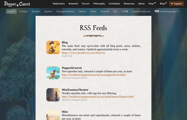
 Kit Bashir
 🕯️Curious Magpie 🕯️
 shom
shom Chris. R. 🎧🎼☕🍍
 Yer Feff
 Berg am Laimerin (v2)
 DDR
DDR Alpaca Male
 𝖘𝖆𝖛𝖊𝖗𝖎𝖔
 Yabo "Yalyn" Vinkindo
 Axel Stieglbauer
 jntesteves