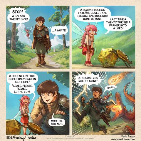
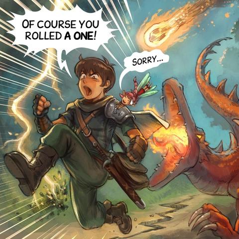
Note: I'm testing something new: splitting the four panels and posting them as separate pictures.
Reasons:
- More resolution and details
- Easier to read, larger font size
- Mobile/small-screen friendly.
Should I keep this format for the future?

That's interesting, tusky shows the 4 panels in a square so it actually looks like a regular comic when scrolling through the feed and then clicking on any one of them opens it full screen.
It makes for a really nice experience.
Seconded! With the old format, I always had to turn my phone and slide from frame to frame. The new format is much better. Thanks, David! I hope you keep it.
@davidrevoy For the internet posting, both solution can be valid, but for printing / display, the old layout is still better.
(Though, if you have the laid out image and the four separate one available, it's probably the most flexible, not sure how much of an overhead it is ?)
@davidrevoy Thank you for posting your amazing art!
Both formats are good IMO.
2) looks nicer, more traditional.
1) is bigger etc. as you say. Also better for alt text, that’s reason enough.

@davidrevoy
I prefer the single image version even on my mobile, because I'm an old fogey and I'm too used to seeing it all in one go, but I can see a case for having both options available.
Maybe posting one version on a post and the alternative as a reply might get the best of both worlds?
@davidrevoy I prefer a single image, because with multiple images I have to click on each one separately to open it. Even on mobile, I find it easy to read an entire comic as a single image. I am surprised by how many people prefer the larger single panels! Obviously I am an outlier.
Another possibility would be a single image that was one panel wide, so you scroll down to read it, as with mobile app sites like tapas and webtoon.
I'll keep reading regardless, obviously. 😊
@davidrevoy I think panel layouts are important for comics. It doesn't feel as coherent when you only see one panel at a time. Seeing the panels all together in a layout determined by the artist adds value to the whole work. Not to mention, the colors and lettering around the panels add to the character of the work.
If you are going to separate the panels, I would still like to see the border/margins around each panel (framing is important) and the title above the first panel. I feel that something important is lost when those aren't included.
That said, you could share it both ways. For example, you could post the whole comic the way you usually do, then comment with the images seperated, or vice versa.
Whatever you think is best. Feel free to experiment more!
@davidrevoy
Could you keep the 4 picture format but also add a link to the comic on your website for those who prefer that format?
It looks like there's plenty of room in the post for a link.
@davidrevoy I think that splitting the comic into its individual panels changes the nature of the comic somehow; this is related, of course, to the fact that clients will often crop the individual images when displaying them as a grid but mostly that a comic displayed as individual panels is a slideshow; the simultaneity of the format gets lost
Is that a compelling argument? Probably not, it's fairly personal, I think. May I suggest posting the comic twice, once split and once as a whole?
@davidrevoy Some on r/comics post 5 images. The 4 panels individually, and then altogether.
Just individually is fine by me; altogether feels like a holdover from pulp/print (especially if the panels are just simple squares and not composed into an intricate full-page/double-page spread)
@davidrevoy Four separate images help it look good on mobile. 
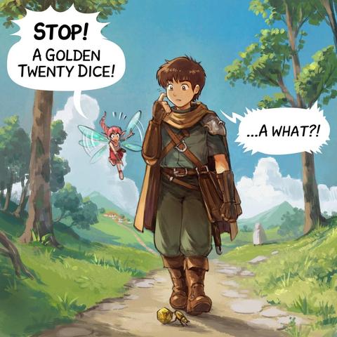
With one exception: the joke lies in the structure of the four-panel comic. Breaking the fourth wall.
I’d give an example, but I’m a bit self-conscious about quoting myself.
@noodlemaz obviously it's a gray-market import, else it would have ”CE“ and thus be save to use … 🤔