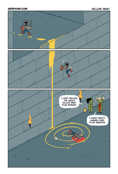
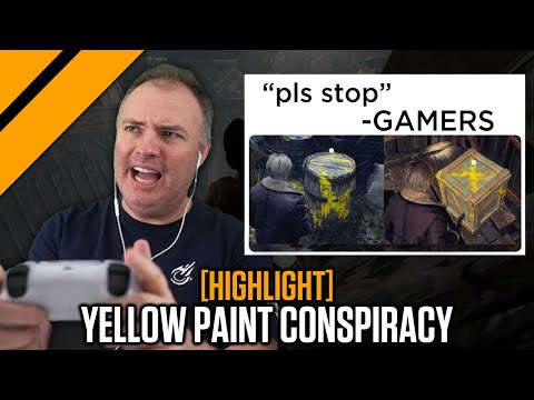
Yellow Paint
Thank you! This is something I saw coming as games got more visually detailed and environments got more visually dense. There was this generation of “detective mode”/“spirit vision”/“highlight the important shit” and I remember that in some games it was so constantly necessary to use that to figure out where you needed to go that you spent more time in desaturated rave-land than seeing that actual game.
I feel like decent signposting, guiding the player towards interactables and points of interest, etc is slowly being lost in favor of “toggleable highlight vision” and yellow paint. It’s a fucking video game, use some rim-lighting or a sparkle effect. Point a toppled lamp at the ladder. Either go all in on realistic environments and work harder to direct your players in ways that don’t break immersion or accept some element of “game-ness” and just highlight the objects.
The toggle-able highlight vision fucks with the gameplay flow, and the yellow paint on shit that doesn’t make sense unless an omniscient helper is leading us just breaks immersion and versimilitude for me more than any glowing collectable does.
The Portal games were really good at this. Using the environment to guide the player where they needed to go and then they used lighting to show what you should look at.
Portal 1 did have some red arrows and “this way” signs on the walls, but that actually made sense because there was someone helping the player character out.
Portal 1 had a very spartan level design. There was only a very limited set of interactible assets, so it was easy to learn which five assets can be interacted with. But also there wasn’t really much of anything else in the levels. Everything was clearly visible and understandable, because there really wasn’t anything there.
Try to do Portal 1 in a forest setting, or in a detailed medieval city centre environment. That kind of design language would completely fall apart.
That’s fair, although there was more stuff in the levels of the second half (but you’re right, even then the only thing you could really interact with were doors).
Try to do Portal 1 in a forest setting, or in a detailed medieval city centre environment. That kind of design language would completely fall apart.
Of course. Their design was very fitting for the kind of games they were, and different games would need something different to guide players :)
I haven’t played through them, but I believe the Half-Life games had a greater variety of environments?
I haven’t played the Half Life games, but they do firmly fall into the low-fidelity-environment category. Lower fidelity environments don’t need such a clear design language, because any object that exists usually exists for a clear purpose.
That’s fair, although there was more stuff in the levels of the second half (but you’re right, even then the only thing you could really interact with were doors).
Doors, turrets, cubes, switches, one type of “portallable” wall, that’s it. Everything else is just an obstacle. They spent the first half of the game training the player which objects are interactible, and in the second half they didn’t introduce anything new that wasn’t just an obstacle (except maybe the doors, don’t remember if they exist in the first half).
But that’s just the point: If there’s not a lot of stuff in the game and all the objects are clearly recognizable, there’s no need for yellow paint because the game world is yellow paint.
Yellow paint becomes necessary when the game is high-fidelity and trying to be photorealistic and thus stuff isn’t quite as clearly understandable. That’s why we use yellow paint in real life for mark ledges that you could stumble over or emergency exits (ok, here it’s green), or first-aid kits (here it’s red), or defibrilators (blue or green) and so on. We do use this technique in real-life.
Dense environments on a screen have this impact. But that issue fades some when you are immersed in them in VR. Your spatial reasoning kicks in better and things become more intuitive. On a flat screen it becomes an ever moving eye spy/where’s Waldo thing in some ways.
Not really a “solution” just an observation from a VR head.
And it doesn’t fix “disabled” objects like things you expect to be able to use, but can’t due to gameplay/design reasons.
And it doesn’t fix “disabled” objects like things you expect to be able to use, but can’t due to gameplay/design reasons.
That’s imho even a bigger issue in VR, since the interactions are more “reality-like”, so when something doesn’t behave like reality, that’s more of an issue.
I agree, and as someone who makes stuff for VR, I have mixed feelings about it sometimes.
In VR, if every single object was interactive and able to be picked up, they would invariable all be tossed around in clutter. Because they are always massless when held and effortless to move. (Yes, this isn’t always true, but disconnecting virtual hands from real hands is the compromise) Due to the ease of manipulation, it’s almost compulsive to throw them all around and make a physics mess.
This isn’t necessarily bad. But it’s not always the goal of the design. Sometimes it’s counter to it. And then setting aside design, just having a lot of physics objects around is often a performance burden in an already performance constrained environment.
We should be able to topple book cases, and shove couches, and flip tables and remove table cloths and drape them on things, etc, etc. It doesn’t just end with small hand held objects.
So while I agree that it sucks that we can’t grab and touch and knock over everything. There will always be limits for the foreseeable future.
Others have given probably similar examples, but Arin’s Mega Man X video both agrees with you and the post. It points out how some games used limited options in games (and showing examples before you died) to train you on ways the game works without the yellow paint. Your point is that games today don’t have the same limitations such as only travel right at the start, whereas the video points out there should be environmental designs that lead you to the answer.
With fully free 3d environments it’s harder to do that without yellow paint though.