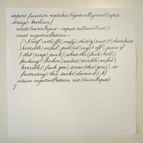
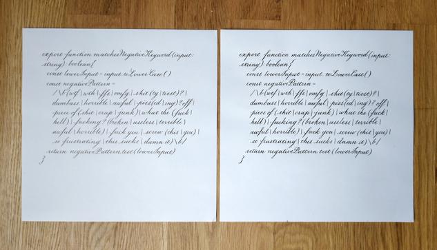
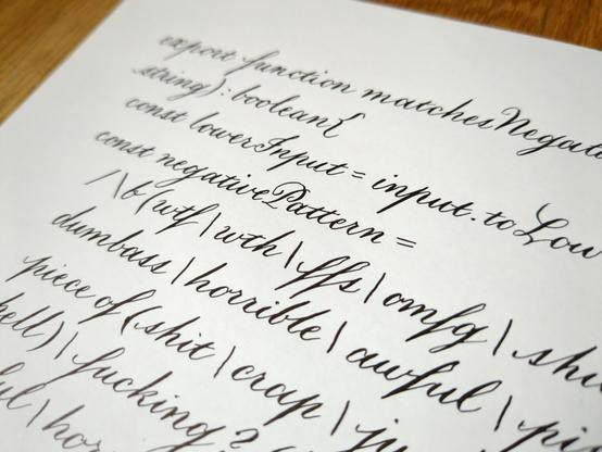
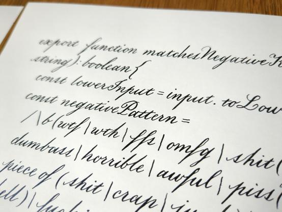
sometimes you see a piece of code so beautiful you simply must commit it to physical media in the most elegant way you know
sometimes you see a piece of code so beautiful you simply must commit it to physical media in the most elegant way you know
Putting aside the sheer absurdity of a multibillion-dollar machine learning company using regex to do sentiment analysis, an actual legit application for machine learning, it is so fantastically inefficiently written. Every time I wrote this out (like 2½ times) I see something new and horrible, and I'm not even what you'd call a regex wizard. Like, why wtf|wth and not wt(f|h)? Why are "horrible" and "awful" in there twice? Why fuck you|screw (this|you) and not (screw|fuck) (this|(yo)?u) ((bull)?shit|crap)? But there is no use trying to understand it because there is no thought or intention behind it. Simply a mindless word generator that got tossed at a problem again and again until the droppings accreted into something that worked well enough.
edit: AND ANOTHER THING, why not have, like, a case-insensitive flag or something rather than converting it to lower case?
@nev i agree with you, but
i authored a system that used regex for sentiment analysis in english language pathology reports. we achieved an incredibly high sensitivity and specificity (precision and recall) and i'm really proud of the work
i think because of the very narrow problem space, and the ways in which pathologists tended to hedge their bets on diagnoses that might or might not be cancer, it was more straightforward.
i'd never attempt to use it writ large like this.
Comparison of the effect of different inks.
Photo #1 is kind of shit but you can hopefully tell how the fountain pen ink allows for thinner lines. The one on the left is done with more watery fountain pen ink (Private Reserve Ultra Black), the one on the right with thicker India ink (Speedball). Both done with a Hunt #22 nib on Tomoe River paper. (The #22 is rather stiff; I could get finer lines with a different nib.)
The inks have different sorts of sheen as well. The India ink is slightly glossier and pure black, whereas the fountain pen ink is a little more matte with warmer sheen.
The advantages of India ink are that 1) you can use it on thinner or lower-quality paper without bleeding, whereas fountain pen ink bleeds easily (this one is the least bleedy of the ones I have); 2) flourishes with a lot of thin strokes often need a thicker ink to be shown off to their full effect, especially with very large letters; and 3) it is more water-resistant and permanent.
You can't use India ink in fountain pens because it'll clog them up! You can use fountain pen ink with dip pen nibs, but they may need a binder like gum arabic to thicken them sufficiently.
@nev I have found the Graf von Faber-Castell pen inks reasonable for use in a fountain pen and dip pen, though now I'm tempted to try and take a portion of them off and mix them thicker.
I can speak from experience that the Noodler's invisible ink will gum up a fountain if you leave it long enough, which I suppose is just an excuse to use it up quickly.
Can you thin an india ink with water or is a more exotic solvent needed?
title: "please don't be mean to me"
"this is so frustrating" was me. you know, teacher talk... but where is "I am disappointed" ?
Wow. The depth and quality of bleeding edge AI code is staggering.
Makes me want to cry.
A really amazing feat.
this is beautiful. i would publish it in my Lit Journal as visual poetry. pay is modest, only $20, but you'd be famous (to a few dozen people)